

You may have noticed it already: We have relaunched our visual identity and are now appearing with an entirely new look and feel.
您可能已经注意到了这一点:我们重新推出了视觉形象,现在以全新的外观出现。

Since over 20 years, we are digital enablers, serving brands to achieve digital relevance and excellency in transformation. And in a rapidly changing market environment, we need to stay agile and adaptive explorers.
二十多年来,我们一直致力于数字化服务,为品牌服务,以实现数字化意义和卓越的转型。在瞬息万变的市场环境中,我们需要保持敏捷和适应性强的探索者。
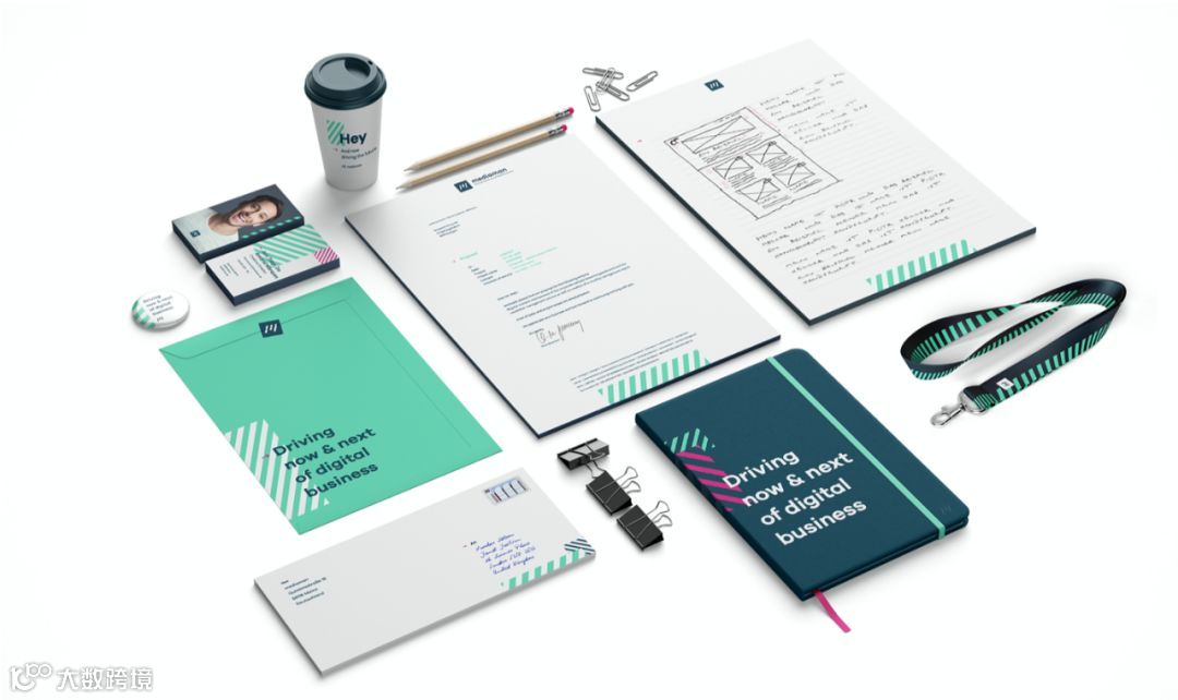
Our new design reflects these requirements to ourselves: Adaption, dynamics and acceleration. Our previous identity key elements, the Juggler, and the double slash, are history; replaced by a dynamic set of colors and visual elements.
我们的新设计向我们自身反映了这些要求:适应性,动态性和加速性。我们以前的身份关键要素,变戏法者和双斜杠,都是历史。替换为一组动态的颜色和视觉元素。
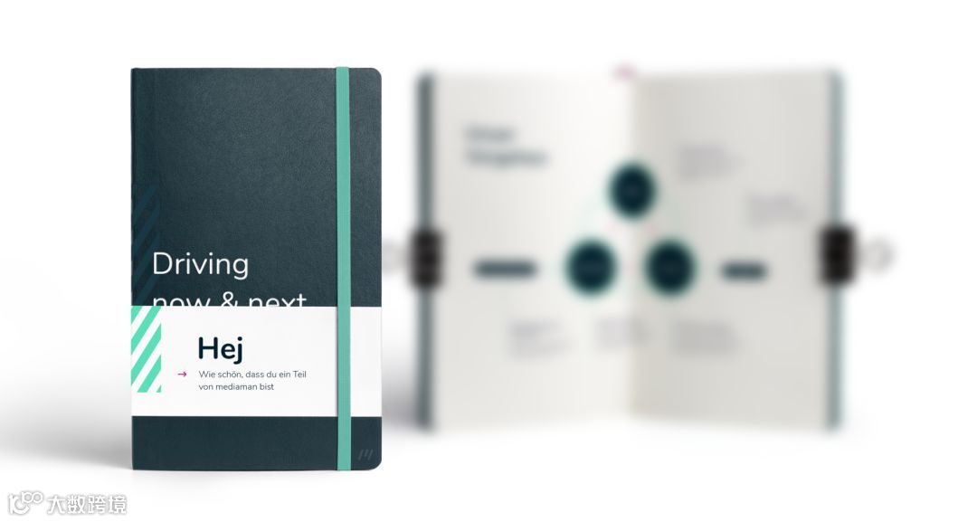
Both our new logo and the supporting stripe-shaped elements represent movement, performance and a future-oriented attitude. The color scheme is led by vocal tones: minty green and flamingo pink, adding more to our key values: Positivity and Curiosity.
我们的新徽标和条纹状的支撑元素都代表了运动,性能和面向未来的态度。配色方案以人声为主导:薄荷绿和火烈鸟粉红色,为我们的主要价值增加了更多:正性和好奇心。

The new visual appearance also marks our internal change towards having a stronger focus in User Experience, Experiential Marketing and innovative Technologies in this field.
新的视觉外观也标志着我们的内部变化,以在该领域更加关注用户体验,体验营销和创新技术。

