
点击上方 【蓝字】 关注我们

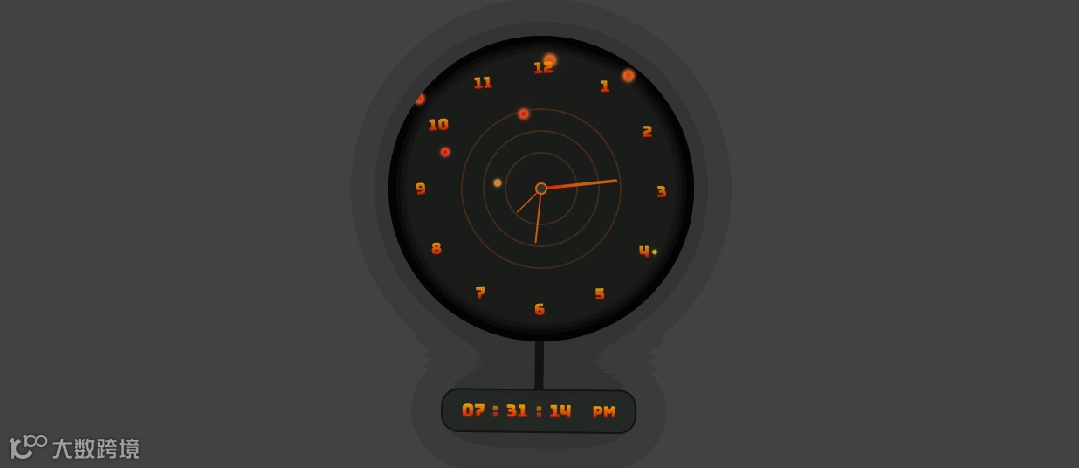
摆钟效果图
HTML

<html lang="zh"><head><meta charset="UTF-8" /><title>好看的摆钟</title><style>/* CSS 样式定义,下面会详细解释 */</style></head><body><body><div class="container"><div class="clock"><!-- 摆钟的各个部分 --></div></div><script>/* JavaScript 代码部分,下面会详细解释 */</script></body></body></html>
CSS

* {margin: 0;padding: 0;}html {overflow-x: hidden;}body {/* 设置页面的背景色、高度、对齐方式、字体等 */}.container {/* 容器的相对定位和最小高度 */}.bubble-wrap {/* 气泡包装容器的样式,包括尺寸、圆角、定位等 */}.bubbles-bg {/* 气泡背景容器的样式,包括定位、间隙等 */}.bubbles-bg span {/* 单个气泡的样式,包括尺寸、边框半径、动画等 */}@keyframes animate {/* 气泡的动画关键帧,定义了不同阶段的样式 */}.clock {/* 摆钟的整体容器样式,包括尺寸、圆角、阴影等 */}.clock::before {/* 摆钟中心的小圆圈样式 */}.inner-circle {/* 内层圆形容器的通用样式,包括尺寸、定位等 */}.inner-circle-2 和.inner-circle-3 {/* 不同大小的内层圆形容器的特定样式 */}.border-circle {/* 边框圆形的样式,包括尺寸、定位、边框等 */}.inner-circle div {/* 内层圆形中的线条样式,包括尺寸、渐变背景等 */}.inner-circle-2 div 和.inner-circle-3 div {/* 不同内层圆形中的线条的特定样式 */}span {/* 时钟数字的定位和旋转样式 */}span b {/* 时钟数字的字体样式和定位 */}/* digital clock */.digital-time-wrap {/* 数字时钟的旋转容器样式,包括尺寸、定位、动画等 */}@keyframes rotate {/* 数字时钟旋转动画的关键帧 */}#digital-time {/* 数字时钟的整体样式,包括尺寸、边框、阴影、背景等 */}#digital-time div {/* 数字时钟中的各个数字部分的样式 */}#digital-time div:nth-child(1)::after 和 #digital-time div:nth-child(2)::after {/* 数字时钟中的冒号样式 */}#digital-time div:nth-child(4) {/* 数字时钟中的 AM/PM 部分的样式 */}
Javascript部分

let hrs = document.querySelector('#hrs');let sec = document.querySelector('#sec');let min = document.querySelector('#min');setInterval(() => {let day = new Date();let hh = day.getHours() * 30;let mm = day.getMinutes() * 6;let ss = day.getSeconds() * 6;hrs.style.transform = `rotateZ(${hh + mm / 12}deg)`;min.style.transform = `rotateZ(${mm}deg)`;sec.style.transform = `rotateZ(${ss}deg)`;}, 1000);function updateClock() {const now = new Date();const hours = now.getHours();const minutes = now.getMinutes();const seconds = now.getSeconds();const ampm = hours >= 12? 'PM' : 'AM';document.getElementById('hours').textContent = formatTime(hours % 12 || 12);document.getElementById('minuts').textContent = formatTime(minutes);document.getElementById('seconds').textContent = formatTime(seconds);document.getElementById('ampm').textContent = ampm;}function formatTime(time) {return time < 10? '0' + time : time;}setInterval(updateClock, 1000);updateClock();
这段代码创建了一个具有气泡背景和模拟指针以及数字显示的摆钟页面。通过 CSS 定义了摆钟和数字时钟的外观样式,使用 JavaScript 实现了模拟指针的旋转和数字时钟的实时更新
完整代码

<html lang="zh"><head><meta charset="UTF-8" /><title>好看的摆钟</title><style>* {margin: 0;padding: 0;}html {overflow-x: hidden;}body {background: #434343;width: 100%;height: 100svh;display: flex;justify-content: center;align-items: center;font-family: 'Bungee Spice', sans-serif;overflow-x: hidden;min-height: 480px;color: #c23307;font-weight: bold;}.container {position: relative;min-height: 250px;}.bubble-wrap {width: 350px;height: 350px;border-radius: 50%;position: relative;display: flex;justify-content: center;align-items: center;overflow: hidden;}.bubbles-bg {position: relative;height: 100%;display: flex;gap: 22px;justify-content: center;width: 100%;}.bubbles-bg span {display: inline-block;position: relative;width: 8px;height: 8px;border-radius: 50%;animation: animate 5s linear infinite;animation-duration: calc(150s / var(--i));}@keyframes animate {0% {transform: translateY(350px) scale(0);background-color: #df6208;box-shadow: 0px 0px 4px 4px #e67d31, 0 0 30px #e67d31,0 0 70px #e67d31;}50% {background: #d3df08;box-shadow: 0px 0px 4px 4px #e4ec53, 0 0 30px #e4ec53,0 0 70px #e4ec53;}70% {background: #df0808;box-shadow: 0px 0px 4px 4px #ec4242, 0 0 30px #ec4242,0 0 70px #ec4242;}100% {transform: translateY(-10px) scale(1);background-color: #df6208;box-shadow: 0px 0px 4px 4px #e67d31, 0 0 30px #e67d31,0 0 70px #e67d31;}}.clock {width: 350px;height: 350px;border-radius: 50%;position: relative;-webkit-box-shadow: inset inset 0px 0px 12px 12px rgba(0, 0, 0, 1), 0px0px 65px 5px rgba(0, 0, 0, 0.5);-moz-box-shadow: inset inset 0px 0px 12px 12px rgba(0, 0, 0, 1), 0px 0px65px 5px rgba(0, 0, 0, 0.5);box-shadow: inset 0px 0px 12px 12px rgba(0, 0, 0, 1), 0px 0px 65px 5pxrgba(0, 0, 0, 0.5);background: #1a1c1a;display: flex;justify-content: center;align-items: center;margin-bottom: 110px;}.clock::before {content: '';width: 10px;height: 10px;border-radius: 50%;border: 2px solid #df6208;background-color: #2f362f;position: absolute;top: 50%;left: 50%;transform: translate(-50%, -50%);z-index: 1;}.inner-circle {width: 200px;height: 350px;border-radius: 50%;position: absolute;display: flex;justify-content: center;align-items: start;}.inner-circle-2 {width: 150px;height: 250px;}.inner-circle-3 {width: 100px;height: 155px;}.border-circle {border-radius: 50%;position: absolute;background: transparent;border: 2px solid rgba(223, 98, 8, 0.2);left: 50%;top: 50%;width: 180px;height: 180px;transform: translate(-50%, -50%);}.border-circle:nth-child(2) {width: 130px;height: 130px;}.border-circle:nth-child(3) {width: 80px;height: 80px;}.inner-circle div {position: relative;height: 50%;width: 7px;z-index: 1;border-radius: 5px;display: inline-block;transform-origin: bottom;transform: scale(0.5);z-index: 0;background: rgb(223, 98, 8);background: linear-gradient(180deg,rgba(223, 98, 8, 0.9108018207282913) 50%,rgba(255, 0, 0, 0.9304096638655462) 100%);}.inner-circle-2 div {width: 4px;}.inner-circle-3 div {width: 3px;}span {position: absolute;text-align: center;transform: rotate(calc(var(--i) * 29.7deg));inset: 25px;}span b {font-size: 18px;position: absolute;text-align: center;transform: rotateZ(calc(var(--i) * -30deg));display: inline-block;opacity: 0.9;}/* digital clock */.digital-time-wrap {width: 10px;height: 80%;background-color: #1a1c1a;position: absolute;left: 48.5%;top: 50%;transform: translate(-50%, -50%);z-index: -1;animation-name: rotate;animation-duration: 2s;animation-iteration-count: infinite;transform-origin: 50% 0%;animation-timing-function: linear;}@keyframes rotate {0% {transform: rotate(-6deg);animation-timing-function: ease-in;}25% {transform: rotate(0deg);animation-timing-function: ease-out;}50% {transform: rotate(6deg);animation-timing-function: ease-in;}75% {transform: rotate(0deg);animation-timing-function: ease-out;}100% {transform: rotate(-6deg);}}#digital-time {width: fit-content;display: flex;padding: 10px;border: 2px solid rgba(0, 0, 0, 0.5);border-radius: 20px;-webkit-box-shadow: 0px 0px 65px 5px rgba(0, 0, 0, 0.5);-moz-box-shadow: 0px 0px 65px 5px rgba(0, 0, 0, 0.5);box-shadow: 0px 0px 65px 5px rgba(0, 0, 0, 0.5);background: #242824;position: absolute;left: 50%;transform: translateX(-50%);bottom: 0;}#digital-time div {font-size: 20px;width: 50px;text-align: center;position: relative;}#digital-time div:nth-child(1)::after,#digital-time div:nth-child(2)::after {content: ':';position: absolute;right: -4px;opacity: 0.7;}#digital-time div:nth-child(4) {font-size: 18px;display: flex;justify-content: center;align-items: center;}</style></head><body><body><div class="container"><div class="clock"><div class="bubble-wrap"><div class="bubbles-bg"><span style="--i: 15"></span><span style="--i: 12"></span><span style="--i: 18"></span><span style="--i: 22"></span><span style="--i: 20"></span><span style="--i: 23"></span><span style="--i: 13"></span><span style="--i: 18"></span><span style="--i: 28"></span><span style="--i: 24"></span><span style="--i: 15"></span><span style="--i: 21"></span></div></div><!-- border inner --><div class="border-circle"></div><div class="border-circle"></div><div class="border-circle"></div><div class="inner-circle inner-circle-1" id="sec"><div></div></div><div class="inner-circle inner-circle-2" id="min"><div></div></div><div class="inner-circle inner-circle-3" id="hrs"><div></div></div><!-- Number of clock --><span style="--i: 1"><b>1</b></span><span style="--i: 2"><b>2</b></span><span style="--i: 3"><b>3</b></span><span style="--i: 4"><b>4</b></span><span style="--i: 5"><b>5</b></span><span style="--i: 6"><b>6</b></span><span style="--i: 7"><b>7</b></span><span style="--i: 8"><b>8</b></span><span style="--i: 9"><b>9</b></span><span style="--i: 10"><b>10</b></span><span style="--i: 11"><b>11</b></span><span style="--i: 12"><b>12</b></span><!-- digital clock --><div class="digital-time-wrap"><div id="digital-time"><div id="hours">00</div><div id="minuts">00</div><div id="seconds">00</div><div id="ampm">PM</div></div></div></div></div></body><script>let hrs = document.querySelector('#hrs');let sec = document.querySelector('#sec');let min = document.querySelector('#min');setInterval(() => {let day = new Date();let hh = day.getHours() * 30;let mm = day.getMinutes() * 6;let ss = day.getSeconds() * 6;hrs.style.transform = `rotateZ(${hh + mm / 12}deg)`;min.style.transform = `rotateZ(${mm}deg)`;sec.style.transform = `rotateZ(${ss}deg)`;});// digital clockfunction updateClock() {const now = new Date();const hours = now.getHours();const minutes = now.getMinutes();const seconds = now.getSeconds();const ampm = hours >= 12 ? 'PM' : 'AM';document.getElementById('hours').textContent = formatTime(hours % 12 || 12);document.getElementById('minuts').textContent = formatTime(minutes);document.getElementById('seconds').textContent = formatTime(seconds);document.getElementById('ampm').textContent = ampm;}function formatTime(time) {return time < 10 ? '0' + time : time;}setInterval(updateClock, 1000);updateClock();</script></body></html>
√完整版代码
1.关注公众号
2.后台留言”摆钟“即可