权威色彩机构潘通(Pantone)日前公布了2016年的主题色彩:粉晶(Rose Quartz <baby pink>)与静谧蓝(Serenity <baby blue>),两款少女心满满的颜色。

Pantone与来自时尚、美容、室内、产品和图形设计等领域的人士一起选出了明年的颜色趋势。Pantone表示:
Joined together, Rose Quartz and Serenity demonstrate an inherent balance between a warmer embracing rose tone and the cooler tranquil blue, reflecting connection and wellness as well as a soothing sense of order and peace.
粉晶与静谧蓝一起展示了一种在温暖包容的玫瑰色和清冷静谧的蓝色之间的平衡,反映出联系、健康以及秩序与平静的舒缓感。
Rose Quartz is a persuasive yet gentle tone that conveys compassion and a sense of composure. Serenity is weightless and airy, like the expanse of the blue sky above us, bringing feelings of respite and relaxation even in turbulent times.
粉晶富含说服力又不失温柔,并传达着同情和镇定的感觉。静谧蓝稳重且充斥着空气感,即便在动荡的时代,也有让人放松和舒压的效果。


生活中出现这两种颜色,一切都变得安静舒适了。


Pantone还给出了一系列同样令人舒服的配色方案,明年穿搭不愁了!

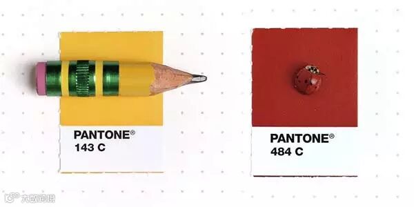
Pantone色卡里的很多颜色其实都来源于大自然与日常生活,一起来看看生活里那些美丽的颜色吧。


(编辑:祝兴媛)
