
知识点汇总:

六、高级功能类(自定义控件进阶拓展)
6.1、如何为自定义View添加属性动画(平移、缩放、旋转、透明度)?动画过程中需要注意什么?
通过Android属性动画框架(ValueAnimator/ObjectAnimator)实现,核心是操作View的属性(如translationX、scaleX)或自定义属性,需注意避免修改layout参数、处理动画状态同步、兼容硬件加速。
核心实现方式:属性动画通过动态修改属性值并触发重绘实现动画效果,支持四种基础动画及组合动画,推荐使用ObjectAnimator(简洁)或ValueAnimator(灵活控制)。
基础动画实现代码示例:
// 1. 平移动画(x轴平移200px)ObjectAnimator translationAnim = ObjectAnimator.ofFloat(customView, "translationX", 0, 200);translationAnim.setDuration(500); // 动画时长500mstranslationAnim.start();// 2. 缩放动画(x/y轴放大1.5倍,以中心为锚点)customView.setPivotX(customView.getWidth()/2); // 缩放锚点xcustomView.setPivotY(customView.getHeight()/2); // 缩放锚点yObjectAnimator scaleAnim = ObjectAnimator.ofFloat(customView, "scaleX", 1.0f, 1.5f);scaleAnim.setDuration(500);scaleAnim.start();// 3. 旋转动画(顺时针旋转90度)ObjectAnimator rotateAnim = ObjectAnimator.ofFloat(customView, "rotation", 0, 90);rotateAnim.setDuration(500);rotateAnim.start();// 4. 透明度动画(从不透明到半透明)ObjectAnimator alphaAnim = ObjectAnimator.ofFloat(customView, "alpha", 1.0f, 0.5f);alphaAnim.setDuration(500);alphaAnim.start();// 5. 组合动画(平移+缩放+旋转)AnimatorSet animSet = new AnimatorSet();animSet.playTogether(translationAnim, scaleAnim, rotateAnim);animSet.setDuration(500);animSet.start();
自定义属性动画(如进度动画):若需操作自定义属性(如进度条的progress),需提供setXxx()方法(动画框架通过反射调用)。
// 自定义View中添加progress属性及set方法private int mProgress;public void setProgress(int progress) {mProgress = progress;invalidate(); // 触发重绘,更新进度显示}// 进度动画(从0到100)ObjectAnimator progressAnim = ObjectAnimator.ofInt(customView, "progress", 0, 100);progressAnim.setDuration(1000);progressAnim.start();
动画过程中的注意事项:
避免修改layout参数(如layout(left, top, right, bottom)):会触发requestLayout(),导致动画卡顿,优先使用translationX/translationY(平移不影响布局)。
处理动画状态同步:动画暂停/取消时,需恢复View原始状态(如anim.setRepeatMode(ValueAnimator.RESTART)或anim.addListener()监听结束事件)。
硬件加速兼容:部分动画(如clipPath+动画)在硬件加速下可能显示异常,可针对性关闭(view.setLayerType(View.LAYER_TYPE_SOFTWARE, null))。
避免内存泄漏:动画持有View引用时,Activity销毁前需调用anim.cancel()并移除监听器。
插值器与估值器:通过setInterpolator()设置动画速率(如AccelerateDecelerateInterpolator加速减速),自定义属性需配合TypeEvaluator(如颜色渐变用ArgbEvaluator)。
6.2、自定义控件如何实现状态保存与恢复(如屏幕旋转时的数据保存)?onSaveInstanceState和onRestoreInstanceState的作用是什么?
通过重写onSaveInstanceState()保存关键状态(如进度、选中状态),onRestoreInstanceState()恢复状态,核心是利用Bundle存储数据,需确保View设置了id(系统才能关联状态)。
两个方法的核心作用:
onSaveInstanceState(Bundle outState):
调用时机:View所在Activity/Fragment销毁(如屏幕旋转、内存不足回收)时触发。
作用:将View的关键状态(如progress、isSelected)存入Bundle,系统会暂存该Bundle。
onRestoreInstanceState(Bundle savedInstanceState):
调用时机:View重建(如屏幕旋转后Activity重建)时触发,在onMeasure()之前执行。
作用:从Bundle中读取之前保存的状态,恢复View的原始数据。
实现步骤(以进度条为例):
一、为自定义View设置id(必须,系统通过id关联状态)
<com.example.customview.ProgressViewandroid:id="@+id/progress_view"android:layout_width="match_parent"android:layout_height="20dp"/>
二、重写onSaveInstanceState()保存状态
protected Parcelable onSaveInstanceState() {// 1. 获取父类的状态(必须调用,保证系统状态正常保存)Parcelable superState = super.onSaveInstanceState();// 2. 封装自定义状态SavedState savedState = new SavedState(superState);savedState.progress = mProgress; // 保存进度savedState.isSelected = mIsSelected; // 保存选中状态return savedState;}// 自定义状态类(需实现Parcelable)static class SavedState extends BaseSavedState {int progress;boolean isSelected;public SavedState(Parcelable superState) {super(superState);}// 从Parcel中读取数据private SavedState(Parcel in) {super(in);progress = in.readInt();isSelected = in.readBoolean();}public void writeToParcel(Parcel out, int flags) {super.writeToParcel(out, flags);out.writeInt(progress);out.writeBoolean(isSelected);}public static final Creator<SavedState> CREATOR = new Creator<SavedState>() {public SavedState createFromParcel(Parcel in) {return new SavedState(in);}public SavedState[] newArray(int size) {return new SavedState[size];}};}
三、重写onRestoreInstanceState()恢复状态
protected void onRestoreInstanceState(Parcelable state) {// 1. 判断是否是自定义状态if (!(state instanceof SavedState)) {super.onRestoreInstanceState(state);return;}// 2. 读取自定义状态SavedState savedState = (SavedState) state;super.onRestoreInstanceState(savedState.getSuperState()); // 恢复父类状态// 3. 恢复自定义数据mProgress = savedState.progress;mIsSelected = savedState.isSelected;// 4. 触发重绘,更新UIinvalidate();}
注意事项:
必须设置id:若View无id,系统不会调用onSaveInstanceState(),状态无法保存。
只保存关键状态:避免存储大量数据(如Bitmap),仅保存必要的基础类型数据(int、boolean、String)。
兼容Fragment:Fragment中的View状态保存需确保Fragment的setRetainInstance(false)(默认),否则Activity重建时Fragment不重建,状态无需额外处理。
手动触发状态保存:可通过view.saveHierarchyState(bundle)手动保存,view.restoreHierarchyState(bundle)手动恢复。
6.3、自定义View如何适配不同屏幕尺寸和分辨率?dp、sp、px的转换逻辑是什么?
适配核心是“尺寸单位标准化”(用dp/sp替代px)、“布局弹性化”(避免硬编码尺寸),dp、sp转px需结合设备屏幕密度(density)计算,确保不同设备显示效果一致。
dp、sp、px的核心区别与转换逻辑:
一、单位定义
px(像素):屏幕物理像素点,不同设备1px大小不同(分辨率越高,px越小)。
dp(设备独立像素):与设备屏幕密度无关,1dp在不同设备上显示尺寸一致(适配布局尺寸的核心单位)。
sp(缩放独立像素):类似dp,但会跟随系统字体大小调整(仅用于文字尺寸)。
二、转换公式
px = dp × density(density是屏幕密度,如mdpi设备density=1.0,hdpi=1.5,xhdpi=2.0)。
px = sp × scaledDensity(scaledDensity = density + 字体缩放比例,系统字体放大时scaledDensity增大)。
三、工具类实现
public class DisplayUtil {// dp转pxpublic static int dp2px(Context context, float dp) {float density = context.getResources().getDisplayMetrics().density;return (int) (dp × density + 0.5f); // +0.5f四舍五入}// sp转pxpublic static int sp2px(Context context, float sp) {float scaledDensity = context.getResources().getDisplayMetrics().scaledDensity;return (int) (sp × scaledDensity + 0.5f);}// px转dppublic static float px2dp(Context context, int px) {float density = context.getResources().getDisplayMetrics().density;return px / density;}}
自定义View适配关键策略:
所有尺寸用dp/sp:自定义属性(如radius、strokeWidth)的format设为dimension,XML中用dp/sp配置,代码中通过getDimension()自动转px。
<!-- attr.xml中定义尺寸属性 --><attr name="circleRadius" format="dimension" /><!-- XML布局中配置(用dp) --><com.example.customview.CircleViewapp:circleRadius="50dp"/><!-- 代码中获取(自动转px) -->mRadius = ta.getDimension(R.styleable.CircleView_circleRadius, dp2px(context, 50));
避免硬编码尺寸:用match_parent/wrap_content、权重(layout_weight)、资源文件(dimens.xml)适配不同屏幕。
示例:在res/values、res/values-sw360dp、res/values-sw480dp等目录下创建dimens.xml,定义不同屏幕的尺寸:
<!-- values/dimens.xml(默认) --><dimen name="circle_radius">40dp</dimen><!-- values-sw480dp/dimens.xml(屏幕宽度≥480dp设备) --><dimen name="circle_radius">60dp</dimen>
弹性布局逻辑:自定义View的宽高计算依赖父容器尺寸,而非固定值(如onMeasure()中用getMeasuredWidth()/getMeasuredHeight()动态计算)。
图片适配:使用矢量图(VectorDrawable)替代位图或通过srcCompat引用不同分辨率的图片资源(mdpi/hdpi/xhdpi等)。
屏幕方向适配:重写onConfigurationChanged(),处理横竖屏切换时的尺寸重计算(如横向时宽度增大,调整内部元素布局)。
6.4、自定义ViewGroup中如何实现子View的复用(类似RecyclerView的复用机制)?
复用核心是“回收池+可见区域判断”,仅加载当前可见区域的子View,不可见的子View回收至缓存池,滚动时复用缓存池中的View,避免频繁创建/销毁View导致的性能问题。
核心原理(参考RecyclerView):
回收池(RecyclerPool):存储不可见的子View,按View类型分类(如不同Item类型),复用时优先从池中获取对应类型的View。
可见区域计算:通过滚动偏移量(scrollY/scrollX)和ViewGroup的可见高度/宽度,判断哪些子View需要显示在屏幕内。
View复用逻辑:滚动时,移除屏幕外的子View并加入回收池,同时从回收池获取View,更新数据后重新添加到ViewGroup。
实现步骤(垂直滚动的复用容器):
一、定义数据模型和View类型
// 数据模型public class ItemData {String text;int type; // View类型(如TYPE_TEXT、TYPE_IMAGE)}// View持有者(类似RecyclerView.ViewHolder)public abstract static class ViewHolder {public View itemView;public ViewHolder(View itemView) {this.itemView = itemView;}public abstract void bindData(ItemData data);}
二、实现回收池
private SparseArray<LinkedList<ViewHolder>> mRecyclerPool = new SparseArray<>();// 从回收池获取对应类型的ViewHolderprivate ViewHolder getViewHolderFromPool(int type) {LinkedList<ViewHolder> holders = mRecyclerPool.get(type);if (holders != null && !holders.isEmpty()) {return holders.removeFirst();}return null;}// 将ViewHolder放回回收池private void putViewHolderToPool(ViewHolder holder) {int type = holder.itemView.getType(); // 假设View有getType()方法LinkedList<ViewHolder> holders = mRecyclerPool.get(type);if (holders == null) {holders = new LinkedList<>();mRecyclerPool.put(type, holders);}holders.add(holder);}
三、可见区域子View布局与复用
private List<ItemData> mDataList;private int mItemHeight; // 每个Item的高度private int mScrollY; // 滚动偏移量protected void onMeasure(int widthMeasureSpec, int heightMeasureSpec) {super.onMeasure(widthMeasureSpec, heightMeasureSpec);mItemHeight = dp2px(getContext(), 50); // 假设每个Item高度50dp// 计算总高度(数据总数×Item高度)int totalHeight = mDataList.size() × mItemHeight;setMeasuredDimension(getMeasuredWidth(), totalHeight);}protected void onLayout(boolean changed, int left, int top, int right, int bottom) {super.onLayout(changed, left, top, right, bottom);layoutVisibleItems(); // 布局可见区域的Item}// 布局可见区域的Itemprivate void layoutVisibleItems() {int visibleTop = mScrollY;int visibleBottom = mScrollY + getHeight(); // 可见区域底部// 1. 移除屏幕外的Item,加入回收池for (int i = getChildCount() - 1; i >= 0; i--) {View child = getChildAt(i);int childTop = child.getTop();int childBottom = child.getBottom();// Item在屏幕上方或下方,移除并回收if (childBottom < visibleTop || childTop > visibleBottom) {ViewHolder holder = (ViewHolder) child.getTag();putViewHolderToPool(holder);removeViewAt(i);}}// 2. 布局屏幕内的Item,复用回收池中的Viewint firstVisiblePosition = visibleTop / mItemHeight; // 第一个可见Item的索引int lastVisiblePosition = visibleBottom / mItemHeight + 1; // 最后一个可见Item的索引lastVisiblePosition = Math.min(lastVisiblePosition, mDataList.size() - 1);int currentTop = firstVisiblePosition × mItemHeight;for (int i = firstVisiblePosition; i <= lastVisiblePosition; i++) {ItemData data = mDataList.get(i);ViewHolder holder = getViewHolderFromPool(data.type);// 回收池无对应View,创建新Viewif (holder == null) {holder = createViewHolder(data.type);}// 更新View数据holder.bindData(data);View itemView = holder.itemView;itemView.setTag(holder);// 添加View并布局if (itemView.getParent() != this) {addView(itemView);}itemView.layout(left, currentTop, right, currentTop + mItemHeight);currentTop += mItemHeight;}}// 创建新的ViewHolder(根据类型创建不同View)private ViewHolder createViewHolder(int type) {View itemView;if (type == ItemData.TYPE_TEXT) {itemView = LayoutInflater.from(getContext()).inflate(R.layout.item_text, this, false);} else {itemView = LayoutInflater.from(getContext()).inflate(R.layout.item_image, this, false);}return new TextViewHolder(itemView); // 或ImageViewHolder}
四、处理滚动事件(触发复用)
@Overridepublic boolean onTouchEvent(MotionEvent event) {switch (event.getAction()) {case MotionEvent.ACTION_MOVE:float dy = event.getY() - mLastY;mScrollY -= dy;// 限制滚动范围mScrollY = Math.max(0, Math.min(mScrollY, getMeasuredHeight() - getHeight()));scrollTo(0, mScrollY);layoutVisibleItems(); // 滚动时重新布局可见Itembreak;}mLastY = event.getY();return true;}
关键优化点:
限制回收池大小:避免回收池缓存过多View导致内存占用,可设置每个类型的最大缓存数量(如5个)。
预加载机制:提前加载可见区域外1-2个Item,避免滚动时出现空白。
避免重复测量:创建ItemView时设置LayoutParams为固定高度,减少onMeasure()的计算开销。
数据更新处理:当数据变化时(如notifyDataSetChanged()),清空回收池并重新布局。
6.5、如何实现带进度的自定义控件(如进度条、评分条)?如何处理进度更新时的重绘优化?
带进度控件的核心是“进度变量+绘制逻辑绑定”,通过setProgress()更新进度值并触发重绘,优化核心是“减少重绘范围”,避免不必要的全局重绘。
实现步骤(圆形进度条为例):
一、定义进度相关属性(attr.xml)
<declare-styleable name="CircleProgressBar"><attr name="maxProgress" format="integer" /> <!-- 最大进度 --><attr name="progress" format="integer" /> <!-- 当前进度 --><attr name="progressColor" format="color" /> <!-- 进度颜色 --><attr name="bgColor" format="color" /> <!-- 背景颜色 --><attr name="strokeWidth" format="dimension" /> <!-- 线条宽度 --></declare-styleable>
二、初始化属性并实现绘制逻辑
public class CircleProgressBar extends View {private int mMaxProgress = 100;private int mProgress = 0;private int mProgressColor;private int mBgColor;private float mStrokeWidth;private Paint mBgPaint;private Paint mProgressPaint;private RectF mRectF;public CircleProgressBar(Context context, AttributeSet attrs) {super(context, attrs);initAttrs(attrs);initPaints();}// 初始化自定义属性private void initAttrs(AttributeSet attrs) {TypedArray ta = getContext().obtainStyledAttributes(attrs, R.styleable.CircleProgressBar);mMaxProgress = ta.getInt(R.styleable.CircleProgressBar_maxProgress, 100);mProgress = ta.getInt(R.styleable.CircleProgressBar_progress, 0);mProgressColor = ta.getColor(R.styleable.CircleProgressBar_progressColor, Color.RED);mBgColor = ta.getColor(R.styleable.CircleProgressBar_bgColor, Color.GRAY);mStrokeWidth = ta.getDimension(R.styleable.CircleProgressBar_strokeWidth, dp2px(getContext(), 4));ta.recycle();mRectF = new RectF();}// 初始化画笔private void initPaints() {// 背景画笔(环形)mBgPaint = new Paint(Paint.ANTI_ALIAS_FLAG);mBgPaint.setColor(mBgColor);mBgPaint.setStyle(Paint.Style.STROKE);mBgPaint.setStrokeWidth(mStrokeWidth);mBgPaint.setStrokeCap(Paint.Cap.ROUND); // 线条端点圆角// 进度画笔(环形)mProgressPaint = new Paint(Paint.ANTI_ALIAS_FLAG);mProgressPaint.setColor(mProgressColor);mProgressPaint.setStyle(Paint.Style.STROKE);mProgressPaint.setStrokeWidth(mStrokeWidth);mProgressPaint.setStrokeCap(Paint.Cap.ROUND);}protected void onSizeChanged(int w, int h, int oldw, int oldh) {super.onSizeChanged(w, h, oldw, oldh);// 计算环形的绘制区域(留出线条宽度的一半,避免线条被裁剪)float padding = mStrokeWidth / 2;mRectF.set(padding, padding, w - padding, h - padding);}protected void onDraw(Canvas canvas) {super.onDraw(canvas);// 1. 绘制背景环形(360度)canvas.drawArc(mRectF, 0, 360, false, mBgPaint);// 2. 绘制进度环形(根据进度计算角度:progress/maxProgress × 360)float sweepAngle = (float) mProgress / mMaxProgress × 360;canvas.drawArc(mRectF, -90, sweepAngle, false, mProgressPaint); // -90度开始(顶部)}// 暴露进度设置方法public void setProgress(int progress) {// 限制进度范围(0~maxProgress)mProgress = Math.max(0, Math.min(progress, mMaxProgress));// 触发重绘(优化点:仅重绘进度相关区域)invalidate(mRectF.left, mRectF.top, mRectF.right, mRectF.bottom);}public void setMaxProgress(int maxProgress) {mMaxProgress = Math.max(1, maxProgress);invalidate();}}
三、进度更新的重绘优化策略
局部重绘:使用invalidate(Rect)或invalidate(left, top, right, bottom),仅重绘进度变化的区域(如环形进度的扇形区域),而非整个View。
避免频繁重绘:若进度更新频繁(如每秒更新10次),使用postInvalidateDelayed()设置最小更新间隔(如16ms,对应60fps),避免过度绘制。
private void updateProgress(int progress) {removeCallbacks(mProgressRunnable);mProgressRunnable = () -> setProgress(progress);postDelayed(mProgressRunnable, 16);}
减少onDraw()中的对象创建:将RectF、Paint等对象初始化在onDraw()之外(如构造方法、onSizeChanged()),避免每次重绘创建新对象。
硬件加速:开启硬件加速(默认开启),提升绘制效率,但需注意canvas.drawArc()等API的兼容性。
进度动画优化:使用属性动画更新进度时,设置setFrameDelay()控制帧率,避免动画卡顿。
6.6、自定义View中如何实现自定义滚动控件(如横向滚动、垂直滚动)?与ScrollView的区别是什么?
自定义滚动控件通过Scroller/OverScroller计算滚动轨迹,配合scrollTo()/scrollBy()更新位置,重写computeScroll()实现平滑滚动,与ScrollView的核心区别是“自定义滚动可灵活控制滚动逻辑(如惯性、边界回弹),ScrollView是系统封装的通用滚动容器”。
实现步骤(垂直滚动控件):
初始化Scroller,处理触摸事件:
public class CustomScrollView extends ViewGroup {private Scroller mScroller;private float mLastY; // 上次触摸的y坐标public CustomScrollView(Context context) {super(context);mScroller = new Scroller(context);}// 测量子View和自身宽高(垂直滚动:宽=父View宽,高=所有子View高度之和)protected void onMeasure(int widthMeasureSpec, int heightMeasureSpec) {super.onMeasure(widthMeasureSpec, heightMeasureSpec);measureChildren(widthMeasureSpec, heightMeasureSpec); // 测量所有子Viewint width = MeasureSpec.getSize(widthMeasureSpec);int totalHeight = 0;for (int i = 0; i < getChildCount(); i++) {totalHeight += getChildAt(i).getMeasuredHeight();}setMeasuredDimension(width, totalHeight);}// 布局子View(垂直排列)protected void onLayout(boolean changed, int left, int top, int right, int bottom) {int childTop = 0;for (int i = 0; i < getChildCount(); i++) {View child = getChildAt(i);int childWidth = child.getMeasuredWidth();int childHeight = child.getMeasuredHeight();child.layout(0, childTop, childWidth, childTop + childHeight);childTop += childHeight;}}// 处理触摸事件,触发滚动public boolean onTouchEvent(MotionEvent event) {switch (event.getAction()) {case MotionEvent.ACTION_DOWN:mLastY = event.getY();// 停止当前滚动(避免触摸时滚动未结束)if (!mScroller.isFinished()) {mScroller.abortAnimation();}break;case MotionEvent.ACTION_MOVE:float dy = event.getY() - mLastY;// 滚动:scrollBy(0, dy) 向上滚动dy为正,向下为负scrollBy(0, (int) -dy);mLastY = event.getY();break;case MotionEvent.ACTION_UP:// 触发惯性滚动(可选,通过VelocityTracker获取速度)VelocityTracker velocityTracker = VelocityTracker.obtain();velocityTracker.addMovement(event);velocityTracker.computeCurrentVelocity(1000);int velocityY = (int) velocityTracker.getYVelocity();fling(-velocityY); // 惯性滚动方向与触摸方向相反velocityTracker.recycle();break;}return true;}// 惯性滚动(fling)private void fling(int velocityY) {int maxScrollY = getMeasuredHeight() - getHeight(); // 最大滚动距离(底部边界)mScroller.fling(getScrollX(), getScrollY(), // 起始滚动位置0, velocityY, // x/y方向速度(x方向为0,仅垂直滚动)0, 0, // x方向边界(无滚动)0, maxScrollY // y方向边界(0~maxScrollY));invalidate(); // 触发computeScroll}// 滚动回调,更新View位置public void computeScroll() {super.computeScroll();if (mScroller.computeScrollOffset()) { // 判断滚动是否结束scrollTo(mScroller.getCurrX(), mScroller.getCurrY());postInvalidate(); // 继续滚动,重绘}}}
与ScrollView的核心区别:

关键扩展功能:
边界回弹:使用OverScroller的springBack()方法,滚动到边界后回弹。
滚动监听:添加OnScrollChangeListener接口,在scrollBy()/computeScroll()中触发回调。
禁止滚动:添加setScrollEnabled(boolean enabled)方法,控制触摸事件是否响应。
6.7、如何实现自定义下拉刷新控件?核心原理和关键步骤是什么?
下拉刷新的核心原理是“头部布局+状态管理+事件拦截”,下拉时显示头部刷新视图,根据下拉距离切换状态(下拉中→释放刷新→刷新中→刷新完成),刷新完成后隐藏头部。
核心状态与原理:
一、核心状态
初始状态(IDLE):头部布局隐藏,仅显示内容区域。
下拉中(PULLING):手指下拉,头部布局逐渐显示,未达到刷新阈值。
释放刷新(RELEASE_TO_REFRESH):下拉距离超过阈值,松开手指触发刷新。
刷新中(REFRESHING):执行刷新任务(如网络请求),头部显示加载动画。
刷新完成(COMPLETE):刷新任务结束,头部布局自动收起。
二、核心原理
事件拦截:父容器(下拉刷新控件)拦截触摸事件,判断下拉动作并处理。
布局结构:包含“头部布局+内容布局”,初始时头部布局位于内容布局上方(不可见)。
位移计算:下拉时通过scrollBy()/setTranslationY()移动内容布局,显示头部。
实现步骤:
一、布局结构设计(组合控件,继承ViewGroup)
public class PullToRefreshLayout extends ViewGroup {private View mHeaderView; // 头部刷新视图private View mContentView; // 内容视图private int mHeaderHeight; // 头部布局高度(初始隐藏)private float mLastY; // 上次触摸y坐标private State mCurrentState = State.IDLE; // 当前状态// 状态枚举public enum State {IDLE, PULLING, RELEASE_TO_REFRESH, REFRESHING, COMPLETE}public PullToRefreshLayout(Context context) {super(context);initHeaderView(); // 初始化头部布局}// 初始化头部布局(可通过XML引入或代码创建)private void initHeaderView() {mHeaderView = LayoutInflater.from(getContext()).inflate(R.layout.layout_header, this, false);addView(mHeaderView);}// 测量:头部高度=自身测量高度,内容高度=父View高度protected void onMeasure(int widthMeasureSpec, int heightMeasureSpec) {super.onMeasure(widthMeasureSpec, heightMeasureSpec);measureChild(mHeaderView, widthMeasureSpec, heightMeasureSpec);mHeaderHeight = mHeaderView.getMeasuredHeight();// 内容布局高度=父View高度View contentView = getContentView();if (contentView != null) {LayoutParams params = contentView.getLayoutParams();params.height = MeasureSpec.getSize(heightMeasureSpec);measureChild(contentView, widthMeasureSpec, MeasureSpec.makeMeasureSpec(params.height, MeasureSpec.EXACTLY));}setMeasuredDimension(MeasureSpec.getSize(widthMeasureSpec), MeasureSpec.getSize(heightMeasureSpec));}// 布局:初始时头部在内容上方(y=-mHeaderHeight),内容在顶部(y=0)protected void onLayout(boolean changed, int left, int top, int right, int bottom) {mHeaderView.layout(left, -mHeaderHeight, right, 0); // 头部隐藏View contentView = getContentView();if (contentView != null) {contentView.layout(left, 0, right, bottom); // 内容显示}}// 获取内容视图(默认是第二个子View,第一个是头部)private View getContentView() {if (getChildCount() > 1) {return getChildAt(1);}return null;}}
二、事件拦截与状态切换
private static final int REFRESH_THRESHOLD = dp2px(getContext(), 80); // 刷新阈值(头部显示80dp触发刷新)// 事件拦截:判断是否需要下拉刷新(内容视图滚动到顶部,且向下拉)@Overridepublic boolean onInterceptTouchEvent(MotionEvent event) {if (mCurrentState == State.REFRESHING) {return true; // 刷新中,拦截所有事件}switch (event.getAction()) {case MotionEvent.ACTION_DOWN:mLastY = event.getY();break;case MotionEvent.ACTION_MOVE:float dy = event.getY() - mLastY;// 内容视图滚动到顶部(scrollY=0),且向下拉(dy>0),拦截事件View contentView = getContentView();if (contentView != null && contentView.getScrollY() == 0 && dy > 0) {return true;}break;}return super.onInterceptTouchEvent(event);}// 处理触摸事件,更新布局位置和状态@Overridepublic boolean onTouchEvent(MotionEvent event) {if (mCurrentState == State.REFRESHING) {return true;}switch (event.getAction()) {case MotionEvent.ACTION_MOVE:float dy = event.getY() - mLastY;if (dy > 0) { // 向下拉float scrollY = getScrollY() - dy; // 内容布局向下移动(scrollY为负)scrollTo(0, (int) Math.max(-mHeaderHeight - REFRESH_THRESHOLD, scrollY)); // 限制最大下拉距离updateStateByScrollY(); // 根据滚动位置更新状态}mLastY = event.getY();break;case MotionEvent.ACTION_UP:case MotionEvent.ACTION_CANCEL:handleRelease(); // 松开手指,处理状态切换break;}return true;}// 根据滚动位置更新状态private void updateStateByScrollY() {int scrollY = getScrollY();if (scrollY == 0) {mCurrentState = State.IDLE;} else if (scrollY > -REFRESH_THRESHOLD) {mCurrentState = State.PULLING; // 未达阈值,下拉中} else {mCurrentState = State.RELEASE_TO_REFRESH; // 已达阈值,释放刷新}// 更新头部视图UI(如文字提示、箭头旋转)updateHeaderUI();}// 松开手指处理private void handleRelease() {if (mCurrentState == State.RELEASE_TO_REFRESH) {// 触发刷新,滚动到头部完全显示位置smoothScrollTo(0, -mHeaderHeight);mCurrentState = State.REFRESHING;updateHeaderUI();// 回调刷新接口,执行刷新任务if (mRefreshListener != null) {mRefreshListener.onRefresh();}} else {// 未达阈值,回滚到初始位置smoothScrollTo(0, 0);mCurrentState = State.IDLE;}}// 平滑滚动(使用Scroller)private void smoothScrollTo(int x, int y) {mScroller.startScroll(getScrollX(), getScrollY(), x - getScrollX(), y - getScrollY(), 300);invalidate();}// 刷新完成,收起头部public void finishRefresh() {mCurrentState = State.COMPLETE;updateHeaderUI();smoothScrollTo(0, 0); // 回滚到初始位置// 延迟后恢复初始状态postDelayed(() -> mCurrentState = State.IDLE, 300);}// 刷新监听器public interface OnRefreshListener {void onRefresh();}private OnRefreshListener mRefreshListener;public void setOnRefreshListener(OnRefreshListener listener) {mRefreshListener = listener;}
三、头部视图UI更新(updateHeaderUI())
根据当前状态更新头部的文字(如“下拉刷新”→“释放刷新”→“加载中”)、箭头旋转动画或进度条显示。
关键优化点:
事件拦截优化:仅当内容视图滚动到顶部时才拦截事件,避免影响内容视图内部滚动。
平滑滚动:使用Scroller实现状态切换时的平滑过渡,提升用户体验。
防止抖动:下拉时添加阻尼效果(下拉距离越大,位移增量越小),避免布局抖动。
内存优化:刷新任务使用异步线程,避免阻塞主线程,刷新完成后及时回收资源。
6.8、自定义控件如何支持RTL(从右到左)布局?需要注意哪些适配细节?
RTL适配核心是“替换布局方向相关API、使用相对单位、适配资源”,Android 4.2+支持RTL布局,通过android:supportsRtl="true"开启,控件需用start/end替代left/right,适配镜像显示,核心适配步骤如下。
一、开启应用RTL支持(AndroidManifest.xml)
<applicationandroid:supportsRtl="true"android:theme="@style/AppTheme"></application>
二、布局文件适配
用start替代left,end替代right(如android:layout_marginStart、android:paddingEnd)。
重力和对齐方式用start/end(如android:gravity="start"、android:layout_alignParentStart="true")。
三、自定义控件代码适配:
public class RTLCompatibleView extends View {private int mLayoutDirection; // 当前布局方向(LTR/RTL)public RTLCompatibleView(Context context) {super(context);init();}private void init() {// 获取当前布局方向(API 17+)mLayoutDirection = getLayoutDirection();// 监听布局方向变化(如系统语言切换)setOnLayoutDirectionChangeListener((v, direction) -> {mLayoutDirection = direction;invalidate(); // 重绘适配新方向});}protected void onDraw(Canvas canvas) {super.onDraw(canvas);Paint paint = new Paint(Paint.ANTI_ALIAS_FLAG);paint.setColor(Color.RED);// 适配RTL:绘制位置根据布局方向调整int viewWidth = getWidth();int viewHeight = getHeight();float x;if (mLayoutDirection == LAYOUT_DIRECTION_RTL) {// RTL布局:从右侧绘制(x = viewWidth - 100)x = viewWidth - dp2px(getContext(), 100);} else {// LTR布局:从左侧绘制(x = 100dp)x = dp2px(getContext(), 100);}// 绘制圆形(RTL时在右侧,LTR时在左侧)canvas.drawCircle(x, viewHeight/2, dp2px(getContext(), 50), paint);}// 适配RTL的属性获取(如paddingStart替代paddingLeft)private int getPaddingStartCompat() {if (Build.VERSION.SDK_INT >= Build.VERSION_CODES.JELLY_BEAN_MR1) {return getPaddingStart();} else {return getPaddingLeft(); // 低版本兼容,用left替代start}}}
四、资源文件适配
图片资源:在res/drawable-ldrtl目录下放置RTL对应的镜像图片(如箭头方向从左→右改为右→左)。
字符串资源:在res/values-ar(阿拉伯语)、res/values-he(希伯来语)等目录下放置对应语言的字符串。
关键适配细节:
布局方向判断:使用getLayoutDirection()(API 17+)判断当前方向(LAYOUT_DIRECTION_LTR/LAYOUT_DIRECTION_RTL),低版本需兼容。
避免绝对坐标:绘制或布局时,避免使用固定的left/right坐标,优先基于start/end或相对位置(如viewWidth - x)。
滚动方向适配:横向滚动控件(如HorizontalScrollView)在RTL布局下,滚动方向会自动反转,自定义滚动控件需通过getLayoutDirection()调整滚动逻辑。
动画适配:平移、旋转等动画需根据布局方向调整(如RTL时平移方向反转)。
自定义属性适配:若自定义属性包含left/right相关配置,需新增start/end对应的属性(如app:paddingStart替代app:paddingLeft)。
常见问题排查:
低版本兼容:API 17以下不支持start/end,需通过Build.VERSION.SDK_INT判断,用left/right替代。
资源加载:确保RTL资源目录命名正确(如drawable-ldrtl),避免资源加载失败。
第三方库适配:部分第三方控件可能未适配RTL,需手动替换其布局中的left/right为start/end。
6.9、如何结合Canvas和Path实现复杂的自定义图形(如不规则形状、路径动画)?
Path是“路径绘制工具”,可定义任意不规则形状(如多边形、曲线),配合Canvas.drawPath()绘制图形,路径动画通过ValueAnimator动态修改Path的坐标点,触发重绘实现。
一、复杂图形绘制(Path的核心用法)
Path支持直线、曲线、圆弧等路径元素,通过lineTo()、quadTo()、arcTo()等方法组合定义形状,常见复杂图形实现示例如下。
三角形(直线组合):
protected void onDraw(Canvas canvas) {super.onDraw(canvas);Paint paint = new Paint(Paint.ANTI_ALIAS_FLAG);paint.setColor(Color.RED);paint.setStyle(Paint.Style.FILL);Path path = new Path();int centerX = getWidth()/2;int centerY = getHeight()/2;int radius = dp2px(getContext(), 100);// 定义三角形三个顶点(上、左、右)path.moveTo(centerX, centerY - radius); // 起点(顶部)path.lineTo(centerX - radius, centerY + radius/2); // 左下方点path.lineTo(centerX + radius, centerY + radius/2); // 右下方点path.close(); // 闭合路径(连接最后一个点到起点)canvas.drawPath(path, paint);}
心形(贝塞尔曲线组合):
Path path = new Path();int centerX = getWidth()/2;int centerY = getHeight()/2;int size = dp2px(getContext(), 100);// 左半心(二阶贝塞尔曲线)path.moveTo(centerX, centerY - size/2);path.quadTo(centerX - size, centerY - size, centerX - size/2, centerY + size/4);// 右半心(二阶贝塞尔曲线)path.quadTo(centerX + size/2, centerY + size/4, centerX, centerY - size/2);path.close();canvas.drawPath(path, paint);
不规则多边形(动态顶点):
// 绘制五边形(5个顶点)Path path = new Path();int centerX = getWidth()/2;int centerY = getHeight()/2;int radius = dp2px(getContext(), 100);int sides = 5; // 边数// 循环计算每个顶点坐标(基于正多边形公式)for (int i = 0; i < sides; i++) {float angle = (float) (2 * Math.PI * i / sides);float x = centerX + radius * (float) Math.cos(angle);float y = centerY + radius * (float) Math.sin(angle);if (i == 0) {path.moveTo(x, y); // 起点} else {path.lineTo(x, y); // 连接到下一个顶点}}path.close();canvas.drawPath(path, paint);
二、路径动画实现(动态修改Path)
路径动画的核心是“通过动画修改Path的顶点坐标或路径参数”,配合invalidate()触发重绘,实现动态效果。
示例:路径动画(三角形缩放):
private float mScale = 1.0f; // 缩放比例public CustomPathAnimView(Context context) {super(context);// 初始化属性动画(缩放比例从1.0→1.5→1.0循环)ValueAnimator animator = ValueAnimator.ofFloat(1.0f, 1.5f, 1.0f);animator.setDuration(2000);animator.setRepeatCount(ValueAnimator.INFINITE);animator.setInterpolator(new AccelerateDecelerateInterpolator());animator.addUpdateListener(animation -> {mScale = (float) animation.getAnimatedValue();invalidate(); // 重绘,应用新缩放比例});animator.start();}protected void onDraw(Canvas canvas) {super.onDraw(canvas);Paint paint = new Paint(Paint.ANTI_ALIAS_FLAG);paint.setColor(Color.RED);paint.setStyle(Paint.Style.FILL);Path path = new Path();int centerX = getWidth()/2;int centerY = getHeight()/2;int radius = (int) (dp2px(getContext(), 100) * mScale); // 缩放半径// 基于缩放比例绘制三角形path.moveTo(centerX, centerY - radius);path.lineTo(centerX - radius, centerY + radius/2);path.lineTo(centerX + radius, centerY + radius/2);path.close();canvas.drawPath(path, paint);}
三、关键注意事项
路径闭合:复杂图形绘制后需调用path.close(),确保形状闭合(避免边缘缺口)。
抗锯齿:必须开启paint.setAntiAlias(true),否则不规则图形边缘会出现锯齿。
性能优化:Path对象初始化在onDraw()之外(如构造方法),避免每次重绘创建新对象。
路径组合:使用path.op()方法实现路径的交集、并集、差集(如path1.op(path2, Path.Op.INTERSECT)),实现复杂形状裁剪。
硬件加速:部分Path操作(如clipPath)在硬件加速下可能显示异常,需针对性关闭(setLayerType(View.LAYER_TYPE_SOFTWARE, null))。
七、性能优化类(提升自定义控件流畅度)
7.1、自定义控件中常见的性能问题有哪些?(如过度绘制、布局层级过深、频繁重绘)
自定义控件的性能问题集中在“绘制、布局、内存”三大维度,核心包括过度绘制、布局层级冗余、频繁重绘、测量低效、对象创建过多、内存泄漏等,直接导致UI卡顿、内存占用过高。
常见性能问题及影响:
过度绘制(Overdraw):同一区域被多次绘制(如View背景+自身绘制+子View重叠),浪费GPU资源,导致帧率下降。
布局层级过深:自定义ViewGroup嵌套过多(如多层嵌套的流式布局),触发多次测量(Measure)和布局(Layout),增加CPU计算开销。
频繁重绘(Invalidate):频繁调用invalidate()/postInvalidate(),导致onDraw()反复执行(如每秒重绘几十次),占用CPU和GPU。
测量/布局低效:自定义ViewGroup重写onMeasure()时重复测量子View或未处理wrap_content逻辑导致计算冗余。
对象创建过多:onDraw()中频繁创建Paint、Rect、Path等对象,触发频繁GC(垃圾回收),导致UI卡顿。
内存泄漏:未回收Bitmap、动画、监听器等资源,或Handler持有View引用,导致内存占用持续升高。
大图片绘制未优化:直接绘制高清大图,未压缩或采样,导致内存溢出(OOM)或绘制卡顿。
7.2、如何检测自定义View的过度绘制问题?如何通过优化减少过度绘制?
通过开发者选项或工具检测过度绘制,优化核心是“减少绘制层数”和“缩小绘制范围”,避免同一区域重复绘制。
一、过度绘制检测方法
开启系统开发者选项:路径:设置 → 系统 → 开发者选项 → 调试GPU过度绘制 → 选择“显示过度绘制区域”,颜色含义:蓝色(1层,正常)→ 绿色(2层,可接受)→ 粉色(3层,需优化)→ 红色(4层+,严重优化)。
工具辅助检测:Hierarchy Viewer:分析View层级和绘制耗时,定位过度绘制的View,Layout Inspector(Android Studio):可视化View树,查看重叠区域和背景设置,GPU渲染模式分析:开发者选项 → GPU渲染模式分析 → 选择“在屏幕上显示为条形图”,红色条表示绘制耗时过长。
二、过度绘制优化措施
移除不必要的背景:自定义View的父布局若已设置背景,且View自身背景与父布局重叠,移除View的冗余背景,避免在XML和代码中重复设置背景(如android:background和setBackgroundDrawable())。
裁剪绘制区域:使用canvas.clipRect(left, top, right, bottom)限定绘制范围,仅绘制可见区域(如滚动控件中只绘制屏幕内的内容),自定义ViewGroup重写dispatchDraw(),对超出边界的子View进行裁剪。
避免重叠绘制:子View与父View重叠部分,若无需显示,设置visibility="gone"或调整布局位置,复杂图形绘制(如渐变、阴影)避免叠加,优先使用单一绘制实现(如用Paint.setShadowLayer()替代额外的阴影View)。
优化布局结构:使用merge标签减少根布局层级,ViewStub延迟加载非必要View,自定义ViewGroup避免嵌套过深(建议不超过3层),简化子View布局。
硬件加速辅助:开启硬件加速(默认开启),GPU会自动优化过度绘制(如合并重叠绘制指令),但需注意兼容性。
7.3、如何避免自定义View的频繁重绘?invalidate和postInvalidate的区别是什么?
避免频繁重绘的核心是“减少重绘触发次数”和“缩小重绘范围”,invalidate()在主线程调用,postInvalidate()在子线程调用,均用于触发重绘,前者支持局部重绘更高效。
一、避免频繁重绘的优化措施
减少重绘触发场景:
1、避免在onDraw()中修改View属性(如setTranslationX()、setText()),否则会触发二次重绘。
2、进度更新、动画等频繁变化的场景,使用属性动画(ValueAnimator)替代手动调用invalidate(),动画框架会自动优化重绘频率。
3、批量更新属性:多个属性修改(如同时改颜色、尺寸)后,统一调用一次invalidate(),而非每次修改都调用。
使用局部重绘:
1、优先使用invalidate(Rect rect)或invalidate(left, top, right, bottom),仅重绘变化的区域(如进度条仅重绘进度增加的部分)。
2、自定义View中维护变化区域的Rect,重绘时仅传入该区域,避免全局重绘。
合理使用requestLayout():
1、requestLayout()会触发Measure→Layout→Draw全流程,比invalidate()开销更大,仅在View宽高或位置变化时调用。
2、避免在onMeasure()/onLayout()中调用requestLayout(),防止无限循环重绘。
禁用不必要的重绘:
1、静态View(如无动画、无数据变化)设置setWillNotDraw(true),告知系统无需重绘(仅View无onDraw()逻辑时可用)。
2、滚动控件中,不可见的子View暂停动画或重绘逻辑。
二、invalidate和postInvalidate的区别
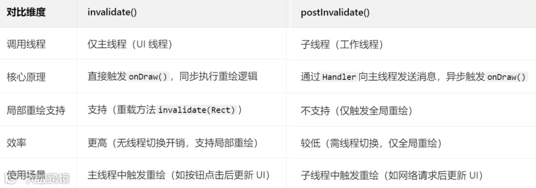
注意:子线程中不可直接调用invalidate(),会抛出CalledFromWrongThreadException,需用postInvalidate()或Handler切换到主线程。
7.4、自定义ViewGroup中如何优化子View的测量和布局效率?(如避免重复测量)
优化核心是“避免重复测量、减少计算开销、缓存测量结果”,通过合理重写onMeasure()/onLayout(),降低子View测量和布局的CPU消耗。
避免重复测量子View:
1、重写onMeasure()时,仅测量一次子View,避免多次调用measureChild()/measureChildren()。
2、若子View的测量规格(MeasureSpec)无变化,直接复用上次的测量结果(如缓存mMeasuredWidth/mMeasuredHeight)。
3、使用measureChildWithMargins()替代measureChild(),自动处理子View的margin属性,避免手动计算导致的重复测量。
优化测量逻辑:
1、子View的LayoutParams为match_parent或固定值时,直接使用父View传递的MeasureSpec,无需额外计算。
2、避免在onMeasure()中遍历子View多次,一次遍历完成所有子View的测量和自身宽高计算。
3、复杂布局(如流式布局)中,提前计算子View的排列规则,减少测量时的条件判断和循环次数。
布局阶段优化:
1、重写onLayout()时,先判断changed参数(true表示布局区域变化),未变化则直接返回,避免重复布局。
2、子View位置计算结果缓存(如缓存每个子View的left/top/right/bottom),布局未变化时直接复用。
3、子View为GONE时,跳过测量和布局(measureChild()会自动忽略GONE的子View,但自定义逻辑中需手动跳过)。
简化子View布局:
1、自定义ViewGroup的子View尽量使用简单控件(如TextView、ImageView),避免子View也是复杂的自定义控件。
2、子View的layout_margin/padding统一在ViewGroup中处理,避免子View自身重复计算。
复用测量规格:
同一类型的子View(如RecyclerView的Item),复用MeasureSpec,减少MeasureSpec.makeMeasureSpec()的对象创建开销。
7.5、如何使用硬件加速提升自定义View的绘制性能?硬件加速的适用场景和注意事项是什么?
硬件加速通过GPU替代CPU执行绘制操作,提升复杂图形、动画的绘制效率,适用于简单绘制和动画场景,需注意部分API兼容性和内存占用问题。
一、硬件加速的开启与关闭
开启方式(默认开启,API 14+):
全局开启:AndroidManifest.xml中application标签添加android:hardwareAccelerated="true"。
Activity级别:activity标签添加android:hardwareAccelerated="true"(可单独为某个Activity开启)。
View级别:view.setLayerType(View.LAYER_TYPE_HARDWARE, null)(仅API 16+支持)。
关闭方式(针对兼容问题):
View级别:view.setLayerType(View.LAYER_TYPE_SOFTWARE, null)(局部关闭,影响最小)。
Activity级别:android:hardwareAccelerated="false"(不推荐全局关闭,会影响所有View)。
二、适用场景
复杂图形绘制:如渐变(LinearGradient)、阴影(setShadowLayer())、路径(Path)绘制,GPU并行计算效率远高于CPU。
动画场景:属性动画(平移、缩放、旋转)、路径动画,硬件加速可减少动画卡顿(如60fps流畅播放)。
多子View布局:自定义ViewGroup包含大量子View(如流式布局、网格布局),GPU可优化布局绘制指令。
滚动场景:RecyclerView、自定义滚动控件,硬件加速可提升滚动时的绘制流畅度。
三、注意事项(避坑点)
部分API不支持硬件加速:
Canvas方法:clipPath()(API 18+支持)、clipRegion()、drawPicture()、drawTextOnPath()(部分机型兼容问题)。
Paint方法:setShadowLayer()(阴影模糊半径过大时可能显示异常)、setMaskFilter()(部分滤镜效果不支持)。
解决方案:涉及不支持的API时,针对性关闭该View的硬件加速。
内存占用增加:
硬件加速会为每个View分配GPU缓存(纹理内存),大量View同时开启时,可能导致内存紧张(尤其是低配置设备)。
优化:动态View(如RecyclerView的Item)复用GPU缓存,不可见时关闭硬件加速。
兼容性问题:
不同Android版本、不同厂商机型的硬件加速实现存在差异,部分效果(如阴影、渐变)可能显示不一致。
解决方案:关键场景(如核心UI控件)需在多机型测试,必要时关闭硬件加速降级处理。
离屏缓冲开销:
使用setLayerType(View.LAYER_TYPE_HARDWARE, paint)时,会创建离屏缓冲层,频繁切换会增加开销,仅在动画或复杂绘制时使用。
7.6、自定义View中如何处理大图片绘制的内存优化问题?
大图片绘制优化的核心是“减少Bitmap内存占用”,通过压缩、采样、复用、懒加载等方式,避免OOM和绘制卡顿。
图片采样压缩(核心优化):
使用BitmapFactory.Options设置inSampleSize(采样率),缩小图片分辨率后再绘制。
采样率规则:inSampleSize=2表示图片宽高各缩小为原来的1/2,内存占用缩小为原来的1/4(内存与分辨率平方成正比)。
代码示例:
private Bitmap decodeLargeBitmap(int resId, int targetWidth, int targetHeight) {BitmapFactory.Options options = new BitmapFactory.Options();options.inJustDecodeBounds = true; // 仅获取图片尺寸,不加载BitmapBitmapFactory.decodeResource(getResources(), resId, options);// 计算采样率options.inSampleSize = calculateInSampleSize(options, targetWidth, targetHeight);options.inJustDecodeBounds = false; // 加载压缩后的Bitmap// 额外优化:设置图片格式(RGB_565比ARGB_8888内存少一半)options.inPreferredConfig = Bitmap.Config.RGB_565;return BitmapFactory.decodeResource(getResources(), resId, options);}// 计算采样率private int calculateInSampleSize(BitmapFactory.Options options, int targetWidth, int targetHeight) {int width = options.outWidth;int height = options.outHeight;int inSampleSize = 1;if (height > targetHeight || width > targetWidth) {int halfWidth = width / 2;int halfHeight = height / 2;// 采样率翻倍,直到图片尺寸小于目标尺寸while ((halfHeight / inSampleSize) >= targetHeight && (halfWidth / inSampleSize) >= targetWidth) {inSampleSize *= 2;}}return inSampleSize;}
图片格式优化:
优先使用Bitmap.Config.RGB_565(16位色,无透明度),内存占用是ARGB_8888(32位色)的一半。
无需透明度的图片(如背景图)强制使用RGB_565,需要透明度的图片(如图标)使用ARGB_8888。
Bitmap复用:
使用BitmapFactory.Options.inBitmap复用已存在的Bitmap内存,避免重复创建Bitmap。
适用场景:列表项图片、滚动控件中的图片,复用不可见项的Bitmap。
代码示例:
options.inMutable = true; // 允许Bitmap被复用if (reusableBitmap != null && canUseForInBitmap(reusableBitmap, options)) {options.inBitmap = reusableBitmap;}
懒加载与按需绘制:
滚动控件中(如自定义ScrollView),仅绘制屏幕内的图片,不可见区域的图片延迟加载或回收。
图片绘制前判断是否在可见区域,不在则跳过绘制(如canvas.clipRect()之外的图片不绘制)。
避免Bitmap泄露:
图片使用完成后(如View销毁、页面退出),调用bitmap.recycle()释放内存,并置为null。
自定义View中,在onDetachedFromWindow()中回收Bitmap,避免内存泄漏:
protected void onDetachedFromWindow() {super.onDetachedFromWindow();if (mBitmap != null && !mBitmap.isRecycled()) {mBitmap.recycle();mBitmap = null;}}
使用第三方库辅助:
集成Glide、Picasso等图片加载库,自动处理采样、缓存、复用、内存管理,无需手动优化。
自定义View中通过Glide加载图片:Glide.with(this).load(resId).into(new CustomTarget<Bitmap>() { ... })。
绘制时缩放:
若需显示原图尺寸(不压缩),使用canvas.drawBitmap(bitmap, src, dst, paint),通过dst参数缩放图片到目标区域,避免Bitmap过大导致绘制卡顿。
7.7、自定义控件的onDraw方法中为什么不建议创建对象?如何优化?
onDraw()会频繁调用(如每秒60次),频繁创建对象会导致内存抖动和GC(垃圾回收),阻塞UI线程,优化核心是“对象复用”和“提前初始化”。
一、不建议创建对象的原因
内存抖动:onDraw()每次调用都会创建新对象(如Rect、Paint、Path),短时间内产生大量临时对象,触发频繁GC。
UI卡顿:GC时会暂停UI线程(Stop The World),频繁GC会导致界面掉帧、卡顿(尤其是动画或滚动场景)。
内存浪费:临时对象占用的内存需等待GC回收,增加内存占用压力,低配置设备易出现OOM。
二、优化措施
成员变量提前初始化:将Paint、Rect、Path、RectF等对象声明为View的成员变量,在构造方法或init()方法中初始化,避免在onDraw()中重复创建。
代码示例:
public class CustomView extends View {private Paint mPaint; // 成员变量private Rect mRect;private Path mPath;public CustomView(Context context) {super(context);init(); // 初始化对象}private void init() {mPaint = new Paint(Paint.ANTI_ALIAS_FLAG); // 仅初始化一次mRect = new Rect();mPath = new Path();}protected void onDraw(Canvas canvas) {super.onDraw(canvas);// 复用成员变量,仅修改属性,不创建新对象mPaint.setColor(Color.RED);mRect.set(100, 100, 300, 300);canvas.drawRect(mRect, mPaint);}}
临时对象复用:不可避免的临时对象(如动态计算的Rect),使用“对象池”复用,避免重复创建。
代码示例(Rect对象池):
private static final ObjectPool<Rect> RECT_POOL = ObjectPool.create(new Poolable.PooledCreator<Rect>() {public Rect create() {return new Rect();}});protected void onDraw(Canvas canvas) {super.onDraw(canvas);// 从对象池获取RectRect rect = RECT_POOL.acquire();rect.set(100, 100, 300, 300);canvas.drawRect(rect, mPaint);// 使用完成后归还对象池RECT_POOL.release(rect);}
避免字符串拼接:onDraw()中拼接字符串(如"进度:" + progress)会创建新的String对象,改用StringBuilder(成员变量)复用。
代码示例:
private StringBuilder mSb = new StringBuilder();protected void onDraw(Canvas canvas) {super.onDraw(canvas);mSb.setLength(0); // 清空mSb.append("进度:").append(mProgress);canvas.drawText(mSb.toString(), 100, 100, mPaint);}
简化对象创建逻辑:
1、无需每次onDraw()都修改的属性(如Paint的抗锯齿、填充模式),在初始化时设置一次,避免重复调用setXxx()方法(虽不创建对象,但减少方法调用开销)。
2、复杂对象(如Shader、Matrix)仅在属性变化时重新创建,否则复用原有对象。
八、封装复用与拓展类(提升自定义控件实用性)
8.1、如何封装自定义控件,使其具备良好的扩展性和复用性?(如抽象基类设计)
封装的核心是“通用逻辑上移、具体实现下沉、职责单一、解耦依赖”,通过抽象基类提取共性、接口定义行为、配置化隔离差异,让控件既能复用通用能力,又能灵活扩展个性化功能。
关键封装策略:抽象基类设计(核心):提取所有子类的通用逻辑(如属性解析、测量逻辑、事件分发基础、回调触发),定义为抽象基类(如BaseCustomView),抽象基类中声明抽象方法(如onDrawContent()、initCustomAttrs()),让子类实现个性化逻辑,避免重复代码,代码示例如下。
// 抽象基类(通用逻辑)public abstract class BaseCustomView extends View {protected Paint mPaint;protected int mDefaultSize;public BaseCustomView(Context context) {super(context);initCommon();}public BaseCustomView(Context context, AttributeSet attrs) {super(context, attrs);initCommon();initCustomAttrs(attrs); // 子类个性化属性初始化}// 通用初始化(画笔、默认尺寸等)private void initCommon() {mPaint = new Paint(Paint.ANTI_ALIAS_FLAG);mDefaultSize = dp2px(100);}// 抽象方法:子类实现自定义属性解析protected abstract void initCustomAttrs(AttributeSet attrs);// 抽象方法:子类实现核心绘制内容protected abstract void onDrawContent(Canvas canvas);protected final void onDraw(Canvas canvas) {super.onDraw(canvas);// 通用绘制逻辑(如背景、边框)drawCommonBackground(canvas);// 子类个性化绘制onDrawContent(canvas);}// 通用背景绘制(所有子类共享)private void drawCommonBackground(Canvas canvas) {mPaint.setColor(Color.WHITE);canvas.drawRect(0, 0, getWidth(), getHeight(), mPaint);}// 通用工具方法(子类可直接调用)protected int dp2px(float dp) {return (int) TypedValue.applyDimension(TypedValue.COMPLEX_UNIT_DIP, dp,getResources().getDisplayMetrics());}}// 子类实现(圆形控件,个性化逻辑)public class CircleView extends BaseCustomView {private int mCircleColor;public CircleView(Context context, AttributeSet attrs) {super(context, attrs);}protected void initCustomAttrs(AttributeSet attrs) {TypedArray ta = getContext().obtainStyledAttributes(attrs, R.styleable.CircleView);mCircleColor = ta.getColor(R.styleable.CircleView_circleColor, Color.RED);ta.recycle();}protected void onDrawContent(Canvas canvas) {mPaint.setColor(mCircleColor);int centerX = getWidth() / 2;int centerY = getHeight() / 2;int radius = Math.min(centerX, centerY);canvas.drawCircle(centerX, centerY, radius, mPaint);}}
职责单一原则:控件仅负责自身的UI绘制、交互逻辑,避免集成网络请求、数据解析等非UI职责(通过回调让外部处理数据),例如:带图片的自定义控件,仅负责图片绘制,图片加载逻辑通过回调让外部用Glide/Picasso实现,控件不依赖具体图片库。
依赖倒置(面向接口编程):定义接口封装可变行为(如ImageLoader接口),控件依赖接口而非具体实现,外部可通过不同实现类扩展功能,代码示例如下。
// 图片加载接口(抽象行为)public interface ImageLoader {void loadImage(String url, ImageLoadCallback callback);}// 自定义图片控件(依赖接口,不依赖具体实现)public class CustomImageView extends BaseCustomView {private ImageLoader mImageLoader;private Bitmap mBitmap;// 外部注入图片加载实现public void setImageLoader(ImageLoader imageLoader) {mImageLoader = imageLoader;}// 加载图片(通过接口委托给外部实现)public void loadImage(String url) {if (mImageLoader != null) {mImageLoader.loadImage(url, bitmap -> {mBitmap = bitmap;invalidate();});}}protected void onDrawContent(Canvas canvas) {if (mBitmap != null) {canvas.drawBitmap(mBitmap, 0, 0, mPaint);}}}// 外部实现Glide加载(扩展功能,不修改控件)public class GlideImageLoader implements ImageLoader {public void loadImage(String url, ImageLoadCallback callback) {Glide.with(context).asBitmap().load(url).into(new CustomTarget<Bitmap>() {public void onResourceReady(Bitmap resource, Transition<? super Bitmap> transition) {callback.onSuccess(resource);}});}}
避免硬编码:所有可配置项(颜色、尺寸、文本)通过XML属性或代码API暴露,不直接写死在控件内部,支持灵活修改。
8.2、自定义控件如何暴露对外的API接口?需要注意哪些接口设计原则?
对外API需遵循“简洁、稳定、兼容、安全”原则,通过setXxx()/getXxx()暴露核心功能,隐藏内部实现细节,同时做好参数校验、线程安全和版本兼容。
API接口设计原则:
命名规范(直观易懂):遵循系统控件命名风格,用setXxx()(设置属性)、getXxx()(获取属性)、doXxx()(执行操作)命名,例如:setProgress(int progress)、getProgress()、startAnimation(),避免模糊命名(如updateData())。
单一职责(接口粒度适中):一个API仅负责一件事,避免“万能接口”(如setConfig(int progress, int color, boolean enabled)可拆分为3个独立set方法),例如:进度条控件拆分setProgress(int progress)、setProgressColor(int color)、setEnabled(boolean enabled),更灵活易维护。
参数校验(安全可靠):对输入参数做合法性校验(如进度值限制在0~maxProgress,颜色值非负数),避免非法参数导致崩溃,代码示例如下。
public void setProgress(int progress) {// 校验参数:进度不能小于0,不能大于最大进度if (progress < 0 || progress > mMaxProgress) {throw new IllegalArgumentException("Progress must be between 0 and " + mMaxProgress);}mProgress = progress;invalidate();}
返回明确结果(可选):关键操作API返回boolean表示成功/失败,或返回Result对象携带详细信息,避免外部猜测执行结果,例如:boolean setImageResource(int resId),返回false表示资源不存在。
版本兼容(向后兼容):新增API时保留旧API,避免直接删除;旧API可内部调用新API实现,确保老代码正常运行,例如:新增setProgress(int progress, boolean animate),旧APIsetProgress(int progress)可调用setProgress(progress, false)。
隐藏内部状态:不暴露控件内部成员变量(如mPaint、mRect),仅通过get方法暴露必要的状态(如getProgress()),避免外部修改导致UI异常。
线程安全(主线程调用):明确API仅支持主线程调用(如invalidate()需在主线程),若支持子线程,内部需切换到主线程处理,代码示例如下。
public void postProgress(int progress) {// 子线程调用时切换到主线程if (Looper.myLooper() != Looper.getMainLooper()) {post(() -> setProgress(progress));return;}setProgress(progress);}
API暴露示例(进度条控件):
public class ProgressBar extends BaseCustomView {private int mProgress;private int mMaxProgress = 100;private int mProgressColor = Color.RED;// 暴露get方法:获取进度public int getProgress() {return mProgress;}// 暴露set方法:设置进度(带参数校验)public void setProgress(int progress) {if (progress < 0 || progress > mMaxProgress) {throw new IllegalArgumentException("Invalid progress value");}if (mProgress == progress) return; // 进度无变化,不触发重绘mProgress = progress;invalidate();}// 暴露set方法:设置最大进度public void setMaxProgress(int maxProgress) {if (maxProgress <= 0) {throw new IllegalArgumentException("Max progress must be positive");}mMaxProgress = maxProgress;// 确保当前进度不超过新的最大进度if (mProgress > mMaxProgress) {mProgress = mMaxProgress;}invalidate();}// 暴露操作方法:重置进度public void reset() {setProgress(0);}}
8.3、如何为自定义控件添加自定义回调接口?实现与外部的通信?
通过“定义接口→声明成员变量→暴露set方法→触发回调”四步实现通信,核心是“回调前判空、主线程触发、支持移除回调”,避免内存泄漏和空指针。
实现步骤:
定义回调接口(明确通信场景):接口命名格式为OnXXXListener,方法参数携带必要信息(如位置、进度、数据),避免无参回调,例如:进度条进度变化回调、自定义View点击回调、滚动回调,代码示例如下。
// 进度变化回调接口public interface OnProgressChangeListener {// 参数:当前控件、新进度、是否是动画触发void onProgressChanged(ProgressBar view, int progress, boolean isAnimating);}// 加载完成回调接口public interface OnLoadCompleteListener {void onLoadSuccess(Bitmap bitmap);void onLoadFailed(String errorMsg);}
声明回调成员变量(支持空安全):用private修饰,避免外部直接修改,可支持多个回调(用CopyOnWriteArrayList存储),代码示例如下。
public class ProgressBar extends BaseCustomView {// 单一回调(大部分场景)private OnProgressChangeListener mProgressListener;// 多个回调(需支持批量注册)private final List<OnProgressChangeListener> mListeners = new CopyOnWriteArrayList<>();}
暴露set方法(注册回调):单一回调用setOnXXXListener(),多个回调用addOnXXXListener()/removeOnXXXListener(),代码示例如下。
// 单一回调注册public void setOnProgressChangeListener(OnProgressChangeListener listener) {mProgressListener = listener;}// 多个回调注册/移除public void addOnProgressChangeListener(OnProgressChangeListener listener) {if (listener != null) {mListeners.add(listener);}}public void removeOnProgressChangeListener(OnProgressChangeListener listener) {mListeners.remove(listener);}
合适时机触发回调(判空+主线程):在状态变化时触发(如进度更新、加载完成、点击事件),触发前必须判空,避免空指针,确保在主线程触发(外部可能更新UI),代码示例如下。
public void setProgress(int progress, boolean isAnimating) {// 校验并更新进度if (progress < 0 || progress > mMaxProgress) return;int oldProgress = mProgress;mProgress = progress;invalidate();// 触发单一回调if (mProgressListener != null && oldProgress != mProgress) {mProgressListener.onProgressChanged(this, progress, isAnimating);}// 触发多个回调for (OnProgressChangeListener listener : mListeners) {if (listener != null) {listener.onProgressChanged(this, progress, isAnimating);}}}// 子线程中触发回调(需切换主线程)private void onLoadSuccess(Bitmap bitmap) {post(() -> {if (mLoadListener != null) {mLoadListener.onLoadSuccess(bitmap);}});}
避免内存泄漏(可选):若回调方是Activity/Fragment,可支持弱引用回调(需外部注意生命周期),或提醒外部在销毁时移除回调,代码示例(弱引用回调)如下。
private static class WeakProgressListener implements OnProgressChangeListener {private final WeakReference<OnProgressChangeListener> mListenerRef;public WeakProgressListener(OnProgressChangeListener listener) {mListenerRef = new WeakReference<>(listener);}public void onProgressChanged(ProgressBar view, int progress, boolean isAnimating) {OnProgressChangeListener listener = mListenerRef.get();if (listener != null) {listener.onProgressChanged(view, progress, isAnimating);}}}// 注册时包装为弱引用public void setOnProgressChangeListener(OnProgressChangeListener listener) {mProgressListener = new WeakProgressListener(listener);}
8.4、如何实现支持自定义样式的自定义控件?(如通过styleable属性组合)
通过attr.xml定义styleable属性组合,支持XML布局配置、主题继承、默认样式,实现“一套控件多套样式”,核心是“属性分类、默认值合理、优先级明确”,实现步骤如下。
一、定义styleable属性组合(attr.xml)
按功能分类属性(如颜色类、尺寸类、状态类),name与控件类名一致(便于关联);支持reference类型引用主题属性,代码示例(圆形进度条样式属性):
<!-- 圆形进度条样式组合 --><declare-styleable name="CircleProgressBar"><!-- 颜色类属性 --><attr name="progressColor" format="color|reference" /> <!-- 进度颜色,支持主题引用 --><attr name="bgColor" format="color|reference" /> <!-- 背景颜色 --><attr name="textColor" format="color|reference" /> <!-- 进度文字颜色 --><!-- 尺寸类属性 --><attr name="strokeWidth" format="dimension" /> <!-- 进度条宽度 --><attr name="radius" format="dimension" /> <!-- 圆形半径 --><attr name="textSize" format="dimension" /> <!-- 文字大小 --><!-- 状态类属性 --><attr name="maxProgress" format="integer" /> <!-- 最大进度 --><attr name="showText" format="boolean" /> <!-- 是否显示进度文字 --></declare-styleable><!-- 主题属性(可在theme中定义默认值) --><attr name="circleProgressBarStyle" format="reference" />
二、解析样式属性(构造方法中)
支持XML配置、主题样式、默认值三级优先级(XML配置 > 主题样式 > 代码默认值);用TypedArray解析,解析后必须回收,代码示例:
public class CircleProgressBar extends BaseCustomView {// 样式属性变量private int mProgressColor;private int mBgColor;private float mStrokeWidth;private float mRadius;private boolean mShowText;private int mMaxProgress;// 代码默认值private static final int DEFAULT_PROGRESS_COLOR = Color.RED;private static final float DEFAULT_STROKE_WIDTH = 4f;private static final boolean DEFAULT_SHOW_TEXT = true;// 构造方法(支持主题样式)public CircleProgressBar(Context context) {this(context, null);}public CircleProgressBar(Context context, AttributeSet attrs) {this(context, attrs, R.attr.circleProgressBarStyle); // 关联主题样式属性}public CircleProgressBar(Context context, AttributeSet attrs, int defStyleAttr) {super(context, attrs, defStyleAttr);// 解析样式属性TypedArray ta = context.obtainStyledAttributes(attrs, R.styleable.CircleProgressBar, defStyleAttr, 0);// 解析属性(第二个参数为代码默认值)mProgressColor = ta.getColor(R.styleable.CircleProgressBar_progressColor, DEFAULT_PROGRESS_COLOR);mBgColor = ta.getColor(R.styleable.CircleProgressBar_bgColor, Color.GRAY);mStrokeWidth = ta.getDimension(R.styleable.CircleProgressBar_strokeWidth,dp2px(DEFAULT_STROKE_WIDTH));mRadius = ta.getDimension(R.styleable.CircleProgressBar_radius, dp2px(50));mShowText = ta.getBoolean(R.styleable.CircleProgressBar_showText, DEFAULT_SHOW_TEXT);mMaxProgress = ta.getInt(R.styleable.CircleProgressBar_maxProgress, 100);// 回收TypedArrayta.recycle();// 初始化画笔等资源initPaint();}private void initPaint() {// 初始化进度画笔mProgressPaint = new Paint(Paint.ANTI_ALIAS_FLAG);mProgressPaint.setColor(mProgressColor);mProgressPaint.setStyle(Paint.Style.STROKE);mProgressPaint.setStrokeWidth(mStrokeWidth);// 其他画笔初始化...}}
三、定义默认主题样式(styles.xml)
在主题中定义circleProgressBarStyle,设置默认样式,方便全局统一风格,代码示例:
<style name="AppTheme" parent="Theme.MaterialComponents.DayNight"><!-- 全局默认圆形进度条样式 --><item name="circleProgressBarStyle">@style/DefaultCircleProgressBar</item></style><!-- 默认圆形进度条样式 --><style name="DefaultCircleProgressBar"><item name="progressColor">@color/primary_color</item> <!-- 引用项目主色 --><item name="bgColor">@color/gray_200</item><item name="strokeWidth">6dp</item><item name="radius">60dp</item><item name="showText">true</item></style>
四、XML布局中使用自定义样式
声明自定义命名空间(xmlns:app="http://schemas.android.com/apk/res-auto"),直接配置属性或引用样式,代码示例:
<LinearLayoutxmlns:android="http://schemas.android.com/apk/res/android"xmlns:app="http://schemas.android.com/apk/res-auto"android:layout_width="match_parent"android:layout_height="match_parent"android:gravity="center"><!-- 直接配置属性 --><com.example.customview.CircleProgressBarandroid:layout_width="wrap_content"android:layout_height="wrap_content"app:progressColor="@color/blue"app:strokeWidth="8dp"app:radius="80dp"app:showText="true" /><!-- 引用样式(优先于主题默认样式) --><com.example.customview.CircleProgressBarandroid:layout_width="wrap_content"android:layout_height="wrap_content"style="@style/CustomCircleProgressBar"android:layout_marginStart="20dp" /></LinearLayout><!-- 自定义样式 --><style name="CustomCircleProgressBar" parent="DefaultCircleProgressBar"><item name="progressColor">@color/green</item><item name="strokeWidth">4dp</item><item name="showText">false</item></style>
关键技巧:
1、支持reference类型属性,可引用主题中的颜色/尺寸,实现全局样式统一修改。
2、样式可继承(如CustomCircleProgressBar继承DefaultCircleProgressBar),减少重复配置。
3、暴露set方法允许代码动态修改样式(如setProgressColor(int color)),覆盖XML配置。
8.5、自定义控件如何集成第三方库的功能?(如Glide加载图片、Lottie动画)
集成第三方库的核心是“弱依赖、解耦、生命周期绑定、异常处理”,避免控件与库强耦合,支持替换/移除库,同时确保资源释放和生命周期同步,集成原则与步骤如下。
弱依赖(面向接口封装):定义抽象接口封装第三方库功能(如ImageLoader、AnimationPlayer),控件依赖接口而非具体库,便于替换不同库(如Glide换Picasso),反例:控件内部直接调用Glide.with(this).load(url),强依赖Glide,无法替换。
生命周期绑定(避免内存泄漏):集成需要生命周期的库(如Glide、Lottie)时,绑定View的生命周期(onAttachedToWindow()/onDetachedFromWindow()),在View销毁时停止任务、释放资源。
异常处理(容错机制):处理库调用失败场景(如图片加载失败、动画文件不存在),提供默认效果(占位图、静态图片)。
集成Glide加载图片示例:
public class CustomImageView extends BaseCustomView {// 图片加载接口(解耦Glide)public interface ImageLoader {void loadImage(Context context, String url, ImageLoadCallback callback);void cancelLoad(); // 取消加载}// 图片加载回调public interface ImageLoadCallback {void onSuccess(Bitmap bitmap);void onFailed(String error);}// Glide实现类(外部注入,控件不直接依赖Glide)public static class GlideImageLoader implements ImageLoader {private RequestBuilder<Bitmap> mRequest;public void loadImage(Context context, String url, ImageLoadCallback callback) {mRequest = Glide.with(context.getApplicationContext()) // 用ApplicationContext避免内存泄漏.asBitmap().load(url).error(R.drawable.placeholder_error) // 加载失败占位图.placeholder(R.drawable.placeholder_loading); // 加载中占位图mRequest.into(new CustomTarget<Bitmap>() {public void onResourceReady(Bitmap resource, Transition<? super Bitmap> transition) {callback.onSuccess(resource);}public void onLoadCleared(Drawable placeholder) {callback.onFailed("Load cleared");}});}public void cancelLoad() {if (mRequest != null) {mRequest.clear();}}}// 控件成员变量private ImageLoader mImageLoader;private Bitmap mBitmap;private Drawable mPlaceholder;public CustomImageView(Context context, AttributeSet attrs) {super(context, attrs);mPlaceholder = ContextCompat.getDrawable(context, R.drawable.placeholder_loading);// 默认使用Glide加载(可外部替换)mImageLoader = new GlideImageLoader();}// 暴露接口:设置图片加载器(支持替换)public void setImageLoader(ImageLoader imageLoader) {if (imageLoader != null) {mImageLoader = imageLoader;}}// 暴露接口:加载图片public void loadImage(String url) {if (mImageLoader != null) {mImageLoader.loadImage(getContext(), url, new ImageLoadCallback() {public void onSuccess(Bitmap bitmap) {mBitmap = bitmap;invalidate();}public void onFailed(String error) {mBitmap = null;invalidate();}});}}protected void onDrawContent(Canvas canvas) {// 绘制图片或占位图if (mBitmap != null) {canvas.drawBitmap(mBitmap, 0, 0, mPaint);} else if (mPlaceholder != null) {mPlaceholder.setBounds(0, 0, getWidth(), getHeight());mPlaceholder.draw(canvas);}}protected void onDetachedFromWindow() {super.onDetachedFromWindow();// View销毁时取消加载,释放资源if (mImageLoader != null) {mImageLoader.cancelLoad();}if (mBitmap != null && !mBitmap.isRecycled()) {mBitmap.recycle();mBitmap = null;}}}
集成Lottie动画示例:
public class LottieAnimationView extends BaseCustomView {private LottieAnimationView mLottieView;private String mAnimationName; // 动画文件名(如"loading.json")public LottieAnimationView(Context context, AttributeSet attrs) {super(context, attrs);// 解析动画文件属性TypedArray ta = context.obtainStyledAttributes(attrs, R.styleable.LottieAnimationView);mAnimationName = ta.getString(R.styleable.LottieAnimationView_animationName);ta.recycle();// 初始化LottieViewmLottieView = new com.airbnb.lottie.LottieAnimationView(context);mLottieView.setLayoutParams(new LayoutParams(LayoutParams.MATCH_PARENT, LayoutParams.MATCH_PARENT));addView(mLottieView);// 加载动画if (!TextUtils.isEmpty(mAnimationName)) {mLottieView.setAnimation(mAnimationName);mLottieView.setRepeatCount(LottieDrawable.INFINITE); // 无限循环}}// 绑定View生命周期protected void onAttachedToWindow() {super.onAttachedToWindow();mLottieView.playAnimation(); // View显示时播放动画}protected void onDetachedFromWindow() {super.onDetachedFromWindow();mLottieView.cancelAnimation(); // View销毁时停止动画mLottieView.clearAnimation(); // 释放资源}// 暴露API:控制动画public void playAnimation() {if (mLottieView != null && !mLottieView.isAnimating()) {mLottieView.playAnimation();}}public void pauseAnimation() {if (mLottieView != null && mLottieView.isAnimating()) {mLottieView.pauseAnimation();}}}
8.6、如何实现可配置化的自定义控件?(如通过XML属性配置不同样式、功能)
可配置化的核心是“多维度属性覆盖、配置优先级明确、配置缓存与动态更新”,支持XML静态配置和代码动态配置,满足不同场景的个性化需求,实现核心策略如下。
一、多维度配置属性设计
覆盖“样式、功能、行为”三类配置:样式(颜色、尺寸、形状)、功能(是否显示某元素、支持某操作)、行为(动画时长、滚动速度)。
例如:自定义按钮的配置属性包括“背景样式、圆角半径、点击动画时长、是否显示图标、图标位置”。
二、明确配置优先级
优先级从高到低:代码动态配置 > XML布局配置 > 样式(style)配置 > 主题(theme)配置 > 代码默认值,确保配置可灵活覆盖,代码示例(优先级处理)如下。
public void setCornerRadius(float radius) {mCornerRadius = radius; // 代码配置覆盖所有其他配置invalidate();}protected void initCustomAttrs(AttributeSet attrs) {TypedArray ta = getContext().obtainStyledAttributes(attrs, R.styleable.CustomButton);// XML配置(优先级高于样式/主题)float xmlRadius = ta.getDimension(R.styleable.CustomButton_cornerRadius, -1);// 样式/主题配置(通过defStyleAttr解析)float styleRadius = ta.getDimension(R.styleable.CustomButton_cornerRadius, DEFAULT_CORNER_RADIUS);// 确定最终值(XML配置存在则用XML,否则用样式/默认值)mCornerRadius = xmlRadius >= 0 ? xmlRadius : styleRadius;ta.recycle();}
三、支持XML静态配置
所有配置属性通过styleable定义,XML布局中直接配置,支持引用资源(如@dimen/button_radius、@color/button_bg),代码示例(XML配置自定义按钮):
<com.example.customview.CustomButtonandroid:layout_width="wrap_content"android:layout_height="48dp"app:cornerRadius="8dp" <!-- 圆角半径配置 -->app:bgColor="@color/button_primary" <!-- 背景颜色 -->app:clickAnimDuration="200" <!-- 点击动画时长 -->app:showIcon="true" <!-- 显示图标 -->app:iconRes="@drawable/ic_button" <!-- 图标资源 -->app:iconPosition="left" <!-- 图标位置(left/right/top/bottom) -->android:text="确认" />
四、支持代码动态配置
为每个配置属性暴露setXxx()方法,允许运行时修改配置,修改后触发重绘或重启功能,代码示例(动态配置自定义按钮):
CustomButton button = findViewById(R.id.custom_button);button.setCornerRadius(dp2px(12)); // 动态修改圆角button.setBgColor(Color.BLUE); // 动态修改背景色button.setIconPosition(IconPosition.RIGHT); // 动态修改图标位置button.setClickAnimDuration(300); // 动态修改动画时长
五、配置缓存与生效
解析后的配置缓存为成员变量,避免重复解析,动态修改配置后,需手动触发重绘(invalidate())或重启相关功能(如动画、加载逻辑)。
六、配置序列化与恢复(可选)
关键配置(如进度、样式)通过onSaveInstanceState()保存,onRestoreInstanceState()恢复,支持屏幕旋转等场景的配置持久化。
可配置化控件完整示例(自定义按钮):
public class CustomButton extends AppCompatButton {// 配置属性枚举public enum IconPosition { LEFT, RIGHT, TOP, BOTTOM }// 配置属性变量private float mCornerRadius;private int mBgColor;private int mClickAnimDuration;private boolean mShowIcon;private int mIconRes;private IconPosition mIconPosition;// 代码默认值private static final float DEFAULT_CORNER_RADIUS = 4f;private static final int DEFAULT_BG_COLOR = Color.BLUE;private static final int DEFAULT_ANIM_DURATION = 200;// 构造方法解析配置public CustomButton(Context context, AttributeSet attrs) {super(context, attrs);initConfig(attrs);initView();}// 解析配置属性private void initConfig(AttributeSet attrs) {TypedArray ta = getContext().obtainStyledAttributes(attrs, R.styleable.CustomButton);// 样式配置mCornerRadius = ta.getDimension(R.styleable.CustomButton_cornerRadius, dp2px(DEFAULT_CORNER_RADIUS));mBgColor = ta.getColor(R.styleable.CustomButton_bgColor, DEFAULT_BG_COLOR);// 功能配置mShowIcon = ta.getBoolean(R.styleable.CustomButton_showIcon, false);mIconRes = ta.getResourceId(R.styleable.CustomButton_iconRes, 0);// 行为配置mClickAnimDuration = ta.getInt(R.styleable.CustomButton_clickAnimDuration, DEFAULT_ANIM_DURATION);// 枚举配置(默认左侧)int position = ta.getInt(R.styleable.CustomButton_iconPosition, 0);mIconPosition = IconPosition.values()[position];ta.recycle();}// 初始化View(应用配置)private void initView() {// 应用圆角背景GradientDrawable bg = new GradientDrawable();bg.setColor(mBgColor);bg.setCornerRadius(mCornerRadius);setBackground(bg);// 应用图标if (mShowIcon && mIconRes != 0) {Drawable icon = ContextCompat.getDrawable(getContext(), mIconRes);setCompoundDrawablesWithIntrinsicBounds(mIconPosition == IconPosition.LEFT ? icon : null,mIconPosition == IconPosition.TOP ? icon : null,mIconPosition == IconPosition.RIGHT ? icon : null,mIconPosition == IconPosition.BOTTOM ? icon : null);}// 应用点击动画setOnClickListener(v -> {ValueAnimator anim = ValueAnimator.ofFloat(1f, 0.9f, 1f);anim.setDuration(mClickAnimDuration);anim.addUpdateListener(animation -> {float scale = (float) animation.getAnimatedValue();setScaleX(scale);setScaleY(scale);});anim.start();});}// 动态配置APIpublic void setCornerRadius(float radius) {mCornerRadius = radius;// 重新应用背景GradientDrawable bg = (GradientDrawable) getBackground();bg.setCornerRadius(radius);setBackground(bg);}public void setIconPosition(IconPosition position) {mIconPosition = position;// 重新应用图标initView(); // 简化示例,实际可单独写更新图标逻辑}// 其他setXxx()方法...private float dp2px(float dp) {return TypedValue.applyDimension(TypedValue.COMPLEX_UNIT_DIP, dp,getResources().getDisplayMetrics());}}
九、特殊场景与问题排查类(应对实际开发问题)
9.1、自定义View在RecyclerView中复用出现的显示异常问题如何解决?
RecyclerView复用导致的显示异常(如数据错乱、状态残留),根源是“View被回收后未重置状态”,解决核心是“绑定数据时强制刷新所有状态+避免View内部缓存临时数据”。
常见问题与解决方案:
状态残留(如进度、选中状态未重置):
原因:RecyclerView复用View时,若未在onBindViewHolder中显式重置View的所有状态(如进度值、颜色、选中状态),会保留上一次绑定的数据。
解决:在onBindViewHolder中通过setXxx()方法强制更新所有关键状态,覆盖旧数据。
// 错误示例:仅更新部分状态,导致其他状态残留public void onBindViewHolder(ViewHolder holder, int position) {Item data = mDataList.get(position);holder.customView.setProgress(data.progress);// 遗漏:未重置颜色、选中状态等,复用后显示旧数据}// 正确示例:全量更新所有状态public void onBindViewHolder(ViewHolder holder, int position) {Item data = mDataList.get(position);// 强制更新所有状态,覆盖旧值holder.customView.setProgress(data.progress);holder.customView.setColor(data.color);holder.customView.setSelected(data.isSelected);holder.customView.resetAnimation(); // 重置动画状态}
动画/绘制异常(如动画未停止、绘制残留):
原因:View被回收时,动画未停止或绘制缓存未清空,复用后继续执行旧动画。
解决:在onViewDetachedFromWindow中停止动画、清空绘制缓存;绑定数据时重启必要的动画。
// 自定义View中处理回收protected void onDetachedFromWindow() {super.onDetachedFromWindow();// 停止所有动画if (mAnimator != null && mAnimator.isRunning()) {mAnimator.cancel();}// 清空绘制缓存(可选)setDrawingCacheEnabled(false);}// ViewHolder中处理绑定public void bind(Item data) {// 重置动画状态后启动新动画customView.stopAnimation();customView.startProgressAnimation(data.progress);}
数据依赖View内部缓存(如临时变量未清空):
原因:自定义View内部缓存了与数据相关的临时变量(如mTempText),复用后未随新数据更新。
解决:View不缓存临时数据,所有显示内容直接依赖setXxx()传入的参数,或在setXxx()中同步更新缓存。
// 错误示例:内部缓存未同步更新private String mTempText; // 缓存文本public void setText(String text) {// 仅更新显示,未更新缓存,导致后续绘制使用旧缓存invalidate();}protected void onDraw(Canvas canvas) {canvas.drawText(mTempText, 0, 0, mPaint); // 依赖旧缓存}// 正确示例:缓存与参数同步public void setText(String text) {mTempText = text; // 同步更新缓存invalidate();}
布局尺寸异常(如宽高未重新计算):
原因:View的onMeasure逻辑依赖旧数据,复用后未根据新数据重新计算尺寸。
解决:在setXxx()中调用requestLayout()(尺寸变化时),强制触发重新测量和布局。
public void setContent(String content) {mContent = content;// 内容变化可能导致宽高变化,触发重新布局requestLayout();invalidate();}
9.2、自定义控件在不同Android版本上的兼容性问题如何处理?(如API版本差异)
兼容性问题源于“API方法差异、行为变更、新增特性”,处理核心是“版本判断+兼容API+降级处理+测试覆盖”。
常见兼容性场景与解决方案:
一、方法/类仅在高版本存在(如View.setElevation()在API 21+)
解决:使用Build.VERSION.SDK_INT判断版本,高版本调用新方法,低版本使用替代方案或忽略。
public void setViewElevation(View view, float elevation) {if (Build.VERSION.SDK_INT >= Build.VERSION_CODES.LOLLIPOP) {view.setElevation(elevation); // 高版本直接调用} else {// 低版本替代方案:用阴影效果模拟view.setLayerType(View.LAYER_TYPE_SOFTWARE, mPaint);mPaint.setShadowLayer(elevation, 0, 2, 0x33000000);}}
二、API行为变更(如Canvas.clipPath()在API 18+支持硬件加速)
原因:同一方法在不同版本行为不同(如低版本clipPath在硬件加速下失效)。
解决:针对版本差异调整配置(如低版本关闭硬件加速)。
protected void onAttachedToWindow() {super.onAttachedToWindow();// API 18以下,clipPath需关闭硬件加速if (Build.VERSION.SDK_INT < Build.VERSION_CODES.JELLY_BEAN_MR2) {setLayerType(View.LAYER_TYPE_SOFTWARE, null);}}
三、主题/样式属性差异(如colorPrimary在API 21+才作为主题属性)
解决:使用ContextCompat或ResourcesCompat兼容获取资源,避免直接引用高版本属性。
// 兼容获取颜色(支持不同版本主题属性)int color = ContextCompat.getColor(context, R.color.primary);// 兼容获取主题中的属性值TypedValue typedValue = new TypedValue();context.getTheme().resolveAttribute(R.attr.colorPrimary, typedValue, true);int primaryColor = ContextCompat.getColor(context, typedValue.resourceId);
四、事件处理差异(如MotionEvent.getActionMasked()在API 14+替代getAction())
解决:使用兼容方法统一处理,避免直接依赖低版本方法。
@Overridepublic boolean onTouchEvent(MotionEvent event) {int action = MotionEventCompat.getActionMasked(event); // 兼容API 8+switch (action) {case MotionEvent.ACTION_DOWN:// 处理逻辑break;}return true;}
五、测试覆盖
关键:在主流版本(如API 21、23、26、30+)上测试,使用Android Studio的“Emulator”模拟不同版本,重点验证绘制、动画、事件处理逻辑。
9.3、自定义ViewGroup中子View的margin/padding属性不生效的原因是什么?如何解决?
margin/padding不生效多因“ViewGroup未正确处理布局参数或测量逻辑”,解决核心是“使用MarginLayoutParams+在测量/布局时计算margin值”。
常见原因与解决方案:
一、未使用MarginLayoutParams
原因:自定义ViewGroup默认使用ViewGroup.LayoutParams,而margin是MarginLayoutParams的属性,直接使用默认布局参数会导致margin被忽略。
解决:重写generateLayoutParams,指定使用MarginLayoutParams。
public LayoutParams generateLayoutParams(AttributeSet attrs) {// 让子View支持margin属性return new MarginLayoutParams(getContext(), attrs);}// 确保子View的布局参数类型正确protected boolean checkLayoutParams(LayoutParams p) {return p instanceof MarginLayoutParams;}protected LayoutParams generateDefaultLayoutParams() {return new MarginLayoutParams(LayoutParams.WRAP_CONTENT, LayoutParams.WRAP_CONTENT);}
二、测量子View时未计算margin
原因:测量子View时使用measureChild()(仅计算子View自身尺寸),未加入margin值,导致子View实际占用空间计算错误。
解决:使用measureChildWithMargins(),自动包含margin的测量。
protected void onMeasure(int widthMeasureSpec, int heightMeasureSpec) {int childCount = getChildCount();for (int i = 0; i < childCount; i++) {View child = getChildAt(i);MarginLayoutParams params = (MarginLayoutParams) child.getLayoutParams();// 测量子View,包含margin(leftMargin+rightMargin影响宽度,top+bottom影响高度)measureChildWithMargins(child, widthMeasureSpec, 0, heightMeasureSpec, 0);}// 计算自身宽高(需加上所有子View的margin和尺寸)setMeasuredDimension(calculateWidth(), calculateHeight());}
三、布局子View时未偏移margin
原因:onLayout中未将margin值加入子View的位置计算,导致子View的实际位置未偏移。
解决:布局时将leftMargin/topMargin作为子View的起始位置偏移量。
protected void onLayout(boolean changed, int l, int t, int r, int b) {int childCount = getChildCount();int currentTop = t; // 起始Y坐标for (int i = 0; i < childCount; i++) {View child = getChildAt(i);MarginLayoutParams params = (MarginLayoutParams) child.getLayoutParams();// 计算子View的位置:left = 父布局left + leftMarginint childLeft = l + params.leftMargin;int childTop = currentTop + params.topMargin;int childRight = childLeft + child.getMeasuredWidth();int childBottom = childTop + child.getMeasuredHeight();// 布局子Viewchild.layout(childLeft, childTop, childRight, childBottom);// 更新下一个子View的起始Y坐标(加上当前子View的高度和bottomMargin)currentTop = childBottom + params.bottomMargin;}}
四、padding未生效:ViewGroup未在绘制/布局时计算padding
原因:ViewGroup的onDraw或子View布局未考虑自身的padding,导致内容超出padding范围。
解决:测量和布局时,将padding作为子View的可用区域偏移量。
protected void onMeasure(int widthMeasureSpec, int heightMeasureSpec) {int paddingLeft = getPaddingLeft();int paddingRight = getPaddingRight();int paddingTop = getPaddingTop();int paddingBottom = getPaddingBottom();// 子View的可用宽度 = 父布局宽度 - paddingLeft - paddingRightint availableWidth = MeasureSpec.getSize(widthMeasureSpec) - paddingLeft - paddingRight;// 用availableWidth计算子View的测量规格...}
9.4、自定义View的onDraw方法不执行的常见原因有哪些?如何排查?
onDraw不执行的本质是“系统判定无需绘制”,排查核心是“检查View的可见性、尺寸、绘制开关及父View影响”。
常见原因与排查步骤:
一、View的visibility不是VISIBLE
原因:visibility为INVISIBLE(仅隐藏,仍占位)或GONE(隐藏且不占位)时,onDraw不会执行。
排查:在onDraw前打印getVisibility(),确认是否为View.VISIBLE。
protected void onDraw(Canvas canvas) {Log.d("CustomView", "visibility: " + getVisibility()); // 检查可见性super.onDraw(canvas);}
二、View的宽高为0(或尺寸为0)
原因:onMeasure未正确设置宽高(如setMeasuredDimension(0, 0)),或布局中设置layout_width="0dp"且未设置权重。
排查:重写onMeasure打印测量后的宽高,或在onLayout中打印getWidth()/getHeight()。
protected void onMeasure(int widthMeasureSpec, int heightMeasureSpec) {super.onMeasure(widthMeasureSpec, heightMeasureSpec);Log.d("CustomView", "measuredWidth: " + getMeasuredWidth() + ", measuredHeight: " + getMeasuredHeight());}
三、View被设置为willNotDraw(true)
原因:willNotDraw(true)告知系统“该View无需绘制”(默认用于ViewGroup,优化性能),会跳过onDraw。
排查:检查是否调用过setWillNotDraw(true),若需绘制,在初始化时设置setWillNotDraw(false)。
public CustomView(Context context) {super(context);setWillNotDraw(false); // 允许绘制(ViewGroup默认true,View默认false)}
四、父View拦截绘制(如dispatchDraw被重写且未调用super.dispatchDraw())
原因:父ViewGroup重写dispatchDraw时未调用父类方法,导致子View的绘制被跳过。
排查:检查父View的dispatchDraw实现,确保调用super.dispatchDraw(canvas)。
五、硬件加速导致绘制失效
原因:部分Canvas方法(如clipPath、drawTextOnPath)在硬件加速下可能失效,表现为onDraw执行但无显示。
排查:关闭硬件加速测试(setLayerType(View.LAYER_TYPE_SOFTWARE, null)),若恢复正常则为硬件加速兼容问题。
六、未触发重绘(未调用invalidate()/postInvalidate())
原因:View初始状态无需绘制,且后续未通过invalidate()触发重绘,导致onDraw仅执行一次或不执行。
排查:在需要更新UI的地方(如setXxx())确认是否调用了invalidate()。
9.5、自定义控件中触摸事件没有响应的排查思路是什么?
触摸事件无响应源于“事件未传递到View”或“View未处理事件”,排查核心是“从事件分发流程逐步验证:父View是否拦截→View是否可接收事件→View是否处理事件”。
排查步骤:
一、检查View是否可点击/触摸
基础条件:View的clickable、longClickable、focusableInTouchMode至少有一个为true,否则onTouchEvent会返回false,事件被忽略。
排查:在初始化时设置setClickable(true)(或XML中android:clickable="true"),并打印相关属性:
Log.d("Touch", "clickable: " + isClickable() + ", longClickable: " + isLongClickable());
二、检查View是否被其他View覆盖
原因:若有其他View(如父View的子View)在当前View上方,且拦截了触摸事件,当前View会收不到事件。
排查:使用“Layout Inspector”(Android Studio → Tools → Layout Inspector)查看View层级,确认当前View是否可见且未被覆盖,临时将当前View的z轴抬高(setZ(100)),若能响应则证明被覆盖。
三、检查父View是否拦截事件
原因:父View的onInterceptTouchEvent返回true时,会拦截事件,不再传递给子View。
排查:重写父View的onInterceptTouchEvent,打印返回值,确认是否拦截:
public boolean onInterceptTouchEvent(MotionEvent ev) {boolean intercept = super.onInterceptTouchEvent(ev);Log.d("Parent", "intercept: " + intercept);return intercept;}
若父View拦截,可在当前View中调用getParent().requestDisallowInterceptTouchEvent(true)阻止拦截(如滑动控件常用)。
四、检查View的onTouchEvent是否返回true
原因:onTouchEvent返回false时,系统会认为View不处理事件,后续事件(如ACTION_MOVE、ACTION_UP)不再传递。
排查:确保onTouchEvent在需要处理事件时返回true:
public boolean onTouchEvent(MotionEvent event) {switch (event.getAction()) {case MotionEvent.ACTION_DOWN:// 处理逻辑return true; // 必须返回true,才能接收后续事件case MotionEvent.ACTION_MOVE:// 处理逻辑return true;}return super.onTouchEvent(event);}
五、检查View的enable状态
原因:enable为false时,onTouchEvent默认返回false(除非clickable仍为true,部分控件如Button会特殊处理)。
排查:确保isEnabled()为true,或在enable为false时强制处理事件:
public boolean onTouchEvent(MotionEvent event) {if (!isEnabled()) {return true; // 强制处理事件(即使disable)}return super.onTouchEvent(event)}
六、检查触摸区域是否在View范围内
原因:触摸点坐标不在View的getLeft()/getTop()/getRight()/getBottom()范围内时,事件不会传递给该View。
排查:在父View的dispatchTouchEvent中打印触摸点,与当前View的位置对比:
public boolean dispatchTouchEvent(MotionEvent ev) {float x = ev.getX();float y = ev.getY();Log.d("Touch", "x: " + x + ", y: " + y + ", view rect: " +customView.getLeft() + "," + customView.getTop() + "," +customView.getRight() + "," + customView.getBottom());return super.dispatchTouchEvent(ev);}
9.6、如何实现自定义控件的 accessibility(无障碍)支持?需要重写哪些方法?
无障碍支持的核心是“让辅助工具(如TalkBack)能识别控件的角色、状态、操作”,需通过重写辅助方法、设置描述信息实现。
关键实现步骤与方法:
一、设置基本描述信息
通过setContentDescription()设置控件的功能描述(如“确认按钮,用于提交表单”),辅助工具会朗读该内容。
public CustomButton(Context context) {super(context);setContentDescription("确认按钮,点击提交表单");}
二、重写onInitializeAccessibilityNodeInfo:定义控件角色与状态
该方法用于初始化无障碍节点信息(AccessibilityNodeInfo),告知辅助工具控件的类型(如按钮、进度条)、状态(如是否可点击、当前进度)。
public void onInitializeAccessibilityNodeInfo(AccessibilityNodeInfo info) {super.onInitializeAccessibilityNodeInfo(info);// 设置角色为按钮(辅助工具会按按钮逻辑处理)info.setClassName(Button.class.getName());// 设置状态:是否可点击info.setClickable(isClickable());// 若为进度条,设置进度信息if (this instanceof ProgressView) {info.setProgress(mProgress);info.setMax(mMaxProgress);}}
三、重写performAccessibilityAction:支持无障碍操作
处理辅助工具触发的操作(如模拟点击、滑动),确保无障碍用户能通过辅助工具操作控件。
public boolean performAccessibilityAction(int action, Bundle arguments) {// 处理“点击”操作if (action == AccessibilityNodeInfo.ACTION_CLICK) {performClick(); // 触发点击逻辑return true;}// 处理“调整进度”操作(进度条)if (action == AccessibilityNodeInfo.ACTION_SET_PROGRESS && arguments != null) {int progress = arguments.getInt(AccessibilityNodeInfo.ACTION_ARGUMENT_PROGRESS_VALUE);setProgress(progress);return true;}return super.performAccessibilityAction(action, arguments);}
四、发送无障碍事件:通知状态变化
当控件状态变化时(如进度更新、选中状态变化),发送AccessibilityEvent,通知辅助工具更新朗读内容。
public void setProgress(int progress) {mProgress = progress;// 发送进度变化事件AccessibilityEvent event = AccessibilityEvent.obtain(AccessibilityEvent.TYPE_VIEW_TEXT_CHANGED);event.setClassName(getClass().getName());event.setPackageName(getContext().getPackageName());event.setText("当前进度:" + progress + "%");sendAccessibilityEventUnchecked(event);invalidate();}
五、支持焦点导航
确保控件可通过键盘或辅助工具的“下一步”导航获取焦点,重写onFocusChanged处理焦点状态变化。
protected void onFocusChanged(boolean gainFocus, int direction, Rect previouslyFocusedRect) {super.onFocusChanged(gainFocus, direction, previouslyFocusedRect);if (gainFocus) {// 焦点获取时,发送事件通知辅助工具sendAccessibilityEvent(AccessibilityEvent.TYPE_VIEW_FOCUSED);}}
六、使用AccessibilityDelegate扩展功能(复杂场景)
对于复杂控件(如自定义列表),可通过setAccessibilityDelegate设置代理,分离无障碍逻辑与控件核心逻辑。
setAccessibilityDelegate(new AccessibilityDelegate() {public void onInitializeAccessibilityNodeInfo(View host, AccessibilityNodeInfo info) {super.onInitializeAccessibilityNodeInfo(host, info);// 自定义节点信息}public boolean performAccessibilityAction(View host, int action, Bundle args) {// 自定义操作处理return super.performAccessibilityAction(host, action, args);}});
测试方法:在设备“设置→无障碍→TalkBack”中开启辅助功能,操作控件验证是否能正确朗读描述、响应操作。
十、Android自定义控件总结
Android自定义控件的学习本质是对View工作机制的深度理解与灵活运用,本文通过9大模块、50+核心问题,系统性梳理了自定义控件的学习路径:从基础认知明确控件分类与设计思路,到前置知识夯实View生命周期、绘制流程、事件分发等核心原理,再到入门实操掌握属性配置与简单控件实现,进而通过进阶绘制、事件处理、高级功能模块解锁复杂场景开发,最后通过性能优化、封装复用与问题排查提升控件的实用性与稳定性,整个学习过程需遵循“理论先行、实操落地、优化迭代”的原则,既要理解底层逻辑(如MeasureSpec的三种模式、事件分发的传递规则),也要注重实战细节(如自定义属性的声明、onDraw的绘制优化),更要积累问题排查经验(如滑动冲突解决、兼容性适配),掌握本文核心知识点后,开发者不仅能独立实现各类个性化控件,更能具备从设计到封装、从优化到排查的全流程能力,为复杂Android项目的UI与交互开发提供坚实支撑。