


推荐公众号奥智生物,分享前沿组学技术、实用生信技能、数据挖掘思路

01
提交需求

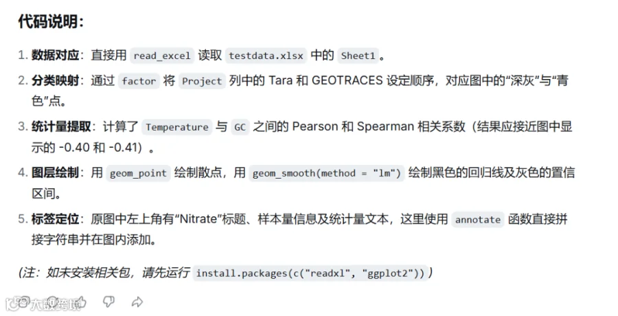
你是一名生物学研究生,附件图片对应Fig9中的子图[a, c, e,],附件中的“testdata.xlsx”对应子图e的绘图数据;基于“testdata.xlsx”文件,给出复现子图e的绘图R代码,要求代码简洁明了,避免函数嵌套;附件中图表对应的图例为:Fig. 9 | Environmental nutrient metrics mask GC–temperature associations in marine metagenomes but not in soils. Scatter plots showing the relationship between GC content and temperature before adjustment [a, c, e, g] (upper row) and after partial correlation controlling for environmental nutrient metrics [b, d, f, h] (bottom row). Each panel contains only samples for which a measurement of the specific metric is available. The metric and the number of samples are noted above each panel. NEON soil samples are shown in panels [a, b, c, d]; Panels [a] and [b] show results for oxidized inorganic nitrogen (NOx-Nμg/g) before and after adjustment, respectively. Panels [c] and [d] show the same, but for the C:N ratio. Marine samples are shown in panels [e, f, g, h]; Panels [e] and [f] show results for nitrate (μmol/kg) before and after adjustment, respectively. Panels [g] and [h] show the same, but for phosphate (μmol/kg). In adjusted panels, both temperature and GC content were independently adjusted (controlled) for the indicated metric, and the plotted relationship reflects the correlation between the corresponding residuals. Each point represents a metagenomic sample. Linear fits are shown for visualization; shaded bands indicate 95% confidence intervals around the fitted regression lines. Pearson and Spearman correlation coefficients are reported in each panel. Statistical significance was assessed using two-sided tests for non-zero correlation coefficients. The p-values were not adjusted for multiple comparisons. Significance levels are denoted as: ns, p > 0.05; *, p ≤ 0.05; **, p ≤ 0.01; ***, p ≤ 0.001; ****, p ≤ 0.0001.


02
绘图测试

03
图形调整

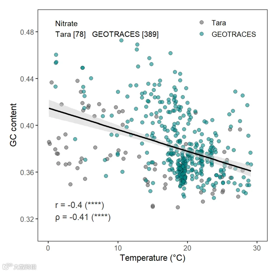
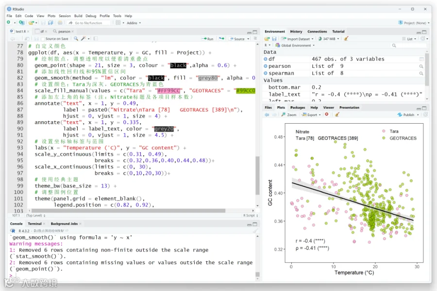

# 安装并加载必要的包library(readxl)library(ggplot2)# 1. 读取数据df<- read_excel("testdata.xlsx")df$Project <-factor(df$Project, levels=c("Tara", "GEOTRACES"))# 2. 计算整体Pearson和Spearman相关系数pearson <- cor.test(df$Temperature, df$GC, method ="pearson")spearman <- cor.test(df$Temperature, df$GC, method ="spearman")# 3. 生成左上角的统计标签(原图中均为****,此处直接对应)label_text <- paste0("r = ", round(pearson$estimate, 2), " (****)\n","ρ = ", round(spearman$estimate, 2), " (****)")# 4. 绘制子图eggplot(df, aes(x = Temperature, y = GC, color = Project))+# 绘制散点,调整透明度以便看清重叠点geom_point(alpha =0.7)+# 添加线性回归线和95%置信区间geom_smooth(method ="lm", color ="black", fill ="grey80", alpha =0.5)+# 设置颜色:Tara为深灰,GEOTRACES为青蓝色scale_color_manual(values =c("Tara"="grey40", "GEOTRACES"="cyan4"))+# 添加左上角的标签(注:Nitrate标题及各项目样本数)annotate("text", x =1, y =0.46,label = paste0("Nitrate\nTara [78] GEOTRACES [389]\n", label_text),hjust =0, vjust =1, size =4)+# 设置坐标轴标签与范围labs(x ="Temperature (°C)", y ="GC content")+xlim(0, 30)+ylim(0.34, 0.46)+# 使用经典主题theme_classic()+# 调整图例位置theme(legend.position =c(0.85, 0.9), legend.title = element_blank())# 5. 图形调整#自定义图表主题,对图表做精细调整;top.mar=0.2right.mar=0.2bottom.mar=0.2left.mar=0.2ggplot(df, aes(x = Temperature, y = GC, fill = Project))+# 绘制散点,调整透明度以便看清重叠点geom_point(shape =21, size =2.5, colour ="black",alpha =0.6)+# 添加线性回归线和95%置信区间geom_smooth(method ="lm", color ="black", fill ="grey80", alpha =0.5)+# 设置颜色:Tara为深灰,GEOTRACES为青蓝色scale_fill_manual(values =c("Tara"="grey40", "GEOTRACES"="cyan4"))+# 添加左上角的标签(注:Nitrate标题及各项目样本数)annotate("text", x =1, y =0.49,label = paste0("Nitrate\nTara [78] GEOTRACES [389]\n"),hjust =0, vjust =1, size =4)+annotate("text", x =1, y =0.335,label = label_text, color ="grey20",hjust =0, vjust =1, size =4.5)+# 设置坐标轴标签与范围labs(x ="Temperature (°C)", y ="GC content")+scale_y_continuous(limits =c(0.31, 0.49),breaks =c(0.32,0.36,0.40,0.44,0.48))+scale_x_continuous(limits =c(0, 30),breaks =c(0,10,20,30))+# 使用经典主题theme_bw(base_size =13)+# 调整图例位置theme(panel.grid = element_blank(),legend.position =c(0.82, 0.92),legend.background = element_blank(),legend.title = element_blank(),plot.margin=unit(x=c(top.mar,right.mar,bottom.mar,left.mar),units="inches"))# 6. 自定义颜色ggplot(df, aes(x = Temperature, y = GC, fill = Project))+# 绘制散点,调整透明度以便看清重叠点geom_point(shape =21, size =3, colour ="black",alpha =0.6)+# 添加线性回归线和95%置信区间geom_smooth(method ="lm", color ="black", fill ="grey80", alpha =0.5)+# 设置颜色:Tara为深灰,GEOTRACES为青蓝色scale_fill_manual(values =c("Tara"="#FF99CC", "GEOTRACES"="#99CC00"))+# 添加左上角的标签(注:Nitrate标题及各项目样本数)annotate("text", x =1, y =0.49,label = paste0("Nitrate\nTara [78] GEOTRACES [389]\n"),hjust =0, vjust =1, size =4)+annotate("text", x =1, y =0.335,label = label_text, color ="grey20",hjust =0, vjust =1, size =4.5)+# 设置坐标轴标签与范围labs(x ="Temperature (°C)", y ="GC content")+scale_y_continuous(limits =c(0.31, 0.49),breaks =c(0.32,0.36,0.40,0.44,0.48))+scale_x_continuous(limits =c(0, 30),breaks =c(0,10,20,30))+# 使用经典主题theme_bw(base_size =13)+# 调整图例位置theme(panel.grid = element_blank(),legend.position =c(0.82, 0.92),legend.background = element_blank(),legend.title = element_blank(),plot.margin=unit(x=c(top.mar,right.mar,bottom.mar,left.mar),units="inches"))

长按识别二维码咨询:

咨询当地销售或拨打客服电话:


分享科研绘图技能与工具
欢迎关注与转发~

你的好友拍了拍你
并请你帮她点一下“分享”~