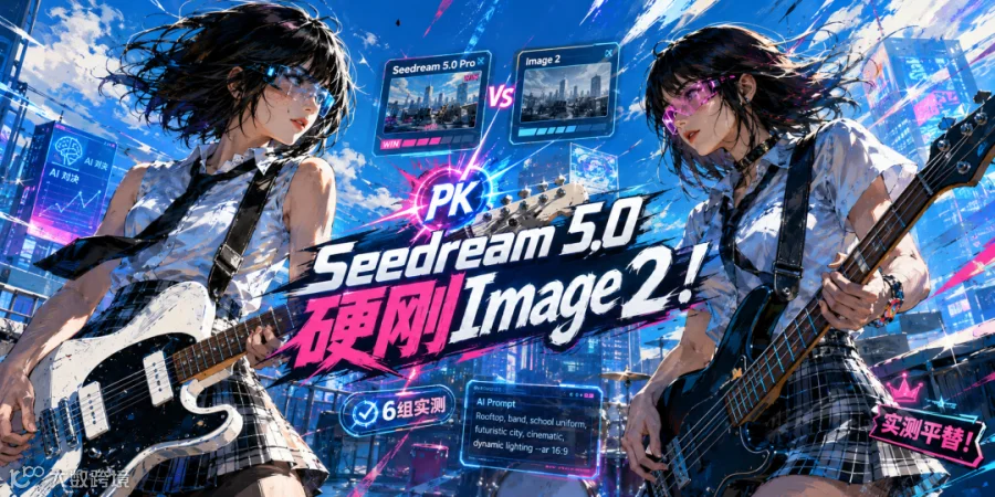
半年来,GPT Image 2 凭借精致的排版、清晰的结构及极低的中文错别字率,成为行业标杆。然而,受限于账号门槛、网络波动及工作流整合难度,国内团队难以将其大规模落地。市场迫切期待一款真正可用、能直接融入本土工作流的国产多模态图像模型。
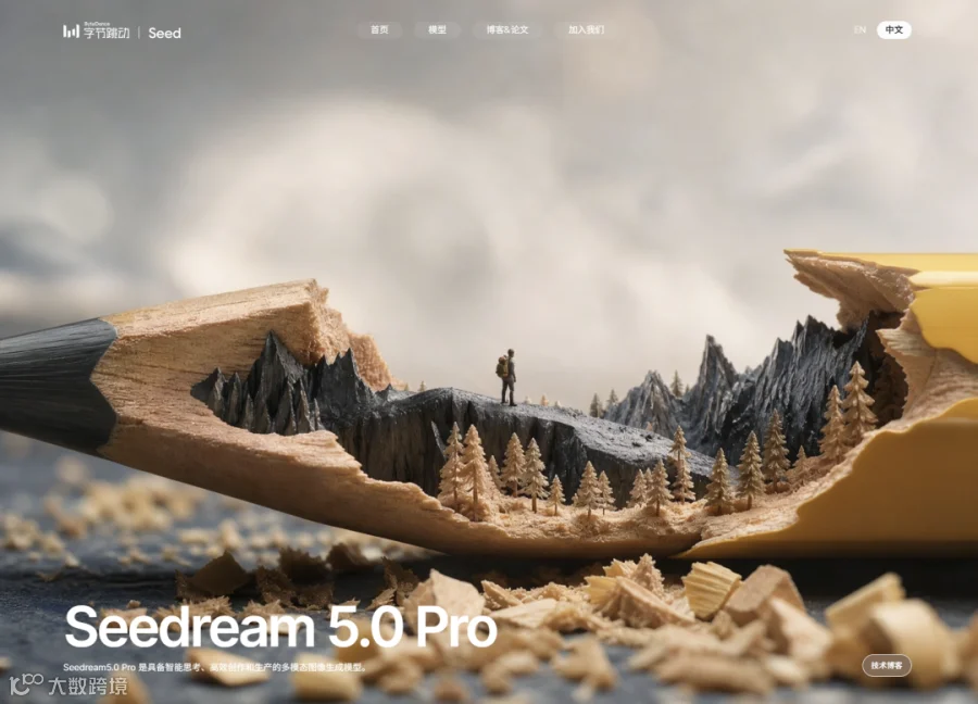
近日,字节跳动 Seed 团队正式发布 Seedream 5.0 Pro。这款全新模型让国内用户得以在本地环境中,使用媲美 GPT 级的生产力工具。
六大高频场景实测
选取六个典型业务场景,对 Seedream 5.0 Pro 进行深度实测。
1. 信息图生成
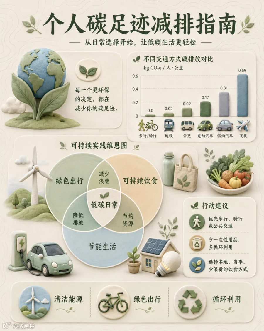
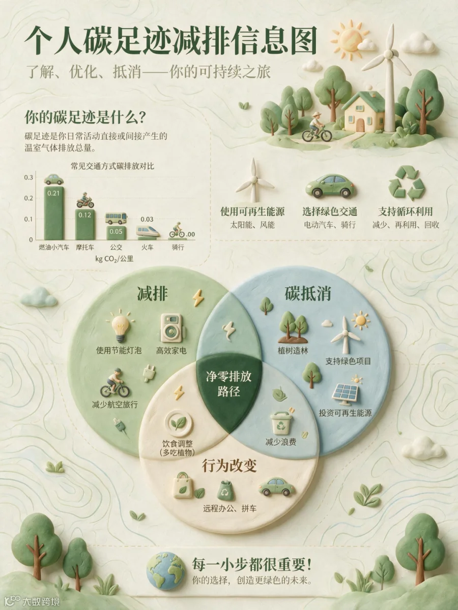
信息图生成历来是 AI 模型的难点,对排版逻辑与文字准确率要求极高。
提示词:一张环保、视觉舒缓的个人碳足迹减排信息图。背景带有细腻优雅的地形图等高线纹理。版式采用精心制作的 3D 软陶风格图标,包括风力涡轮机、电动汽车和回收标志。数据元素包含简洁精致的竖向柱状图,用于比较不同交通方式的碳排放;中央则是一个大型重叠式维恩图,展示可持续实践。整体配色以柔和的鼠尾草绿、米白色和淡海洋蓝为主。
实测显示,Seedream 5.0 Pro 表现稳定。中文字体清晰锐利,错别字控制在可接受范围内,完全满足商用需求。
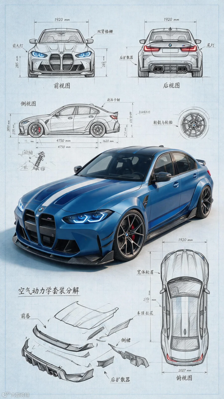
提示词:Highly detailed technical blueprint sketch and realistic 3D–render fusion of a custom modified car 2027 BMW iM3. Transform the car into a tuned concept blueprint with an aggressive lowered stance, wide-body aesthetic (adapted to match the real car's form), and bold racing stripe accents matching or enhancing the original photo colors. Add large aftermarket-style wheels inspired by the car in the photo (accurate spoke design & size), sharp LED-like lighting details, and sporty aerodynamic additions such as front spoiler, side skirts, rear diffuser, and small spoiler — all adjusted realistically to the BMW iM3's geometry. Surround the main render with precise engineering-style blueprint elements: multiple orthographic views (front, rear, side, top) derived from the reference photo, construction lines, mm-dimensions, exploded-view details for wheels, suspension, and body kit components. Art style combines pencil/ink drafting with fine cross-hatching, clean annotations, and a photorealistic shaded center render. Blueprint background in soft light-blue or sepia technical-paper texture, ultra-detailed, professional automotive concept-design composition.
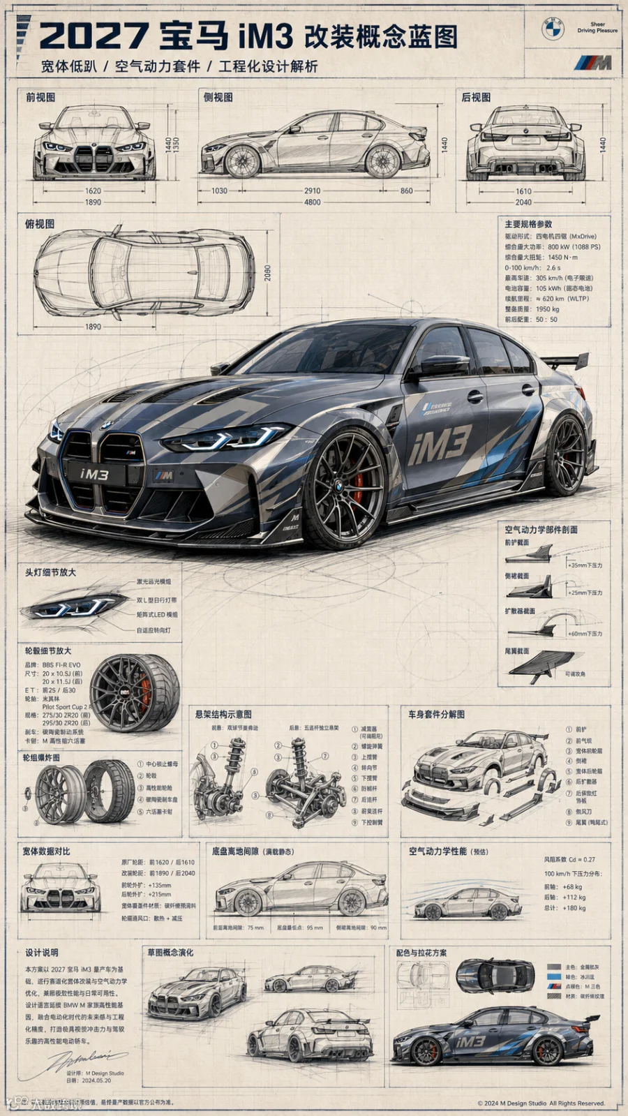
在中文密集型场景下,该模型已达到直接投入业务使用的水平。
2. 电商图生成
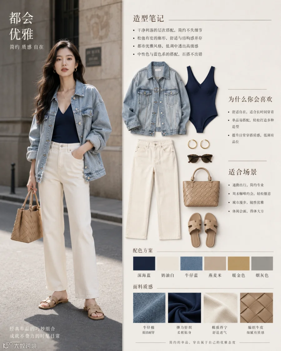
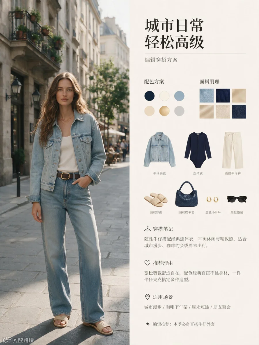
提示词:Fashion editorial layout, split design with model photo on the left and styled outfit board on the right, modern minimal magazine aesthetic. A woman with long soft waves wearing a deep navy blue bodysuit, light wash oversized denim jacket, high-waisted cream straight-leg jeans, beige slide sandals, and a structured woven leather handbag. Neutral city street background, soft natural lighting.On the right: neatly arranged outfit flat lay (denim jacket, navy bodysuit, cream jeans, sandals, handbag, gold hoop earrings, sunglasses), color palette swatches (navy, cream, denim blue, beige, muted gold, grey), fabric texture samples, and clean typography sections like"Style Notes,""Why You'll Love It,"and"Perfect For."Editorial typography, muted tones, luxury minimalist branding, balanced grid layout, high-end fashion magazine style, ultra-realistic, sharp details, soft shadows.
Seedream 5.0 Pro 在信息分组上逻辑清晰,文字可读性强,排版布局甚至更为舒展。
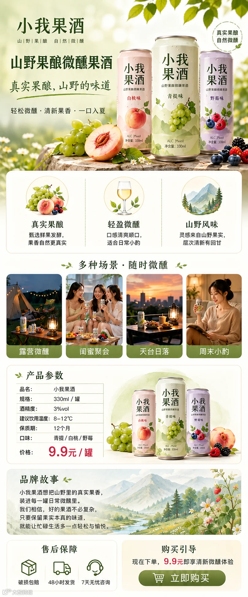
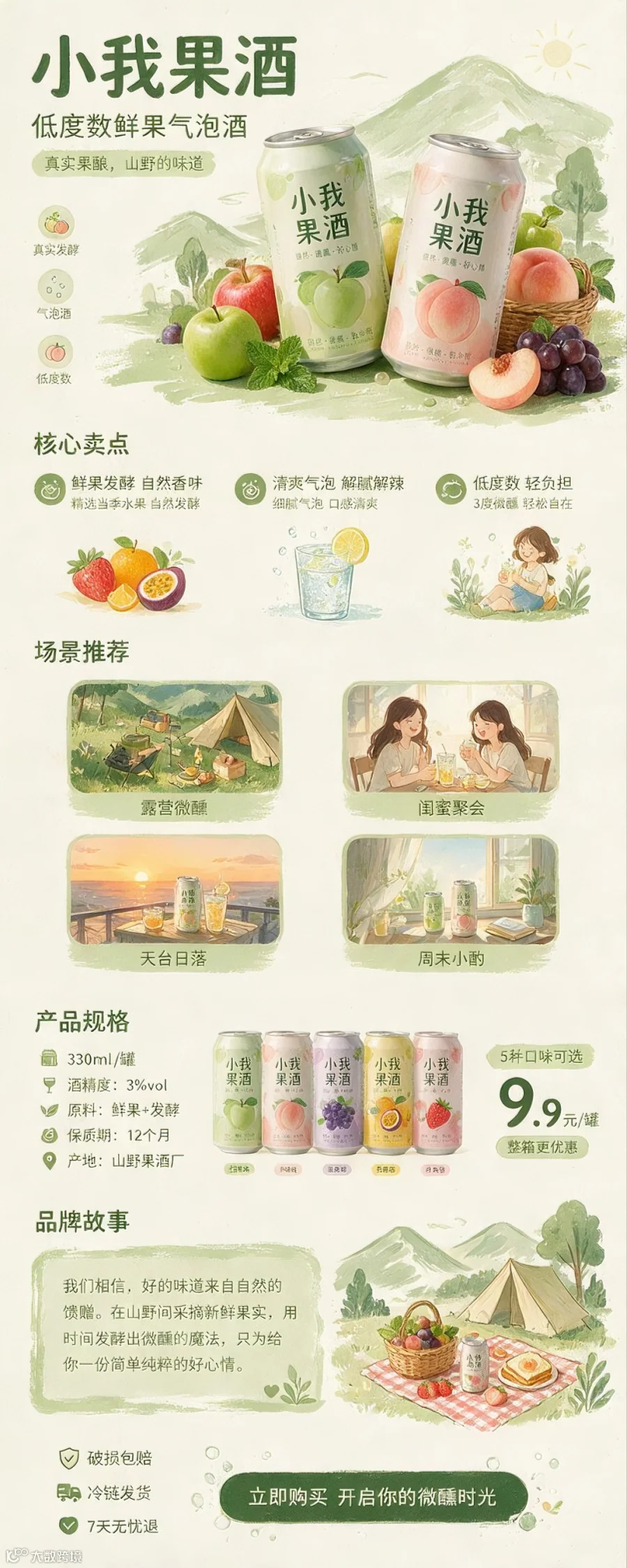
提示词:设计一张果酒品牌“小我果酒”的电商产品详情页,竖版长图。内容结构包括:1.头图区:产品主图 + 品牌名称 + 产品名称 + 一句话卖点“真实果酿,山野的味道”;2.卖点区:3 个核心卖点;3.场景区:使用场景图:露营微醺、闺蜜聚会、天台日落、周末小酌;4.产品参数:规格信息 + 价格,价格 9.9 元/罐;5.产品品牌故事;6.售后保障 + 购买引导。视觉风格清新自然,主色调浅绿 + 米白,与品牌海报风格统一。
其对中文提示词的遵循度优于 Image 2,在国内本土工作流中的实用性显著提升。
3. 创意海报生成
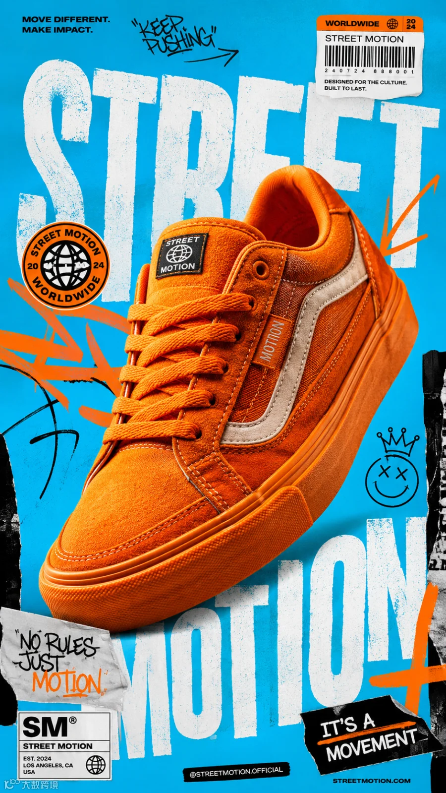
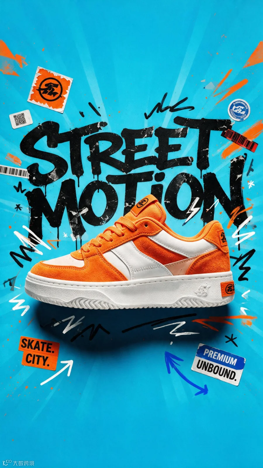
提示词:A premium 9:16 streetwear footwear advertising poster.Central Subject:A single oversized bright-orange skate sneaker positioned perfectly in the center.Background:Electric cyan studio backdrop with bold orange graphic accents.Design Style:Modern skate culture branding mixed with luxury editorial graphic design.Graphic Layer:Huge distorted typography reading:"STREET MOTION"Large sticker graphics. Hand-drawn arrows. Graffiti marker strokes. Barcode strips. Paper-cut collage elements.The typography is partially hidden behind the sneaker.Materials:Premium suede panels. Textured rubber sole. Visible stitching. Luxury manufacturing details.Lighting:High-contrast fashion campaign lighting. Strong shadows. Sharp highlights.Color Palette:Bright orange. Electric cyan. White. Black.Mood:Bold. Youthful. Urban. Highly commercial.Aspect Ratio:9:16 vertical.8K masterpiece.
在创意拼贴海报生成方面,Seedream 5.0 Pro 略逊于 Image 2,这可能源于训练库的差异。
4. 真实影像质感
人像生成一直是 AI 领域的痛点,稍有不慎便会产生严重的“塑料感”。
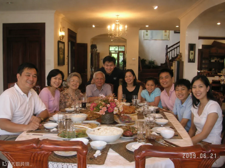
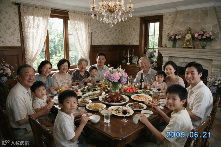
提示词:为我生成一张照片,一家 11 口人在大别墅里围坐在一起吃饭,大家都看向镜头,右下角时间戳 2009.06.21
本次更新中,官方重点优化了人像质感。实测表明,生成的肤色更加自然,五官比例协调,避免了崩坏现象。
5. UI 界面设计
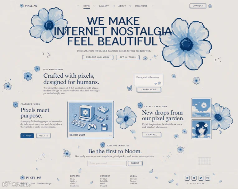
测试生成像素风艺术网站界面,对比两者表现。
提示词:Design a premium creative website inspired by retro pixel-art aesthetics, vintage internet culture, and digital nostalgia while maintaining a clean contemporary user experience. The entire interface should revolve around oversized bitmap typography, intentionally pixelated text, and soft blue pixel-art flower illustrations used throughout the design as hero elements, decorative accents, section dividers, and background details. Use a minimal color palette consisting of a warm light-gray background, faded powder-blue accents, and deep navy-blue highlights. The layout should be spacious and editorial with generous whitespace, creating an artistic and handcrafted feel rather than a corporate SaaS appearance. Incorporate pixel-inspired buttons, navigation, badges, cards, icons, and subtle grid details, combining rounded shapes with low-resolution visual elements. The hero section should feature a massive pixel-font headline accompanied by large blue pixel flowers partially overlapping the content, supported by small bitmap-style text and minimal call-to-action buttons. Interactions should remain elegant and subtle, including soft hover effects, tiny pixel bloom animations, gentle transitions, and nostalgic computer-inspired micro-interactions. The overall aesthetic should feel like a fusion of pixel art, Japanese minimalism, editorial web design, and modern digital craftsmanship, resulting in a visually striking website that feels both nostalgic and premium.
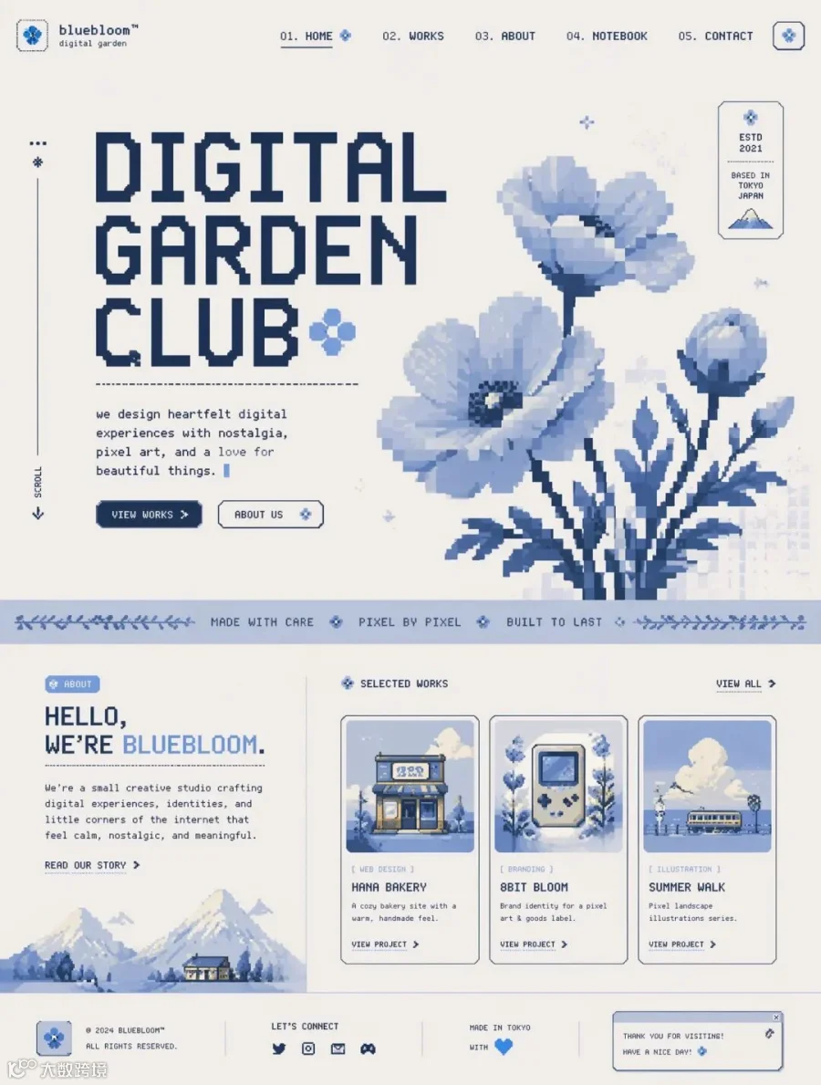
Seedream 5.0 Pro 在 UI 网格界面的整体架构上表现稳健,骨架完整。
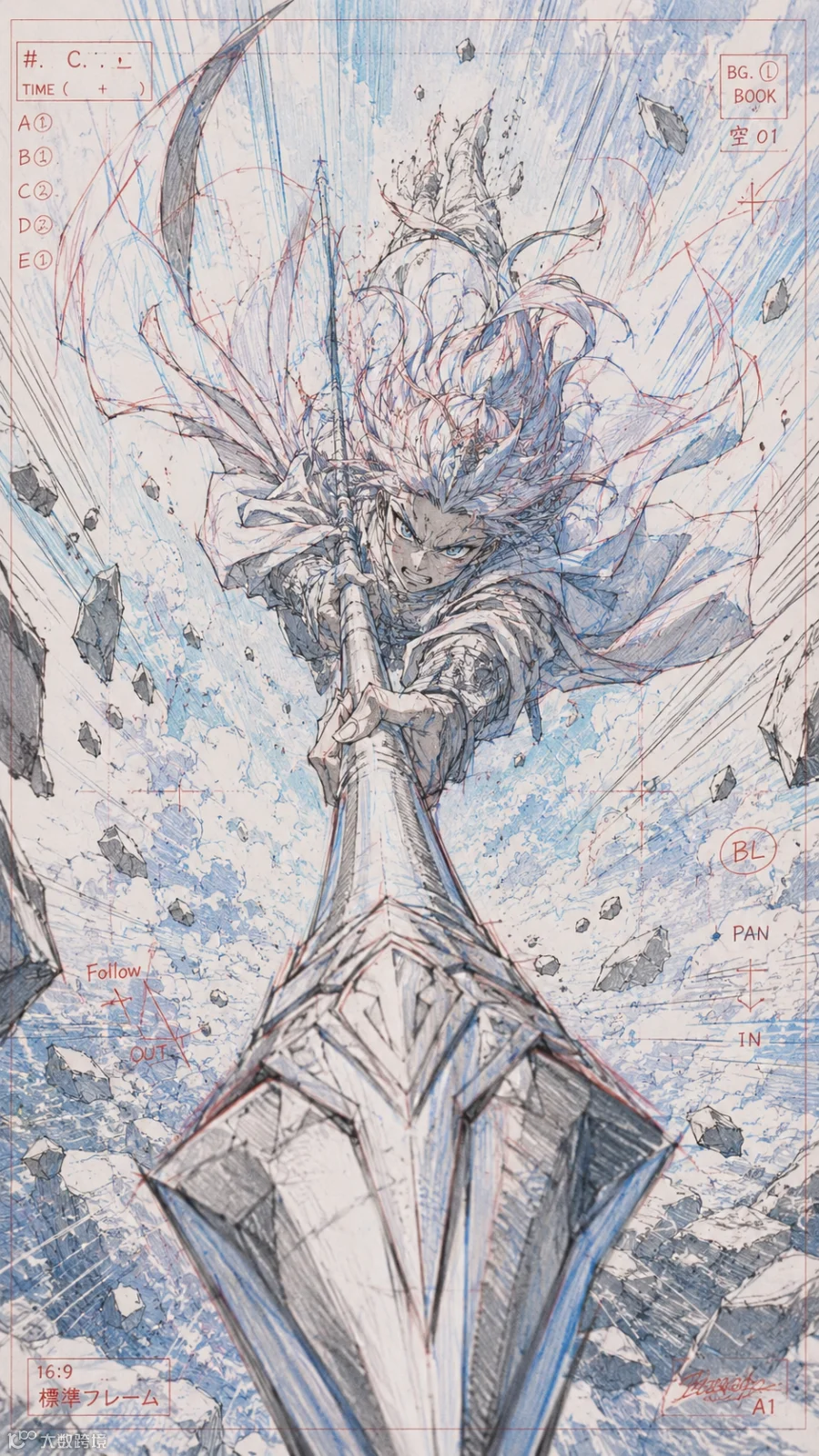
6. 风格插画
提示词:极具动态感的夸张透视。一名风格化动漫战士从天空笔直俯冲而下,将一支巨大的长矛直指摄像机镜头。碎石悬浮在空中。动漫工作室原画风格,可见蓝色和红色铅笔布局线,高能动作分镜。
尽管两者画风存在差异,但 Seedream 5.0 Pro 在笔触质感和表现力上均达到了极高水准。
国产模型实现平替
新生代文生图模型若想实现业务落地,必须跨越 Image 2 设定的两大门槛:具备设计师般的理解能力,以及攻克中文文字生成难题。
首先,模型需像真人设计师一样,能够精准拆解用户需求并转化为完美的视觉方案。其次,必须解决商业场景中不可或缺的汉字生成问题。若汉字渲染失败,无论画面多么唯美,都无法融入真实工作流。
长期以来,国内内容创作者深受 AI 工具不趁手之苦,面对海外大厂不断抬高的技术标准,往往受限于网络环境和昂贵的 API 成本。而在 2026 年的夏天,Seedream 5.0 Pro 在中文语境下实现了真正的追赶。
该模型已全面布局内容制作的核心能力,涵盖复杂的中文信息可视化、真实影像质感以及友好的交互式精准编辑。在高密度中文海报和局部修改场景中,它甚至更懂中国设计师的痛点。
总结与展望
客观而言,在极端长文本逻辑推理或跨平台复杂创意场景下,Image 2 仍具底蕴优势。但在设计师日常的信息图、海报、插画及电商主图制作中,Seedream 5.0 Pro 已完全具备挑大梁的实力。
更重要的是,用户无需折腾复杂的网络环境,也无需承担高昂的美元计费成本。通过火山方舟、豆包或即梦等平台,即可在本地工作流中高效出图。对于中小商家、独立设计师及初创团队而言,这标志着生产力的实质性解放。