

本文字数:2500字
阅读时间:11分钟
How Tiffany & Co. monopolized
a shade of blue
蒂芙尼是如何将这抹蓝占为己有的?
In the early 1990s, color went to court. The Chicago-based company Qualitex, which produces green-gold press pads for dry-cleaning plants, sued St. Louis's Jacobson Products for making the same items in the same hue.
20世纪90年代初,法院审理了一起有关颜色的诉讼。总部位于芝加哥的Qualitex公司为干洗工厂生产金绿色压垫,该公司起诉圣路易斯的Jacobson公司生产同一色调的相同产品。
The case made it to the Supreme Court, and in his opinion that favored Qualitex, who ultimately won the case, Justice Stephen Breyer wrote: "Color alone, at least sometimes, can meet the basic legal requirements for use as a trademark. It can act as a symbol that distinguishes a firm's goods and identifies their source, without serving any other significant function."
该案被提交至最高法院。法官Stephen Breyer偏向Qualitex公司一方的意见对Qualitex有利,他写道:“有时颜色本身,就能满足作为商标使用的基本法律要求。它可以作为一个标志,区分不同公司的产品,表示其生产商突出公司的商品,确定其来源,而不一定需要承担其他重要功能。”
In the years since, brands ranging from T-Mobile (magenta) to UPS (deep brown) have trademarked their own colors, signifying their potency in building loyal customers and communicating a company's ethos.
从那以后的几年里,从洋红色的T-Mobile到深棕色的UPS,各种品牌都为自己的颜色注册了商标,无不展现着它们在打造客户忠诚度和传播企业精神方面的潜力决心。
Cadbury has spent more than a decade in legal battles to expand its claim of the color purple; Cadbury lost rights to its trademarked hue (Pantone 2685C) after Nestlé opposed its application to trademark it for all of its goods (and not just a single chocolate bar).
吉百利花了10多年时间打官司,拓展了对紫色的所有权。不过,因雀巢反对吉百利为其所有产品(而不仅仅是一块巧克力)申请商标,吉百利失去了其潘通(色彩研究所)色号2685C的商标使用权。
Yet of all these chromatically oriented organizations, it's the jeweler and retailer Tiffany & Co. that has made a single blue hue synonymous with luxury.
然而,在所有这些以颜色为标志的公司中,正是珠宝商和零售商蒂芙尼让单一的蓝色成为奢侈品的代名词。
In 1837, Charles Lewis Tiffany and John B. Young opened the shop Tiffany & Young for stationery and other high-end goods in Lower Manhattan, just across from City Hall Park.
1837年, Charles Lewis Tiffany和John B. Young在曼哈顿下城市政厅公园对面开设了Tiffany & Young文具店和其他高端商店。
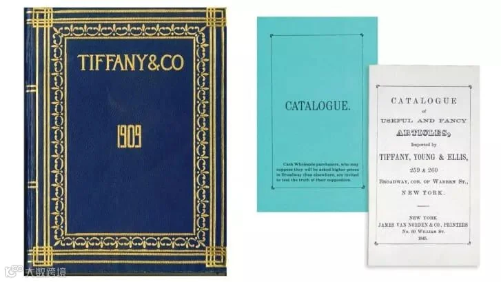
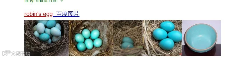
Before the brand even became a major purveyor of silver -- or solidified its name -- Tiffany & Young began publishing the now-iconic Blue Book. First issued in 1845, the "Catalogue of Useful and Fancy Articles" featured a blue cover that skewed more green than the robin's egg hue we now associate with the brand.
在蒂芙尼成为一家大型银饰供应商(或者说巩固了自己的品牌地位)之前,Tiffany & Young就开始出版如今标志性的蓝皮书。1845年首次发行的《实用及高档物件目录》的封面是蓝色的,比我们现在联想到的品牌的罗宾蛋色(一种青色)更偏向绿色。
Over the subsequent century, Blue Books varied in shade until around 1966, when the company settled on a color close to Tiffany Blue.
在随后的一个世纪里,蓝皮书的颜色一直在变化,直到1966年前后,蒂芙尼公司决定采用一种接近“蒂芙尼蓝”的颜色。
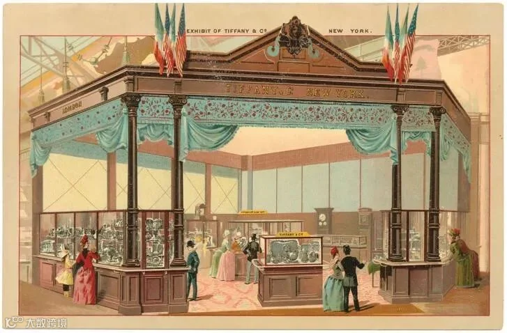
According to Andrea Davey, the senior vice president of global marketing at Tiffany's, it's difficult to pinpoint when turquoise became associated with the company, and it's unclear why, exactly, the founders settled on that particular shade. Yet she noted that as early as 1889, the company used the hue in its display at the World's Fair in Paris.
蒂芙尼全球营销高级副总裁Andrea Davey说,很难说绿松石是什么时候开始与蒂芙尼有了千丝万缕的联系,也不清楚蒂芙尼创始人为什么会选择这个颜色。但她指出,早在1889年巴黎世博会上,蒂芙尼就用了这种色调。
"The presence of the color at the fair could suggest that by the turn of the 19th century, this shade of blue was already associated with Tiffany & Co.," she said.
她说:“在世博会上出现这种颜色说明,可能19世纪初这种蓝色已经与蒂芙尼紧密相连。”
At the time, turquoise was a novel gemstone in America. In the late 1800s and early 1900s, miners discovered the mineral in the West and Southwest.
Demand increased throughout the country, and prices rose. Across the Atlantic, Victorian brides gifted their attendants with turquoise brooches on their wedding days. The hue, perhaps, adopted connotations of both modernity and classic glamour, with a hint of the exotic: The ancient Egyptians had used turquoise in amulets and gold jewelry, while the Aztecs had crafted it into ritual masks.
绿松石当时在美国是一种新奇的宝石。19世纪末20世纪初,矿工们在西部和西南部都发现了这种矿石。
对这种矿石的需求在全国激增,价格随之上涨。在大西洋彼岸,维多利亚时代的新娘在婚礼当天会送服务员绿松石胸针。或许这种绿色调既具有现代气息,又具有古典魅力,同时还带有一丝异域风情,因为古埃及人在护身符和黄金首饰中用了绿松石,而阿兹特克人把绿松石制作成仪式面具。
An orchid-shaped Tiffany's brooch from the time, now owned by theMetropolitan Museum of Art, came in an elegant turquoise case with cream-colored lining. Already, the company was linking the color with packaging -- an early iteration of the now-iconic blue box, which Davey asserted is "recognized, admired, and loved around the world."
蒂芙尼当时设计的兰花胸针现在归大都会艺术博物馆所有,装在一个精致的青绿色盒子里,内衬是奶油色的。蒂芙尼已经将青绿色与包装完美融合——这个盒子是今天蒂芙尼标志性蓝盒的早期版本,Davey称这个小盒子“在全世界得到了认可、赞赏和喜爱”。
That isn't just a marketing platitude: AdWeek once noted that the blue box "is very possibly the most recognizable and most desired retail container in history." Charles Lewis refused to sell the boxes alone, enhancing their value as a symbol -- you couldn't receive one of the most significant symbols of love and commitment without the Tiffany's box.
这不仅仅是一种营销的陈词滥调:《广告周刊》曾指出,蓝盒“可能是有史以来最知名、最受欢迎的零售容器”。 Charles Lewis拒绝单独出售这些盒子,以提升它们作为象征的价值——如果要接收爱和承诺,就不能没有蒂芙尼蓝色盒子的衬托。
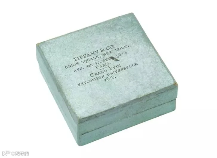
(1878 Tiffany box notes the grand prize win at the Paris World's Fair. Credit: Tiffany & Co. Archives
1878年Tiffany的盒子在巴黎世界博览会上获得了大奖。)
In 1998, Tiffany & Co. finally trademark its color. Three years later, the brand partnered with Pantone to solidify its hue: "1837 Blue," commemorating its founding year.
在1998年,蒂芙尼终于为其颜色注册了商标。三年后,它与潘通(色彩研究所)合作,确立了公司的代表色:“1837蓝,”以此纪念公司成立年份。
"Tiffany has turned (its) distinctive shade into an international icon of elegance and sophistication," Laurie Pressman, vice president of Pantone Color Institute, has said.
潘通色彩研究所副所长劳里·普雷斯曼说:“蒂芙尼将其独特的色调变成了全世界认可的标志,代表着高雅和精致。”
"From the moment you set your eyes upon Tiffany's cool and fresh aquatic blue shade, a color that speaks to vibrancy and escape, you are immediately transported into a world filled with luxury and delight."
“你只要一见到蒂芙尼凉爽清新的水蓝色色调,就会立刻进入到一个充满奢华和欢乐的世界,水蓝色让人充满活力,从生活的烦恼中解脱。”
Tiffany's need not update its branding strategies to retain its appeal, as Davey emphasized. "We are in a rare and enviable position, that consumers recognize the brand simply by seeing the color -- even without any other brand identity," she said.
正如Davey强调的那样,蒂芙尼不需要新的品牌战略来保持吸引力。”她说:“我们已经处于行业的前沿,即使没有任何其他关于这个品牌的标识,消费者仅仅通过看到颜色也可以认出这个品牌。”
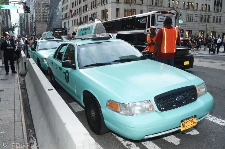
(A taxi in Tiffany & Co.'s famous blue features as part of the company's Paper Flowers event and Believe in Dreams campaign launch on May 3, 2018 in New York City. Credit: Jamie McCarthy/Getty Images North America/Getty Images for Tiffany & Co.)
2018年5月3日的纽约,在公司纸花活动和“相信梦想”活动中,蒂芙尼蓝的出租车作为活动的一部分亮相。
No other trademarked color has become so closely associated with its brand. The hue (RGB 82, 183, 189) is soft and feminine, but not garishly so; it's playful and light, without being frivolous.
没有其他商标的颜色与它的品牌有如此密切的联系。色调(rgb 82,183,189)柔和,具有女性美,但并非华而不实;很活泼轻盈,却不轻浮。
Though corporations have successfully co-opted democratic objects and symbols -- an apple, a swoosh, the number 57 -- none has claimed anything as simultaneously specific and broadly applicable as 1837 Blue: The company can paint anything, from taxis to storefronts, with its trademark color, and the significance will resonate. It's a paradox that perfectly resonates with what Tiffany sells: jewelry with a definite weight and form, and a concept as mutable as love.
尽管许多公司已经成功地融入了大众化、具有象征性的物件——苹果、Swoosh(耐克标识)、数字57——但没有一个公司敢声称拥有与1837蓝一样既具象又广泛应用的标识:从出租车到店面,蒂芙尼公司可以用它的商标颜色蒂芙尼蓝来粉刷任何东西,其意义将不断扩大。蒂芙尼将两样看似矛盾的东西完美融合在了一起:固定重量和形态的珠宝,像爱一样变幻莫测的理念。
文章来源|CNN
图片来源|CNN
编译|庄怡 顾贝盈 尹天翼
排版|庄怡
指导老师|刘佳