
全文字数:1968字 / 阅读时间:6分钟
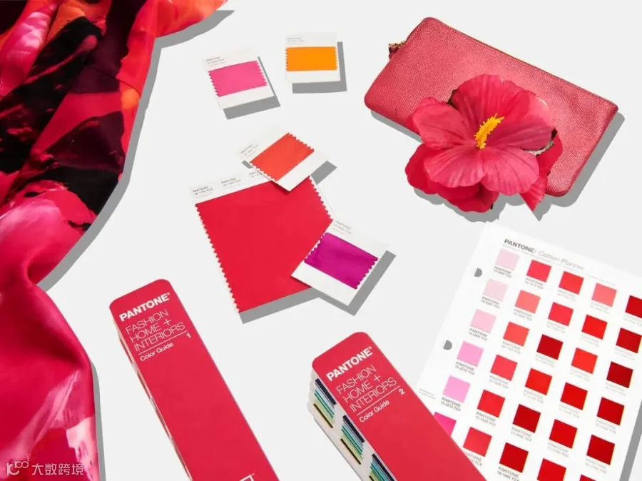
It's official: 2023 is the year of magenta. That's according to the Pantone Color Institute, the authoritative consultancy that's christened an "it color" every year for more than two decades.
权威咨询机构潘通色彩研究所宣布:2023年是洋红色之年。二十多年来,该机构每年都会命名一种年度“流行色”。
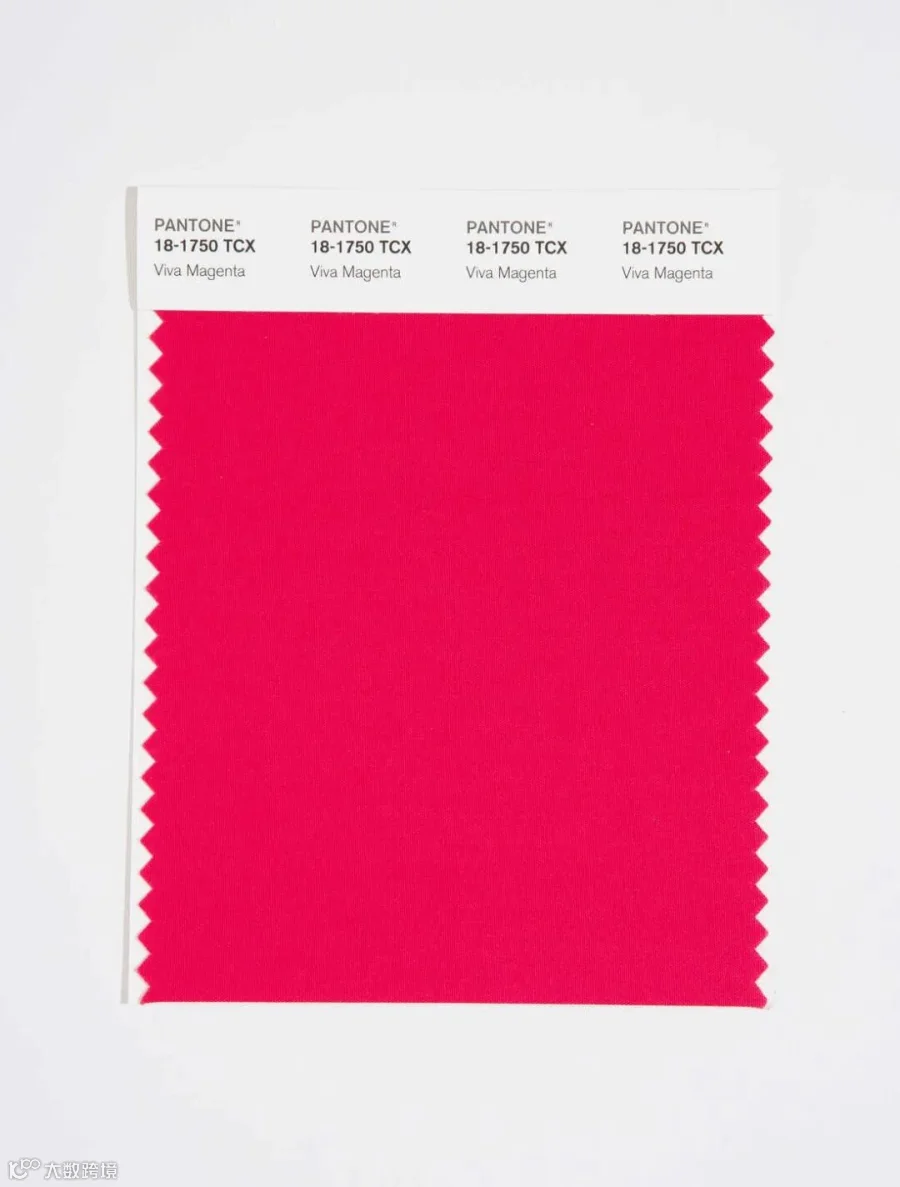
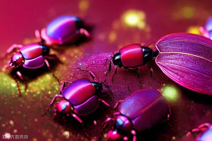
Its latest pick is none other than viva-magenta 18-750, which it describes as "a shade rooted in nature descending from the red family and expressive of a new signal of strength."
潘通最新挑中的正是活力洋红色18-750,它将其描述为“一种源于自然的红色,一种新的力量符号。”
Other words the company uses to characterize the color — and, by extension, the current cultural moment — include powerful, empowering, electrifying, boundaryless, audacious and inclusive.
潘通还用了其他的一些词语来描述这一颜色,以及它延伸出的流行文化,包括强大、赋权、振奋人心 、无界、大胆和包容。
"Viva Magenta is brave and fearless, and a pulsating color whose exuberance promotes a joyous and optimistic celebration, writing a new narrative," it says.
“活力洋红色是勇敢无畏、有生命力的颜色,它的热情洋溢让人想到欢乐积极的庆祝场面,书写新的篇章。”潘通说。
Some skeptics would point out that magenta doesn't technically exist, since there's no wavelength of light that corresponds to that color. But Pantone defines it as a "nuanced crimson red tone that presents a balance between warm and cool."
但也有人质疑称,严格意义上说,洋红色这种颜色并不存在。因为没有与这种颜色对应的光的波长。但潘通将洋红定义为“微妙的深红色色调,呈现出冷暖色调间的平衡”。
为何选择洋红色
巴黎秋天,咖啡香气
Pantone is known for creating the Pantone Matching System, which is used to identify and match colors in industries such as printing, graphic design and fashion. It has named a color of the year annually for more than two decades.
潘通以创建彩通而闻名,该系统在印刷、平面设计和时尚等行业被用于识别和匹配颜色。二十多年来,潘通每年都会选出年度流行色。
The program aims to highlight the relationship between color and culture, and colors of the year are chosen because they reflect the global culture at a specific moment in time, according to Laurie Pressman, the institute's vice president.
潘通副总裁劳里·普雷斯曼表示,该项目旨在突出颜色与文化之间的关联,选择年度流行色是因为它们反映了特定时刻的全球文化。
Pantone invented a completely new shade for 2022's color of the year: Very Peri, a light purple representing courage and creativity. It previously picked two separate colors — bright yellow and solid gray — to embody the dual moods of 2021.
潘通为2022年的年度色彩发明了一种全新的色调:长春花蓝,一种代表勇气和创造力的浅紫色。之前,它选择了两种不同的颜色——亮丽黄和极致灰——来体现2021年的双重情绪。
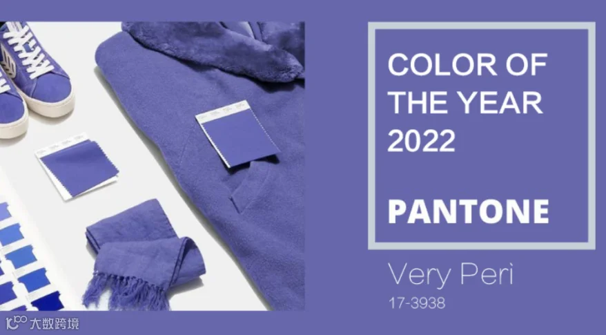
2022年:
长春花蓝
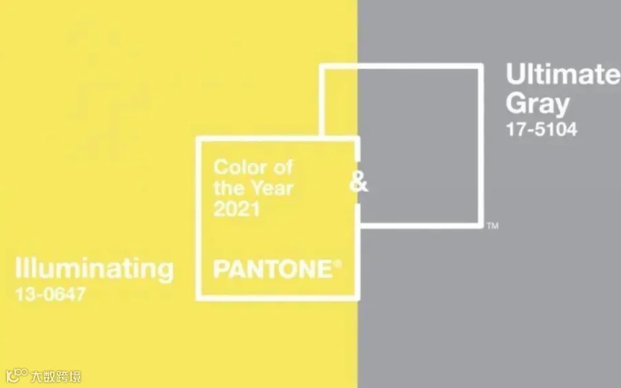
2021年:亮丽黄和极致灰
They say Magenta is fitting in part because of its organic origins, which it traces to the cochineal, the source of red carmine dye.
专家说洋红色适合作为年度色,部分是因为它的自然起源,可以追溯到胭脂红染料的来源——胭脂虫。
There's also a psychological, emotional component. Pantone says magenta balances boldness and fun, confidence and humanity. It likens that to how digital spaces have accelerated globalization, allowing people to connect with others and deepen their empathy.
还有一个因素是心理和情感。潘通说,洋红色平衡了大胆与乐趣、自信与人情味。他把这比作数字空间加速全球化进程,让人们与他人建立更深厚的联系。
"The Color of the Year 2023 merges the richness, warmth, and strength of natural matters with the rich, open horizons of the digital world," Pantone says. "The result is a shade of red that expands our horizons of authenticity."
“2023年的色彩将自然世界的丰富、温暖和力量与网上空间的丰富、开放的视野融合在一起。”潘通说,“那片红色拓宽了我们的实际视野。”
While last year's color also spoke to the balance between nature of technology, Pantone says what sets magenta apart is its "ability to answer our collective need for strength."
虽然2022年的颜色也表现了技术和自然之间的平衡,但潘通表示,洋红的特殊在于,它“能够满足我们对力量的集体需求”。
Amid the ongoing pandemic, Viva Magenta represents reassurance, confidence and connection in a world trying to get back on its feet, according to Laurie Pressman.
据劳里·普雷斯曼介绍,在持续的疫情中,在一个试图重获新生的世界中,活力洋红色象征着安心、信心和联系。
"Three years deep into a pandemic, facing a war, an unstable economy, social unrest, supply chain breakdowns, and mounting climate change, we need to heal," it adds. "And still, we need to find the motivation to continue. Here, Viva Magenta cloaks us in both power and grace, and sends us out into the world with the verve we've yearned for."
“过去三年里,我们经历了疫情,战争,不稳定的经济社会大环境,崩坏的供应链,以及不断加剧的气候问题。深陷各种问题的我们格外需要被治愈。”她补充道,“不过即使如此,我们仍需要找到支撑我们继续努力下去的动力。对此,洋红色为我们注入了力量和优雅,并将我们送回到一个充满热情的世界,正如我们渴望中的那样。

为什么年度代表色很重要?
巴黎秋天,特有的咖啡香气
Pantone's chosen colors of the year go on to influence product development and purchasing decisions in all sorts of industries, including fashion, industrial design and product packaging.
潘通选择的年度颜色将会进一步影响各行各业的产品开发和采购决策,包括时尚,工业设计和产品包装。
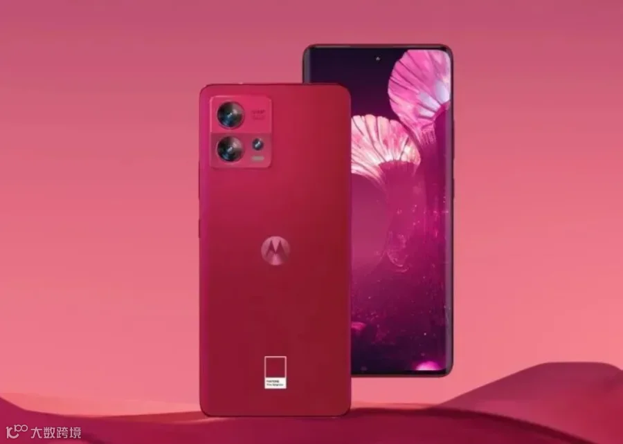
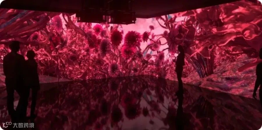
It seems the "Magentaverse" is already upon us. Pantone has partnered with companies including Motorola, Spoonflower and Cariuma to release cellphones, wallpaper, skate shoes and more in the designated shade. And the art space ARTECHOUSE is offering an immersive magenta experience, starting during Miami's Art Basel and opening to the public on Saturday.
这股“洋红追捧热潮”似乎已经发生在我们身边了。潘通与摩托罗拉,spoonflower(定制面料图案供应商),Cariuma(巴西环保手工休闲复古鞋履品牌)等一系列公司已经开展了合作,推出了限定色的手机,墙纸,滑板鞋等产品。在ARTECHOUSE艺术空间中,我们可以获得沉浸式的洋红色体验,这一活动将在迈阿密巴塞尔艺术展期间举办,于12月3日开始面向公众开放。


Color has power in consumer behavior — one 2015 study found that 85% of shoppers base their purchasing decisions on a product's color — as well as self-expression and communication.
颜色能对消费行为产生影响,2015年的一项研究发现,85%的消费者会基于产品的颜色做出消费选择,并将其作为一种自我呈现、交流沟通的方式。
Pantone has a lofty view of what color can do not only for people who are deciding what to wear or buy, but for society as a whole.
潘通认为,颜色不仅会影响人们穿什么或者买什么,而是对于社会这个整体来说都有影响。
"It is a visual language we all understand, one whose message crosses genders, generations, and geographies," Pressman says. "Learning more about the unique meanings particular colors give voice to helps us to be a more expressive, closely connected society, one that provides people with a more holistic understanding of their peers and communities alike."
“这是一种能够跨越性别,年龄,地域,为我们所有人都理解的视觉语言。”普雷斯曼表示。更好地了解每种颜色的独特含义,有助于人们更全面地了解他们的同龄人或者所属社群,而这也使得整个社会更具表现力、联系更紧密。

重
点
词
汇
1
pulsating
excited, or exciting
adj. 脉动的;脉冲的;搏动的
例句:I thought I was entitled to celebrate the goal after a pulsating game.
2
verve
energy and enthusiasm
n. 活力;热情
Kollo sings with supreme verve and flexibility.
原文链接:
https://edition.cnn.com/style/article/pantone-color-of-the-year-2023-viva-magenta/index.html
https://www.npr.org/2022/12/02/1140310663/pantone-color-year-viva-magenta
编译 | 翟芸 侯倩 殷奕蕊 陈宇嘉
排版 | 翟芸