
2025年度色彩“棕” 磅来袭
全文字数:1317字
阅读时长:4分钟
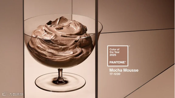
当冬天来临时,没有什么比一杯丝般柔滑的拿铁咖啡、一杯舒适的奶油茶或一杯热可可更令人舒心的了。Pantone的色彩专家似乎同意这一点。与过去26年一样,在今年12月5日Pantone 宣布了其年度色彩: 摩卡慕斯(Mocha Mousse)。
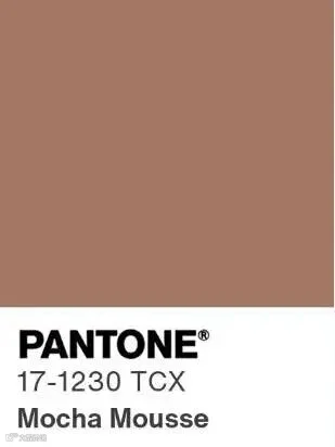
图源Patone官网
PANTONE 17-1230 (Mocha Mousse's government name), is a serene, lightly pigmented color. It's "a mellow brown infused with a sensorial and comforting warmth," Pantone Color Institute vice president Laurie Pressman tells USA TODAY.
PANTONE 17-1230(Mocha Mousse 的官方名称)是一种宁静、轻浅色的颜色。这是“一种柔和的棕色,蕴含着一种能给人带来感官享受且让人感到舒适的温暖。”Pantone 色彩研究所副总裁 Laurie Pressman 告诉《今日美国》。
Pantone 年度颜色是由在色彩研究与标准化领域极具权威性的 Pantone 公司选定的一款具有代表性意义的颜色。每年,Pantone 公司凭借其专业的色彩分析体系、广泛的市场调研以及对全球色彩趋势的深入洞察,从众多色彩中甄别出能够反映当下时代精神、文化氛围与社会心理倾向的特定颜色作为年度色彩。
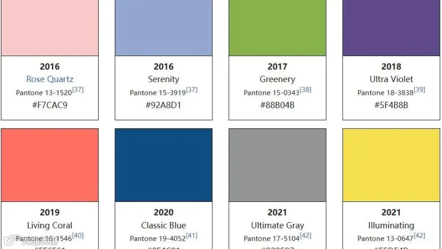
自 2000 年以来,Pantone已经宣布28个“年度颜色”(2016年、2021年分别有两个年度颜色)。
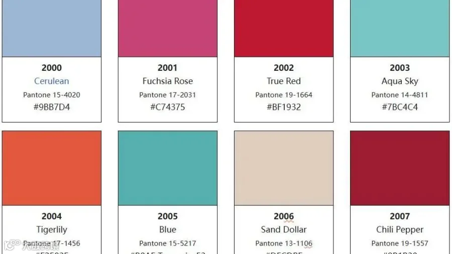
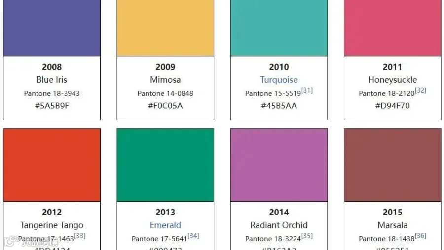
左右滑动 查看更多
图源网络


轻享文化的“摩卡时刻”
Meant to engage multiple senses, the color should evoke a desire to dip your spoon into it, Pressman says. Inspired in part by "little treat culture" − a growing trend in which people punctuate their day with small pleasures like a store-bought coffee − Pressman encourages fans to "find your mocha moment."
Pantone副总裁Pressman表示,这个颜色旨在调动多种感官,它能唤起人们想要用勺子舀取它的欲望。其灵感部分源自 “轻享文化”—— 一种日益流行的趋势,比如人们会用在商店购买咖啡之类的小乐趣来点缀自己的一天。Pressman鼓励粉丝们“找到属于你的摩卡时刻”。
"Little treat culture really goes back to boosting our sense of personal comfort and wellness," she says. That the color reflects a cup of coffee with one-too-many dashes of cream or a smooth milk chocolate is intentional. The name too is meant to tickle your tastebuds.
“轻享文化实际上回归到了提升我们个人的舒适感和幸福感上,” 她说道。这种颜色有意呈现出一杯加了过量奶油的咖啡或是丝滑牛奶巧克力的感觉,就连这个名字也是为了勾起你的味蕾。
图源Pantone官网
"Underpinned by our desire for every day pleasures, Pantone 17-1230 Mocha Mousse expresses a level of thoughtful indulgence” says Leatrice Eiseman, Executive Director Pantone Color Institute.
Pantone色彩研究所执行董事Leatrice Eiseman表示:“Pantone17-1230 号摩卡慕斯色体现出了一种精心营造的放纵感,其背后是我们对日常愉悦的追求。”
In2023 and 2024 Pantone selected shades of magenta and peach, respectively, reflecting a desire to be celebratory after prolonged COVID lockdowns. Now, with the pandemic firmly in the collective rearview, the world is ready to embrace a softer, quieter joy Pressman and Eiseman say.
在2023年和 2024年,Pantone分别选择了洋红色和桃红色作为年度颜色,它们反映出人们在经历了长时间的新冠疫情封锁之后渴望欢庆的心理。如今,疫情已然彻底成为大家共同的过往,Pressman称世界已经准备好拥抱一种更柔和、更安静的快乐。
"The overriding theme as we went into looking for this year's color was this whole idea of harmony," Pressman says. As the world becomes more complex, consumers are searching for inner peace and balance, she says. A "versatile" light brown that can reflect both luxury and an alignment with the natural world is the perfect shade to communicate that desire.
“在我们着手寻找今年的年度色彩时,首要主题就是整体和谐这一整体理念,”Pressman说道。她表示,随着世界变得越发复杂,消费者们正在寻求内心的平静与平衡。一种“用途广泛” 的浅棕色,既能体现奢华感,又能与自然世界相契合,它是传达这种渴望的绝佳色调。
"We have enough going on outside of us we're looking for things that are softer and things that are lighter," Pressman says.
Pressman 说:“外界已经有够多纷扰了,我们正在寻找那些更柔和、更轻盈的事物。”
As for those "dopamine brights" (read: Barbie pink and Brat green), there's a place for those as well, but mocha mousse reflects a mood much larger than any fleeting zeitgeisty trend, she says.
至于那些 “多巴胺亮色”(比如芭比粉和Brat绿),它们也有其存在的一席之地,但摩卡慕斯色所反映出的情绪远比任何转瞬即逝的潮流风尚所体现的更为深刻。
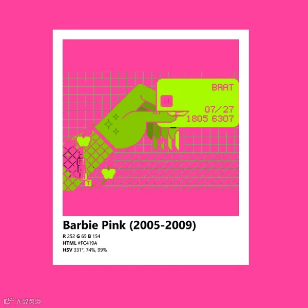
芭比粉和Brat绿,图源网络(后期拼接)
从 “熊孩子” 到 “拽丫头” 柯林斯年度词汇「 brat 」什么来头?
最后简单回顾下近几年的年度颜色吧〰
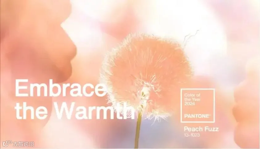
2024年
柔和桃 Peach Fuzz
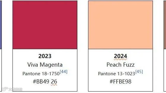
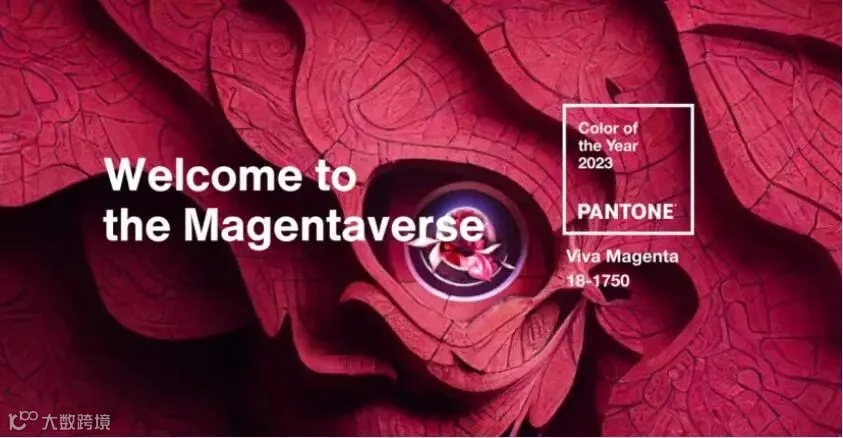
2023年
非凡洋红 Viva Magenta
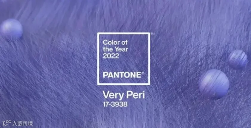
2022年
长春花蓝 Very Peri
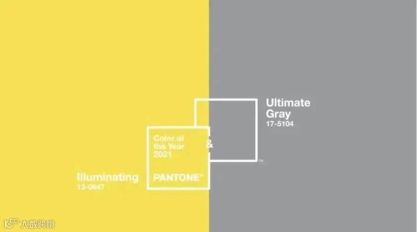
2021年
亮丽黄+极致灰
Illuminating and Ultimate Gray
图片均源于Pantone官网
原文链接:
https://www.msn.com/en-us/lifestyle/lifestyle-buzz/pantone-announces-2025-color-of-the-year-no-its-not-brat-green/ar-AA1vkBIl
https://en.wikipedia.org/wiki/Pantone
https://abcnews.go.com/GMA/Living/pantones-2025-color-year-revealed/story?id=116507517
https://edition.cnn.com/2024/12/05/style/pantone-color-of-year-2025-scli-intl/index.html
编译 | 艾妮古丽
排版 | 艾妮古丽

点击关注,携手成长👇