
The future looks bright (like, really bright) for color lovers. This year’s diverse spectrum of color trends has a little something for everyone. From bold, vibrant technicolor to pretty (and punchy) pastels and an assortment of new neutrals, you’re guaranteed to find the perfect palette for your project in 2018.
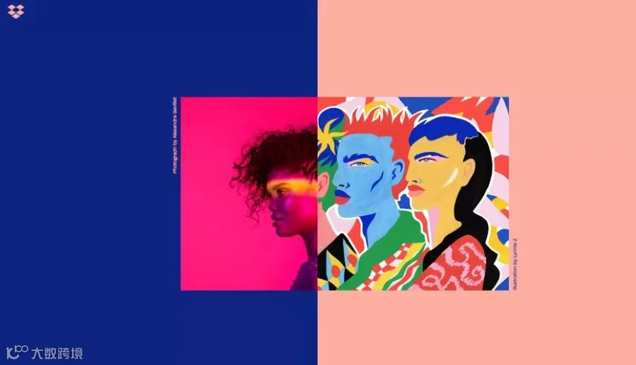
Brutalism without sacrificing user experience via Dropbox
These are the color trends you can expect to see everywhere this year:
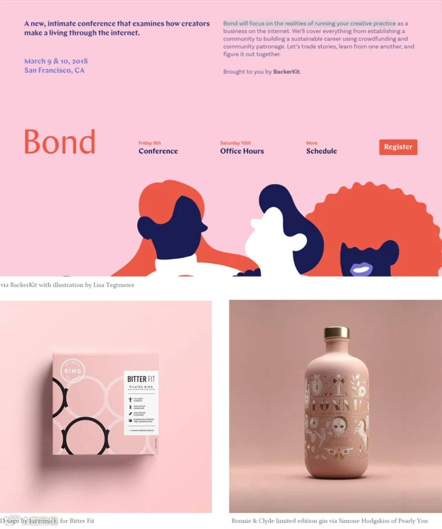
PRACTICAL IN PINK
—
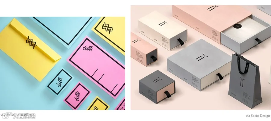
Pink has become one of the most ubiquitous and versatile colors of the decade. Its modern rise to fame began on Tumblr as content creators across the platform widely adopted the color, which became known as “Tumblr Pink”. The resurgent popularity of pink quickly reached mainstream status and began to take the design world by storm.
BRIGHT AND BOLD
—
Bold color has been trending in web and app design for years and this will continue in 2018. A staple of the flat design movement, the introduction of Google Material Design’s vibrant palette in 2014 further solidified the trend making it the standard in new media.
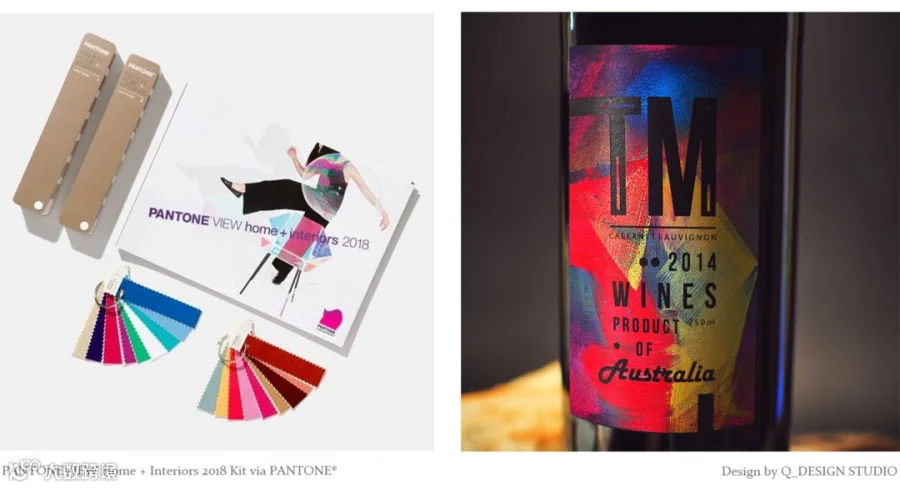
PANTONE'S COLOR OF THE YEAR: ULTRAVIOLET
—
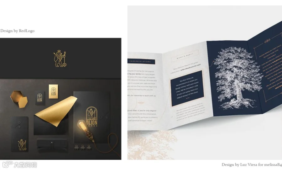
We’ve established that bold and beautiful color is in for 2018 and according to the Pantone Color Institute, UltraViolet will be the hue to rule them all.
Pantone describes this particular purple shade as “dramatically provocative and thoughtful” and further explains that “…purples have also long been symbolic of counterculture, unconventionality, and artistic brilliance.”
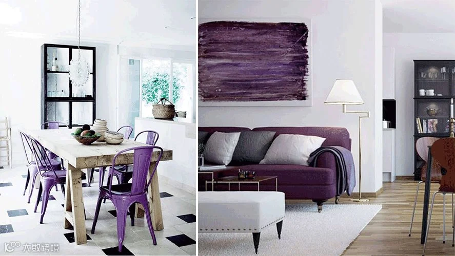
Related post ∣ Ultraviolet, in Your Home
PASTELS: THE NEW MINIMALIST PALETTE
—
Minimalism is a core value of hipster counterculture—less consumption, less waste, less stuff. These “hipster aesthetics” emerged prominently in the interior, graphics and new media design, resulting in an overabundance of whitewashed walls and websites, and black and white branding.
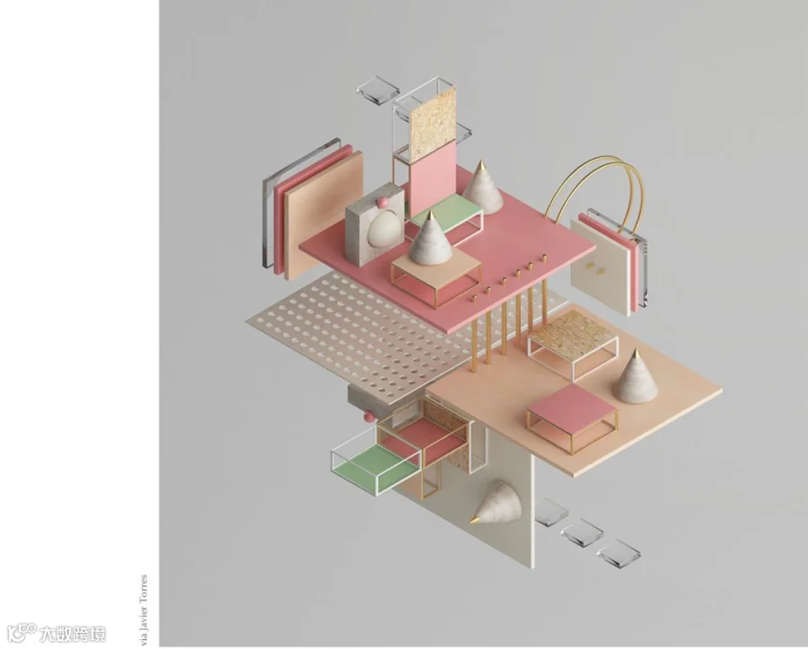
When it comes to color, we will see pushback in 2018 with a rise in modern pastel palettes—sandy Scandi pinks, mint and sage green tints, taupes and stormy blues will be replacing generic grey and breaking up the white surplus.
METALLICS AS NEUTRALS
—
At the 2017 International Home + Housewares Show the Executive Director of Pantone, Leatrice Eiseman shared her insights on color in 2018 and told her audience that “Metallics we know are classic, but they have really moved over into neutrals.” It’s easy to see her reasoning behind this statement.
Metallics are standard in interior and fashion design as they have the unique ability to mesh beautifully with a broad range of color palettes and design trends.
JOMOO Vitality Faucet, Red Dot awardee, faultlessly combines the posture of natural plants and metallic luxury finish. It can meet both your pragmatic needs and fashion taste to a great level.
JOMOO VITALITY FAUCET
—
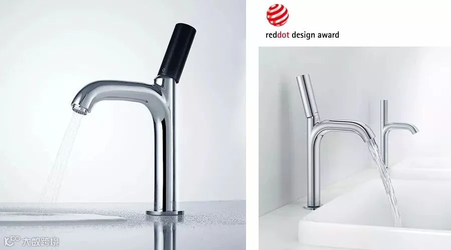
JOMOO VITALITY faucet
VITALITY faucet is now available on
JOMOO Official Store at Aliexpress.com
- AND -
Aliexpress Anniversary Sale
offers you both discount and coupon!
Until 23:59, March 30 (PST)
Click "Read More" below to get it!