![[论文分享]跟着《Microbiome》一起玩转微生物网络图!](https://cdn.10100.com/user/4d45ef863a29683762b456df77cad6ea.png?x-oss-process=style/180x)
欢迎关注R语言数据分析指南
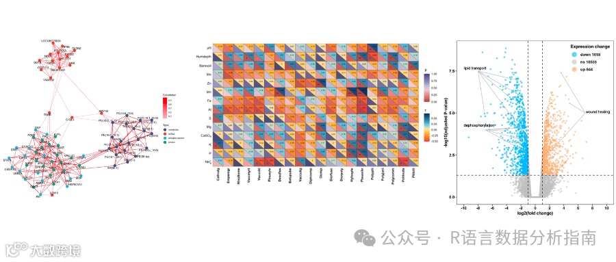
❝本节来分享Microbiome上一篇论文中的微生物网络图的绘制,论文作者有提供对应的代码+数据,小编在其基础上进行了略微的调整,与原文有所出入仅供参考,关于此图的更加详细的介绍请参考论文内容。有需要学习R语言绘图的朋友可关注文末介绍购买小编的R绘图文档。购买前请咨询,零基础不要买。
论文信息
Microbial network inference for longitudinal microbiome studies with LUPINE Kodikara, S., Lê Cao, KA. Microbial network inference for longitudinal microbiome studies with LUPINE. Microbiome 13, 64 (2025). https://doi.org/10.1186/s40168-025-02041-w
论文代码
https://github.com/SarithaKodikara/LUPINE_manuscript
图形解读
该图作者提供了绘图所需的数据,可直接用于绘图。如果想了解具体的数据处理过程,可以去原文中进一步查看。
加载R包
library(RColorBrewer)
library(patchwork)
library(tidyverse)
library(igraph)
library(circlize)
library(ComplexHeatmap)
library(SpiecEasi)
library(ggraph)
library(graphlayouts)
library(tidygraph)
导入数据
load("taxonomy.rds")
load("OTUdata.rds")
定义网络图绘制函数
netPlotVRE<-function(data, taxonomy, day, method){
  load(paste0("Results/", method,"_Day", day,".rdata"))
  net<-(res$pvalue<0.05)*1
  net<-apply(net,c(1,2), function(x){ifelse(is.na(x),0,x)})
  g <- graph.adjacency(net, mode="undirected", weighted=NULL)
# provide some names
  V(g)$name <- 1:vcount(g)


  Day0<-OTUdata_array[,,1]
  taxa_info<-taxanomy_filter_ordered[colnames(Day0),]
  taxa_info$V6<-factor(taxa_info$V6)
  col2 = list(Order = c(" o__Anaeroplasmatales"="grey48",
                        " o__Bacillales"="pink",
                        " o__Bacteroidales" = "green",
                        " o__Clostridiales" = "darkred",
                        " o__Deferribacterales"= "orange",
                        " o__Enterobacteriales"="red",
                        " o__Erysipelotrichales"="deepskyblue",
                        " o__Lactobacillales"="purple",
                        " o__RF39"="hotpink",
                        " o__Rickettsiales"= "darkgreen",
                        " o__Streptophyta"="yellow",
                        " o__Turicibacterales"="tomato",
                        " o__Verrucomicrobiales"="blue",
                        " o__"="black"))

  row_ha = rowAnnotation( Order = taxa_info$V6, col = col2)

# Create the heatmap annotation
  ha <- HeatmapAnnotation(
    Order = taxa_info$V6,
    col = col2, show_legend = FALSE
  )

# # plot using ggraph
  graph_tbl <- g %>%
    as_tbl_graph() %>%
    activate(nodes) %>%
    mutate(degree  = centrality_degree()) %>%
    mutate(community = as.factor(rep(c("black","grey48","pink", "green", "darkred", "orange","red","deepskyblue",
                                       "purple", "hotpink","darkgreen","yellow","tomato", "blue"),
                                     c(summary(factor(taxanomy_filter_ordered$V6))))))

  layout <- create_layout(graph_tbl, layout = 'igraph', algorithm = 'sphere')
  layout$x[1:14]<-layout$x[1:14]-0.5
  layout$y[1:14]<-layout$y[1:14]-3

  layout$x[15:16]<-layout$x[15:16]+1.2
  layout$y[15:16]<-layout$y[15:16]+1.1

  layout$x[17:19]<-layout$x[17:19]+0.2
  layout$y[17:19]<-layout$y[17:19]+1.1

  layout$x[20:27]<-layout$x[20:27]-0.5
  layout$y[20:27]<-layout$y[20:27]+1

  layout$x[28:111]<-layout$x[28:111]+0.5
  layout$y[28:111]<-layout$y[28:111]-1

  layout$x[112]<-layout$x[112]-0.8
  layout$y[112]<-layout$y[112]-1.5

  layout$x[113]<-layout$x[113]-0.8
  layout$y[113]<-layout$y[113]-1.5

  layout$x[114]<-layout$x[114]-0.8
  layout$y[114]<-layout$y[114]-1.5

  layout$x[115:119]<-layout$x[115:119]+1.5
  layout$y[115:119]<-layout$y[115:119]-1.5

  layout$x[120:122]<-layout$x[120:122]+2.1
  layout$y[120:122]<-layout$y[120:122]-0.5

  layout$x[123]<-layout$x[123]-0.8
  layout$y[123]<-layout$y[123]-1.5

  layout$x[124]<-layout$x[124]-0.8
  layout$y[124]<-layout$y[124]-1.5

  layout$x[125]<-layout$x[125]-0.8
  layout$y[125]<-layout$y[125]-1.5

  layout$x[126]<-layout$x[126]-0.8
  layout$y[126]<-layout$y[126]-1.5

  p<-ggraph(layout) +
    geom_edge_fan(
      aes(color = as.factor(from), alpha = 0.2),
      show.legend = F
    ) +theme_graph(background = "white")+
    geom_node_point(
      aes(size = degree, color = as.factor(name)),
      show.legend = F
    ) +
    scale_color_manual(
      limits = as.factor(layout$name),
      values = rep(c("black","grey48","pink", "green", "darkred", "orange","red","deepskyblue",
                     "purple", "hotpink","darkgreen","yellow","tomato", "blue"),
                   c(summary(factor(taxanomy_filter_ordered$V6))))
    ) +
    scale_edge_color_manual(
      limits = as.factor(layout$name),
      values = rep(c("black","grey48","pink", "green", "darkred", "orange","red","deepskyblue",
                     "purple", "hotpink","darkgreen","yellow","tomato", "blue"),
                   c(summary(factor(taxanomy_filter_ordered$V6))))
    )

return(p)

}
plots<-sapply(2:10, function(i){netPlotVRE(OTUdata_array, taxanomy_filter_ordered,  i, "LUPINE")}, simplify = FALSE)
plots[[1]]
plots[[9]]

titles <- c("Day 1\nNaive Phase",
            "Day 2\nNaive Phase",
            "Day 5\nNaive Phase",
            "Day 6\nAntibiotic Phase",
            "Day 7\nAntibiotic Phase",
            "Day 9\nVRE Phase",
            "Day 12\nVRE Phase",
            "Day 13\nVRE Phase",
            "Day 14\nVRE Phase")

title_colors <- c("forestgreen", "forestgreen", "forestgreen",
                  "chocolate", "chocolate",
                  "steelblue", "steelblue", "steelblue", "steelblue")
plots <- lapply(1:9, function(i) {
  p <- netPlotVRE(OTUdata_array, taxanomy_filter_ordered, i + 1, "LUPINE")  # 注意你的 netPlotVRE 是从2开始
  p + ggtitle(titles[i]) +
    theme(
      plot.title = element_text(color = title_colors[i],
                                face = "bold",
                                size = 14,
                                hjust = 0.5,
                                lineheight = 1.2)
    )
})

final_plot <- wrap_plots(plots, ncol = 5)  # 设定每行 4个图
print(final_plot)

绘制图例
labels <- c(" o__Anaeroplasmatales"," o__Bacillales",
            " o__Bacteroidales" ," o__Clostridiales" ,
            " o__Deferribacterales"," o__Enterobacteriales",
            " o__Erysipelotrichales"," o__Lactobacillales",
            " o__RF39"," o__Rickettsiales"," o__Streptophyta",
            " o__Turicibacterales"," o__Verrucomicrobiales",
            " o__")

colors <- c("grey48","pink", "green",
            "darkred","orange","red",
            "deepskyblue","purple",
            "hotpink", "darkgreen","yellow","tomato",
            "blue","black")

# 每一个 label 都对应一个绘图函数
graphics_list <- mapply(function(col) {
function(x, y, w, h) {
    grid.points(x, y, pch = 16, size = unit(4, "mm"), gp = gpar(col = col))
  }
}, col = colors, SIMPLIFY = FALSE)

# 传给 Legend()
lgd <- Legend(labels = labels, graphics = graphics_list)
draw(lgd,x = unit(0.89,"npc"),y = unit(0.3,"npc"))

关注下方公众号下回更新不迷路
购买介绍
❝本节介绍到此结束,有需要学习R数据可视化的朋友欢迎到淘宝店铺:R语言数据分析指南,购买小编的R语言可视化文档,2025年购买将获取2025年更新的内容,同时将赠送2024年的绘图文档内容。
更新的绘图内容包含数据+代码+注释文档+文档清单,小编只分享案例文档,不额外回答问题,无答疑服务,更新截止2025年12月31日结束,零基础不推荐买。
案例特点
❝所选案例图绝大部份属于个性化分析图表,数据案例多来自已经发表的高分论文,并会汇总整理分享一些论文中公开的分析代码。
2025年起提供更加专业的html文档,更加的直观易学。文档累计上千人次购买拥有良好的社群交流体验,R代码结构清晰易懂.


目录大纲展示

群友精彩评论

淘宝店铺

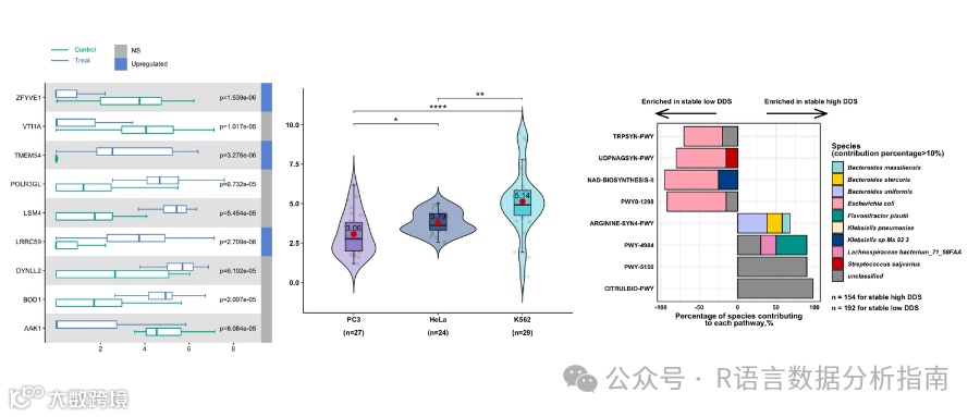
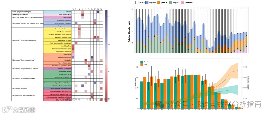
2025年更新案例图展示


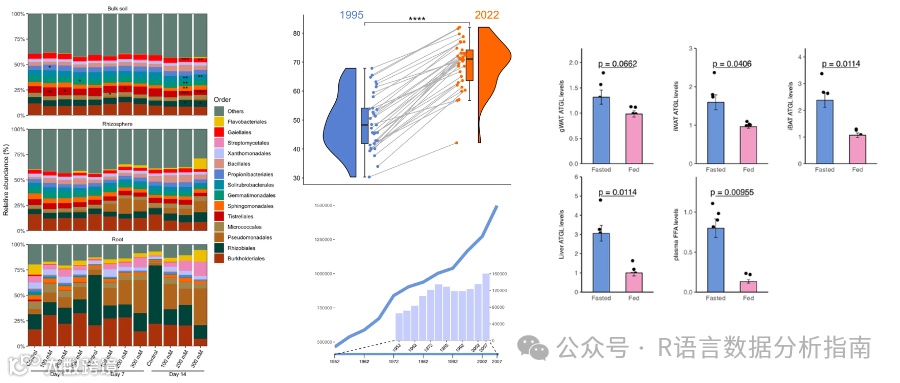
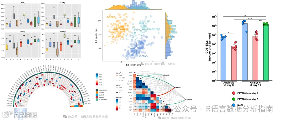
2024年案例图展示