
欢迎关注R语言数据分析指南
❝本节来通过NC上一篇论文展示一张森林图的绘制,论文未提供该图的数据。小编根据图形自行构建了数据并进行绘图,结果图与原文有所不同,个人观点仅供参考。有需要学习R语言绘图的朋友可关注文末介绍购买小编的R绘图文档。购买前请咨询,零基础不要买。
论文信息
Metabolism archetype cancer cells induce protumor TREM2+ macrophages via oxLDL-mediated metabolic interplay in hepatocellular carcinoma
 Chu, T., Zhu, G., Tang, Z. et al. Metabolism archetype cancer cells induce protumor TREM2+ macrophages via oxLDL-mediated metabolic interplay in hepatocellular carcinoma. Nat Commun 16, 6770 (2025). https://doi.org/10.1038/s41467-025-62132-y
原图

仿图

图形解读
这幅图本质上是一张标准的森林图(Forest Plot),但其亮点在于对数据进行了编号注释,并将这些编号巧妙地映射至图例中,形成了“圆点编号 + 图例文本”的双通道标注方式。这种做法大大增强了图形的可读性与精细度,尤其适合多变量展示时的对照解读。
需要指出的是,此类高度定制化的图例设计和元素排布,常规的森林图专用包(如 forestplot等)往往难以实现,因其结构较为封装,不利于图层级微调。而使用 ggplot2 进行完全自主绘制,配合 grid、ComplexHeatmap::Legend() 等组件,则可以灵活控制图中每一个元素的位置、颜色与含义,实现更高水平的定制化表达。
整体而言,该图绘制逻辑清晰,技术细节相对适中,非常适合作为进阶 ggplot2 用户练习自定义图形结构、构建复合图例的学习案例。
代码展示部分
library(tidyverse)
library(ggh4x)

df <- read_tsv("data.tsv")

df$Variable <- factor(df$Variable,levels = rev(df$Variable))

mycolor <- df %>% drop_na() %>% select(Cell_Type) %>%
  mutate(col=brewer.pal(10,"Paired")) %>%
  deframe()
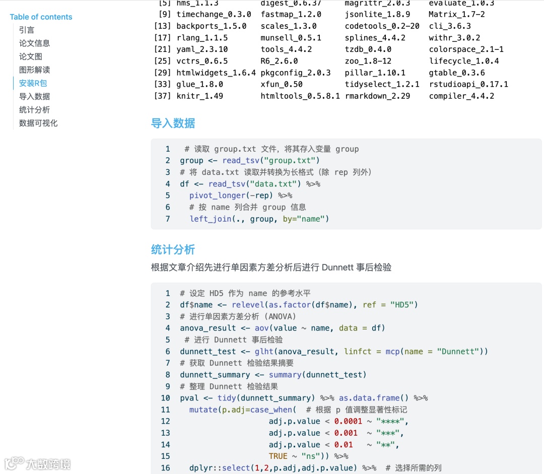
数据可视化
df %>%
  ggplot(aes(y=Variable)) +
  geom_rect(data=df %>% filter(id %% 2 == 0),inherit.aes = F,
            aes(ymin=id-0.5,ymax=id+0.5),xmin=-0.7,xmax=Inf,
            fill="grey90")+
  geom_point(aes(x=HR,y=Variable),shape=15,size=3) +
  geom_errorbarh(aes(xmin=CI_lower,xmax=CI_upper),height=0.2) +
  labs(x=NULL,y=NULL)+
  coord_cartesian(clip = "off") +
  scale_x_continuous(limits = c(-0.7,2.8),
                     breaks = c(0.5,1,1.5,2,2.5),
                     labels = c(0.5,1,1.5,2,2.5),
                     guide=guide_axis(cap = TRUE)) +
  geom_text(data=df,
            aes(x =0,y=Variable,label=`HR (95% CI)`),size=4,fontface = "bold")+
  geom_point(data=df %>% slice(5:n()),
             aes(x=-0.5,Variable,fill=Cell_Type,color=Cell_Type),
             size=8,pch=21,show.legend = F) +
  scale_fill_manual(values = mycolor) +
  scale_color_manual(values = mycolor) +
  geom_text(data=df %>% slice(5:n()),
            fontface = "bold",
            aes(x =-0.5,y=Variable,label=Variable),
            size=4,color="white") +
  geom_text(data=df %>% slice(1:4),
            fontface = "bold",hjust=0,
            aes(x =-0.6,y=Variable,label=Variable),
            size=4,color="black") +
  geom_text(aes(x =2.5,y=Variable,label=P_value),
            size=4,fontface = "italic",hjust=0) +
  geom_text(aes(x =0,y=max(id)+1),size=4,label="HR (95% CI)",fontface = "bold") +
  geom_text(aes(x =-0.5,y=max(id)+1),size=4,
  label="Variable",fontface="bold") +
  geom_text(aes(x =2.65,y=max(id)+1),size=4,label="P_value",fontface = "bold")+
  annotate(geom="segment",x=1,xend=1,
           y=0.5,yend=13.5,color="black",linetype=2) +
  theme(axis.text.y=element_blank(),
        axis.text.x=element_text(color="black",face="bold",size=11),
        axis.ticks.y=element_blank(),
        panel.background = element_blank(),
        axis.line.x=element_line(color="black"),
        plot.margin = margin(0.5,6,0.5,0.5,unit="cm"))
关注下方公众号下回更新不迷路
❝本节介绍到此结束,有需要学习R数据可视化的朋友欢迎到淘宝店铺:R语言数据分析指南,购买小编的R语言可视化文档,2025年购买将获取2025年更新的绘图内容,同时将赠送2024年的绘图文档内容。
更新的绘图内容包含数据+代码+注释文档+文档清单,小编只分享案例文档,不额外回答问题,无答疑服务,更新截止2025年12月31日结束,后续不在进行任何更新,零基础基础一般不推荐买。
案例特点
❝所选案例图绝大部份属于个性化分析图表,数据案例多来自已经发表的高分论文,并会汇总整理分享一些论文中公开的分析代码。
2025年起提供更加专业的html文档,更加的直观易学。文档累计上千人次购买拥有良好的社群交流体验,R代码结构清晰易懂.

目录大纲展示

淘宝店铺

2025年更新案例图展示


 )
)


