欢迎关注R语言数据分析指南
❝最近在看相关论文发现作者提到一个专门用于微生物组学分析的R包,小编仔细查看了一下官方文档,发现内容非常丰富,本节通过一个常见的相关案例来引入介绍一下该包的用途,个人观点仅供参考,更多详细内容请参考官方文档。
论文信息
A workflow for statistical analysis and visualization of microbiome omics data using the R microeco package Liu, C., Mansoldo, F.R.P., Li, H. et al. A workflow for statistical analysis and visualization of microbiome omics data using the R microeco package. Nat Protoc (2025). https://doi.org/10.1038/s41596-025-01239-4
官方文档
https://chiliubio.github.io/microeco_tutorial/

加载R包
# install.packages("microeco")
library(microeco)
library(magrittr)
library(ggplot2)
library(aplot)
整合数据集
mt <- microtable$new(sample_table = sample_info_16S,
                     otu_table = otu_table_16S,
                     tax_table = taxonomy_table_16S,
                     phylo_tree = phylo_tree_16S)
# 筛选
mt$tax_table %<>% base::subset(Kingdom == "k__Archaea" | Kingdom == "k__Bacteria")
# another way with grepl function
mt$tax_table %<>% .[grepl("Bacteria|Archaea", .$Kingdom), ]
mt$filter_pollution(taxa = c("mitochondria", "chloroplast"))
mt$tidy_dataset()
抽平
# first clone the data
mt_rarefied <- clone(mt)

mt_rarefied$sample_sums() %>% range # 查看每个样本的测序深度范围
# 将每个样本稀释到 10000 条序列,保证不同样本间可比性。
mt_rarefied$rarefy_samples(sample.size = 10000)
mt_rarefied$sample_sums() %>% range # 检查稀释后的测序深度是否一致
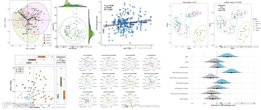
beta多样性分析
# 考虑 Unifrac 距离需要系统发育树文件
mt_rarefied$cal_betadiv(unifrac = TRUE)

class(mt_rarefied$beta_diversity)
# 存储多个距离矩阵
mt_rarefied$save_betadiv(dirpath = "beta_diversity")

PCoa分析+箱图
 # 构建 β 多样性对象
t1 <- trans_beta$new(dataset = mt_rarefied,
                     group = "Group", measure = "bray")
# PCoA 降维
t1$cal_ordination(method = "PCoA")
# 提取坐标结果
tmp <- t1$res_ordination$scores
t2 <- trans_env$new(dataset = mt_rarefied,add_data = tmp[, 1:2])
# 差异检验
t2$cal_diff(group = "Group",method = "anova")

p1 <- t1$plot_ordination(plot_color = "Group",
                         plot_shape = "Group",
                         plot_type = c("point","ellipse"))

p2 <- t2$plot_diff(measure = "PCo1", add_sig = T) +
  theme_bw() + coord_flip() +
  theme(legend.position = "none",
        axis.title.x = element_blank(),
        axis.text.y = element_blank(),
        axis.ticks.y = element_blank())

p3 <- t2$plot_diff(measure = "PCo2", add_sig = T) +
  theme_bw() +
  theme(legend.position = "none",
        axis.title.y = element_blank(),
        axis.text.x = element_blank(),
        axis.ticks.x = element_blank())

p1 %>% insert_top(p2, height = 0.2) %>%
  insert_right(p3, width = 0.2)

过程解读
从上面的代码过程可以看到,分析是从原始数据开始,依次完成数据整合、β 多样性分析直至绘图,流程一气呵成。如果不借助此类R包,也能够得到相同的结果,但代码量会显著增加。与这些高度集成化的 R 包相比,自行构建代码的最大优势在于能够获得更高的灵活性。
关注下方公众号下回更新不迷路
购买介绍
❝本节介绍到此结束,需要获取下方所示R绘图案例全部代码的读者,欢迎到淘宝店铺:R语言数据分析指南,购买小编的R语言可视化文档,2025年购买将获取2025年更新的绘图内容,同时将赠送2024年的绘图文档内容,其余内容无。
更新的绘图内容包含数据+代码+注释文档+文档清单,小编只分享案例文档,不额外回答问题,无答疑服务,更新截止2025年12月31日结束,后续不在进行任何更新,零基础基础一般不推荐买。
淘宝店铺

2025年更新案例图展示