

# 安装pyecharts模块,直接安装就是最新的版本
pip install pyecharts#导入需要使用的模块
import pyecharts.options as opts
from pyecharts.charts import Gauge
Gaug_1=(
#创建仪表盘对象,并设置大小,也可以不设置,直接使用默认大小即可
Gauge(init_opts=opts.InitOpts(width="800px", height="400px"))
#设置数据系列名称及数据
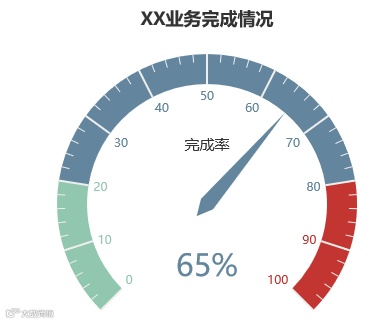
.add(series_name="完成率", data_pair=[["完成率", 65]])
.set_global_opts(
# 设置图表标题及位置
title_opts=opts.TitleOpts(title="XX业务完成情况",pos_left="center"),
# 设置不显示图例,饼图不建议使用图例,不方便读图
legend_opts=opts.LegendOpts(is_show=False),
#设置提示框数据标签显示格式
tooltip_opts=opts.TooltipOpts(is_show=True, formatter="{a} <br/>{b} : {c}%"),
)
#通过render()方法将仪表盘渲染为html
.render("gauge.html")
)

Gaug_1=(
    Gauge(init_opts=opts.InitOpts(width="800px", height="400px"))
    .add(series_name="完成率", data_pair=[["完成率", 65]],
         #设置仪表盘颜色
         axisline_opts=opts.AxisLineOpts(
            linestyle_opts=opts.LineStyleOpts(
                color=[(0.6, "#fd666d"), (0.8, "#FFD700"),(1, "#3CB371")], width=30)))
    .set_global_opts(
        title_opts=opts.TitleOpts(title="XX业务完成情况",pos_left="center"),
        legend_opts=opts.LegendOpts(is_show=False),
        tooltip_opts=opts.TooltipOpts(is_show=True, formatter="{a} <br/>{b} : {c}%"),
    )
    .render("gauge.html")
)


如果你在跟着学习,请在留言区留言:打卡
如果你刚看到本文,可以查看本系列历史文章跟着学习:
跟小白学Python数据分析——Anaconda安装
跟小白学Python数据分析——使用spyder
跟小白学Python数据分析——数据导入1
跟小白学Python数据分析——数据导入2

1.回复“PY”领取1GB Python数据分析资料
2.回复“BG”领取5GB 名企数据分析报告