
微信公众号:数据皮皮侠
如果你觉得该公众号对你有帮助,欢迎关注、推广和宣传
内容目录:Matplotlib下:标准的类定义和函数定义
0.图形类的定义1.基础图形:线2.散点图3.柱状图4.填充图--fill函数的各种用法5.imshow6.pcolor7.地形图8.向量场9.数据分布图
0.图形类的定义
通过对class的定义,使其成为可以共同调用的功能性模块,
从而实现程序的高效性和图形的复杂性。
#共用模块
import matplotlib.pyplot as plt
class example_utils:
# 创建画图
    def setup_axes():
        fig, axes = plt.subplots(ncols=3, figsize=(6.6,3))
        for ax in fig.axes:
            ax.set(xticks=[], yticks=[])  #不显示刻度
        fig.subplots_adjust(wspace=0, left=0.2, right=0.9)
        return fig, axes
# 标题
    def title(fig, text, y=1):
        fig.suptitle(text, size=15, y=y, weight='medium', x=0.45, ha='center',
                 bbox=dict(boxstyle='round', fc='ivory', ec='#8B7E66',
                           lw=2))
# 添加文本注释
    def label(ax, text, y=0):
        ax.annotate(text, xy=(0.5, 0.00), xycoords='axes fraction', ha='center',
                style='normal',
                bbox=dict(boxstyle='round,pad=0.5', fc='ivory', ec='k',lw=1))
# 第5、6、7组图片的数据
    def datas(delta):
            x = np.arange(-3.0, 3.0, delta)
            y = np.arange(-2.0, 2.0, delta)
            X, Y = np.meshgrid(x, y) #生成网格型数据
            Z1 = np.exp(-X**2 - Y**2)
            Z2 = np.exp(-(X - 1)**2 - (Y - 1)**2)
            z = (Z1 - Z2) * 2
            return z
1.基础图形:线
   采用for循环语句调用类函数#1.基本图
import numpy as np
import matplotlib.pyplot as plt

x = np.linspace(0, 10, 100)

fig, axes = example_utils.setup_axes()
for ax in axes:
    ax.margins(y=0.10)

# 子图1 默认plot多条线
for i in range(1, 6):
    axes[0].plot(x, i * x)

# 子图2 展示线的不同linestyle
for i, ls in enumerate(['-', '--', ':', '-.']):
    axes[1].plot(x, np.sin(x) + i, linestyle=ls)

# 子图3 展示线的不同linestyle和marker
for i, (ls, mk) in enumerate(zip(['-', '--', ':', '-.'], ['*', 'o', '^', 's'])):
    axes[2].plot(x, np.cos(x) + i, linestyle=ls, marker=mk, markevery=10)

# 设置标题
example_utils.title(fig, 'ax.plot(): Lines and markers', y=1)
# 保存图片
fig.savefig('plot_example.png', facecolor='none')
plt.show()

2.散点图
import numpy as np
import matplotlib.pyplot as plt

# 随机生成数据
np.random.seed(2020)
x, y, z = np.random.normal(0, 1, (3, 100))
size = 50 * np.sin(3 * x)**2 + 20 #设置不同大小的点

fig, axes = example_utils.setup_axes()

# 子图1
axes[0].scatter(x, y, marker='o',  color='purple', facecolor='white', s=70)
example_utils.label(axes[0], 'scatter(x, y)')

# 子图2
axes[1].scatter(x, y, s=size, marker='s', color='purple')
example_utils.label(axes[1], 'scatter(x, y, s)')

# 子图3
axes[2].scatter(x, y, s=size, c=z,  cmap='gist_rainbow')
example_utils.label(axes[2], 'scatter(x, y, s, c)')

example_utils.title(fig, 'ax.scatter(): Colored/scaled markers')
fig.savefig('scatter_example.png', facecolor='none')
plt.show()
显示结果:

3.柱状图
该程序流程是首先定义主函数,然后在定义不同功能的柱状图,最后统一Main
()函数实现图形可视化。import numpy as np
import matplotlib.pyplot as plt
def main():
fig, axes = example_utils.setup_axes()
basic_bar(axes[0])
tornado(axes[1])
general(axes[2])
example_utils.title(fig, 'ax.bar(): Plot rectangles')
fig.savefig('bar_example.png', facecolor='none')
plt.show()
# 子图1
def basic_bar(ax):
y = np.array([1, 2, 2.5, 1, 1]) #给出第一组数据
y1 = np.array([1.5, 1, 1, 0.5, 1]) #给出第二组数据
y2 = np.array([0.5, 1, 1, 2, 1.5]) #给出第三组数据
err = [0.4, 1.5, 0.4, 1, 0.8]
x = np.arange(len(y))
ax.bar(x, y, color='lightblue')
ax.bar(x, y1, color='salmon', bottom=y)
ax.bar(x, y2, yerr=err, color='purple', bottom=y+y1, ecolor='blue')
ax.margins(0.05) #边距
ax.set_ylim(bottom=0) #坐标下限
example_utils.label(ax, 'bar(x, y)')
# 子图2
def tornado(ax):
y = np.arange(6)
x1 = y + np.random.random(6) + 1
x2 = y + 2 * np.random.random(6) + 1
ax.barh(y, x1, color='purple')
ax.barh(y, -x2, color='salmon')
ax.margins(0.15)
example_utils.label(ax, 'barh(x, y)')
# 子图3
def general(ax):
num = 10
left = np.random.randint(0, 10, num)
bottom = np.random.randint(0, 10, num)
width = np.random.random(num) + 0.5
height = np.random.random(num) + 0.5
ax.bar(left, height, width, bottom, color='purple')
ax.margins(0.15)
example_utils.label(ax, 'bar(l, h, w, b)')
main()
显示结果:

4.填充图--fill函数的各种用法
import numpy as np
import matplotlib.pyplot as plt
# ---------- 产生数据 -----------
def fill_data():
    t = np.linspace(0, 2*np.pi, 100)
    r = np.random.normal(0, 1, 100).cumsum()
    r -= r.min()
    return r * np.cos(t), r * np.sin(t)

def sin_data():
    x = np.linspace(0, 10, 100)
    y1 = np.sin(x)
    y2 = np.cos(x)
    return x, y1, y2

def stackplot_data():
    x = np.linspace(0, 10, 100)
    y = np.random.normal(0, 1, (5, 100))
    y = y.cumsum(axis=1)  #返回给定axis上的累计和
    y -= y.min(axis=0, keepdims=True) #按行相加,并且保持其二维特性
    return x, y
# ----------- 图形 -------------
def fill_example(ax):
    # fill一个多边形区域
    x, y = fill_data()
    ax.fill(x, y, color='purple')
    ax.margins(0.1)
    example_utils.label(ax, 'fill')

def fill_between_example(ax):
    # 两条线间填充
    x, y1, y2 = sin_data()
    # fill_between的最常用法1
    err = np.random.rand(x.size)**2 + 0.1
    y = x + 2
    ax.fill_between(x, y + err, y - err, color='purple')

    # 最常用法2:两条曲线相交区域对应不同填充色
    ax.fill_between(x, y1, y2, where=y1 > y2, color='lightblue')
    ax.fill_between(x, y1, y2, where=y1 < y2, color='salmon')

    # 最常用法3
    ax.fill_betweenx(x, -y1, where=y1 > 0, color='lightblue')
    ax.fill_betweenx(x, -y1, where=y1 < 0, color='salmon')

    ax.margins(0.15)
    example_utils.label(ax, 'fill_between/x')

def stackplot_example(ax):
    # Stackplot就是多次调用 ax.fill_between
    x, y = stackplot_data()
    ax.stackplot(x, y.cumsum(axis=0), alpha=0.5)
    example_utils.label(ax, 'stackplot')

def main():
    fig, axes = example_utils.setup_axes()

    fill_example(axes[0])
    fill_between_example(axes[1])
    stackplot_example(axes[2])

    example_utils.title(fig, 'fill/fill_between/stackplot: Filled polygons',
                        y=1)
    fig.savefig('fill_example.png', facecolor='none')
    plt.show()
main()
显示结果:

5.imshow
import matplotlib.pyplot as plt
import numpy as np
from matplotlib.cbook import get_sample_data
from mpl_toolkits import axes_grid1
#import example_utils
def main():
    fig, axes = setup_axes()
    plot(axes, *load_data())
    example_utils.title(fig, 'ax.imshow(): Colormapped or RGB arrays')
    fig.savefig('imshow_example.png', facecolor='none')
    plt.show()
def plot(axes, img_data, scalar_data, ny):
    # 默认线性插值
    axes[0].imshow(scalar_data, cmap='gist_earth', extent=[0, ny, ny, 0])
     # 最近邻插值(插值可通过函数在有限个点处的取值状况,估算出函数在其他点处的近似值)
    axes[1].imshow(scalar_data, cmap='gist_earth', interpolation='nearest',
                   extent=[0, ny, ny, 0])

    # 展示RGB/RGBA数据
    axes[2].imshow(img_data)

# 读取数据
def load_data():
    img_data = plt.imread(get_sample_data(r'C:\Users\liao\Desktop\近半年数据.PNG'))
    ny, nx, nbands = img_data.shape  # 维数

    scalar_data = example_utils.datas(0.25)

    return img_data, scalar_data, ny

# 重新设置画图格式
def setup_axes():
    fig = plt.figure(figsize=(6, 3))
    axes = axes_grid1.ImageGrid(fig, [0, 0, .93, 1], (1, 3), axes_pad=0)

    for ax in axes:
        ax.set(xticks=[], yticks=[])
    return fig, axes

main()
显示结果:

6.pcolor
import matplotlib.pyplot as plt
import numpy as np

# 数据
z = example_utils.datas(0.5)
ny, nx = z.shape
y, x = np.mgrid[:ny, :nx]
y = (y - y.mean()) * (x + 10)**2

mask = (z > -0.1) & (z < 0.1)
z2 = np.ma.masked_where(mask, z) #掩盖满足条件的数组

fig, axes = example_utils.setup_axes()

# pcolor 或 pcolormesh 都可,后者效率更高
axes[0].pcolor(x, y, z, cmap='gist_earth')
example_utils.label(axes[0], 'either')

# 使用pcolor
axes[1].pcolor(x, y, z2, cmap='gist_earth', edgecolor='blue')
example_utils.label(axes[1], 'pcolor(x,y,z)')

# 使用pcolormesh
axes[2].pcolormesh(x, y, z2, cmap='gist_earth', edgecolor='blue', lw=0.5,
                   antialiased=True)
example_utils.label(axes[2], 'pcolormesh(x,y,z)')

example_utils.title(fig, 'pcolor/pcolormesh: Colormapped 2D arrays')
fig.savefig('pcolor_example.png', facecolor='none')
plt.show()
显示结果:

7.地形图
import matplotlib.pyplot as plt
import numpy as np

z = example_utils.datas(0.25)

fig, axes = example_utils.setup_axes()

axes[0].contour(z, cmap='gist_earth')
example_utils.label(axes[0], 'contour')

axes[1].contourf(z, cmap='gist_earth')
example_utils.label(axes[1], 'contourf')

axes[2].contourf(z, cmap='gist_earth')
cont = axes[2].contour(z, colors='black')
axes[2].clabel(cont, fontsize=6)  #等高线上标明高度的值
example_utils.label(axes[2], 'contourf + contour\n + clabel')

example_utils.title(fig, 'contour, contourf, clabel: Contour/label 2D data',y=1)
fig.savefig('contour_example.png', facecolor='none')
plt.show()
显示结果:

8.向量场
import matplotlib.pyplot as plt
import numpy as np

# Generate data
n = 256
x = np.linspace(-np.pi, np.pi, n)
y = np.linspace(-np.pi, np.pi, n)
xi, yi = np.meshgrid(x, y)
z = (1 - xi / 2 + xi**5 + yi**3) * np.exp(-xi**2 - yi**2)
#z = np.sin(xi) + np.cos(yi)
dy, dx = np.gradient(z)
mag = np.hypot(dx, dy)

fig, axes = example_utils.setup_axes()

# 单箭头
axes[0].arrow(0, 0, -0.5, 0.5, width=0.005, color='black')
axes[0].axis([-1, 1, -1, 1])
example_utils.label(axes[0], 'arrow(x, y, dx, dy)')

# ax.quiver
ds = np.s_[::16, ::16]  # 降低采样
axes[1].quiver(xi[ds], yi[ds], dx[ds], dy[ds], z[ds], cmap='gist_earth',
               width=0.01, scale=0.25, pivot='middle')
axes[1].axis('tight')
example_utils.label(axes[1], 'quiver(x, y, dx, dy)')

# ax.streamplot
# 宽度和颜色变化
lw = 2 * (mag - mag.min()) / mag.ptp() + 0.2
axes[2].streamplot(xi, yi, dx, dy, color=z, density=1.5, linewidth=lw,
                   cmap='gist_earth')
example_utils.label(axes[2], 'streamplot(x, y, dx, dy)')

example_utils.title(fig, 'arrow/quiver/streamplot: Vector fields', y=1)
fig.savefig('vector_example.png', facecolor='none')
plt.show()
显示结果:

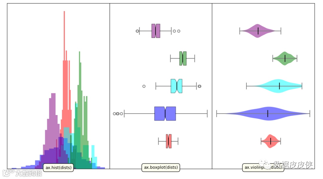
9.数据分布图
import numpy as np
import matplotlib.pyplot as plt
def main():
    colors = ['red', 'blue','cyan', 'green', 'purple']
    dists = generate_data()
    fig, axes = example_utils.setup_axes()
    hist(axes[0], dists, colors)
    boxplot(axes[1], dists, colors)
    violinplot(axes[2], dists, colors)
    example_utils.title(fig, 'hist/boxplot/violinplot: Statistical plotting',
                         y=1)
    fig.savefig('statistical_example.png', facecolor='none')
    plt.show()

def generate_data():
    means = [0, -1, 2.5, 4.3, -3.6]
    sigmas = [1.2, 5, 3, 1.5, 2]
    # 每一个分布的样本个数
    nums = [120, 800, 70, 170, 460]

    dists = [np.random.normal(*args) for args in zip(means, sigmas, nums)]
    return dists

# 频率分布直方图
def hist(ax, dists, colors):
    for index,dist in enumerate(dists):
        ax.hist(dist, bins=20, density=True, facecolor=colors[index],
                edgecolor='none', alpha=0.5)

    ax.margins(y=0.05)
    ax.set_ylim(bottom=0)

    example_utils.label(ax, 'ax.hist(dists)')

# 箱型图
def boxplot(ax, dists, colors):
    result = ax.boxplot(dists, patch_artist=True, notch=True, vert=False)

    for box, color in zip(result['boxes'], colors):
        box.set(facecolor=color, alpha=0.5)
    for item in ['whiskers', 'caps', 'medians']:
        plt.setp(result[item], color='gray', linewidth=1.5)
    plt.setp(result['fliers'], markeredgecolor='gray', markeredgewidth=1.5)
    plt.setp(result['medians'], color='black')

    ax.margins(0.05)
    ax.set(yticks=[], ylim=[0, 6])

    example_utils.label(ax, 'ax.boxplot(dists)')

#小提琴图
def violinplot(ax, dists, colors):
    result = ax.violinplot(dists, vert=False, showmedians=True)
    for body, color in zip(result['bodies'], colors):
        body.set(facecolor=color, alpha=0.5)
    for item in ['cbars', 'cmaxes', 'cmins', 'cmedians']:
        plt.setp(result[item], edgecolor='gray', linewidth=1.5)
    plt.setp(result['cmedians'], edgecolor='black')

    ax.margins(0.05)
    ax.set(ylim=[0, 6])

    example_utils.label(ax, 'ax.violinplot(dists)')

main()
显示结果:
通过该例子的学习,可以掌握python下的数据生产,for循环的使用,类及主函数的调研,以及整个项目的工作流程,同时,也实现了可视化的功能。
(编辑:廖月悦)